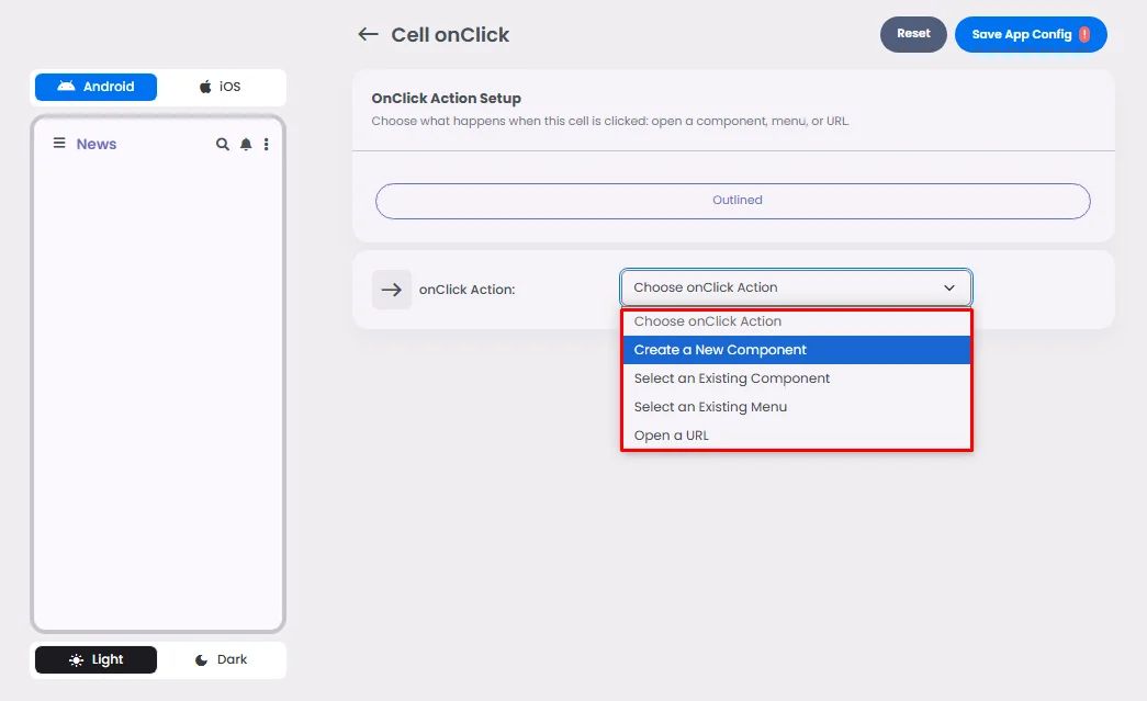
Make sure to drag and drop the element into your workspace.
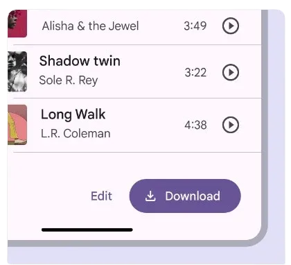
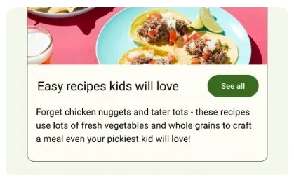
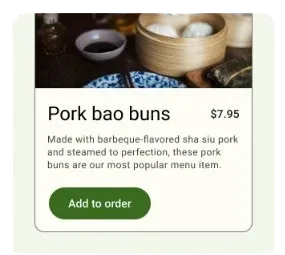
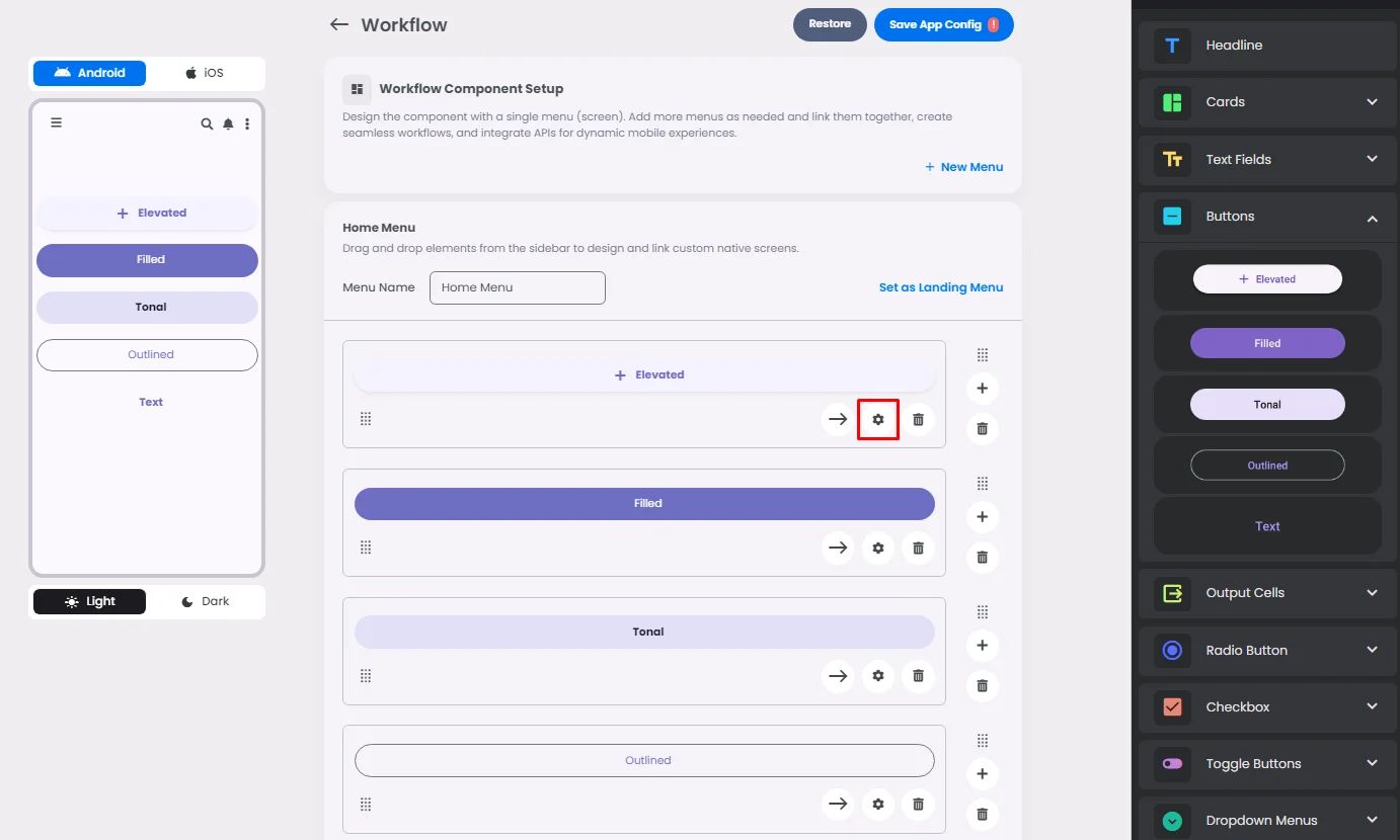
Buttons are used to perform specific actions. There are 5 types of them, which have fully rounded corners and are wide enough to fit label text: elevated, filled, filled tonal, outlined, and text.

Guide—Under the following circumstances, use these button types:
🟠Elevated: You should only use them when you have to, like when the button needs to stand out from a colored background.
🟠Filled: It should be used for the last steps in a flow or for getting rid of any blocks.
🟠Tonal: You should only use them when you have to, like when the button needs to stand out from a colored background, but do so with less force.
🟠Outlined: Should be used for acts that need attention but aren't the main ones, like ‘See all’ or ‘Add to cart.’
🟠Text: Should be used for acts with little emphasis, like giving someone another choice.

Click or drag and drop a button and click the gear icon to open the button’s settings
Settings
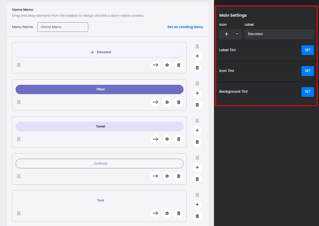
The settings for each button element are identical. Add your button label, icon, label tint, icon and background tint.
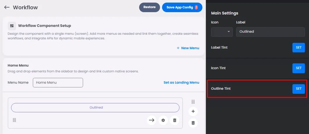
The only thing that makes each button different is the style you pick; for example, the outlined button has the option of changing the outline color.
‣ onClick
The onClick option in buttons is the same as cards.
