Navigation
The navigation page is the main page your users will land on once they open the app. It's where you can design your Navigation Tab Theme, add, modify, or delete Components.
Tab Theme
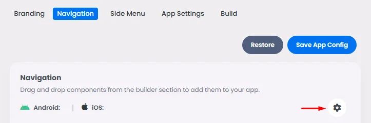
Click the 'Navigation' tab and then click the gear icon in the Tab Theme section.
Android Navigation
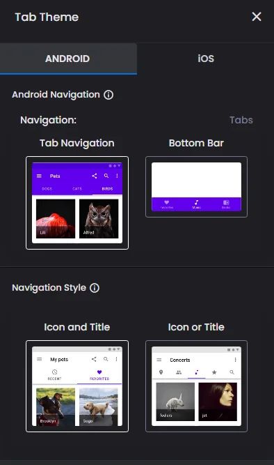
This is where you choose the top or bottom navigation bar tab interface, as well as the style that displays the tab's icon and title, icon only, or title only.
iOS Navigation
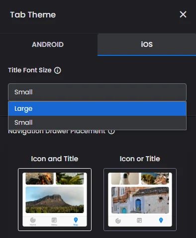
The concept goes similarly for iOS; you have the option of selecting the font size for the tab's title just the icon only, or both.
Navigation Bar Tabs
Your navigation bar is where you can add up to 5 components to install them.
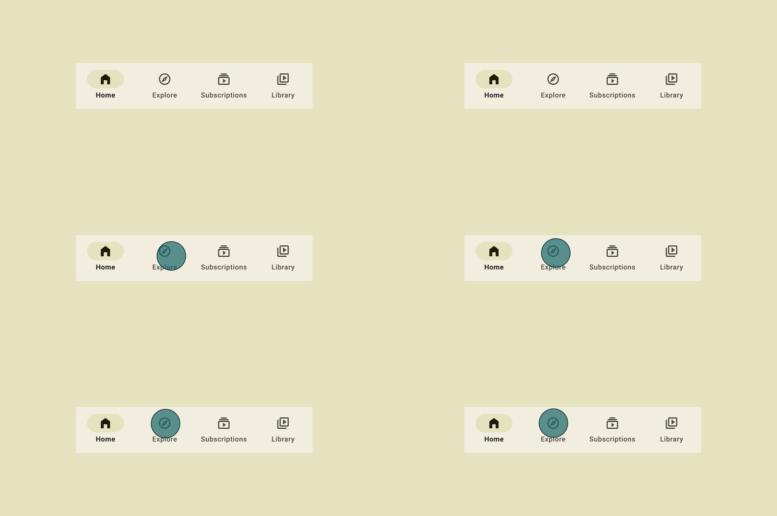
Include fewer tabs, if possible. It keeps the user's mental load low and makes sure the tabs aren't too close together to be easily clicked.
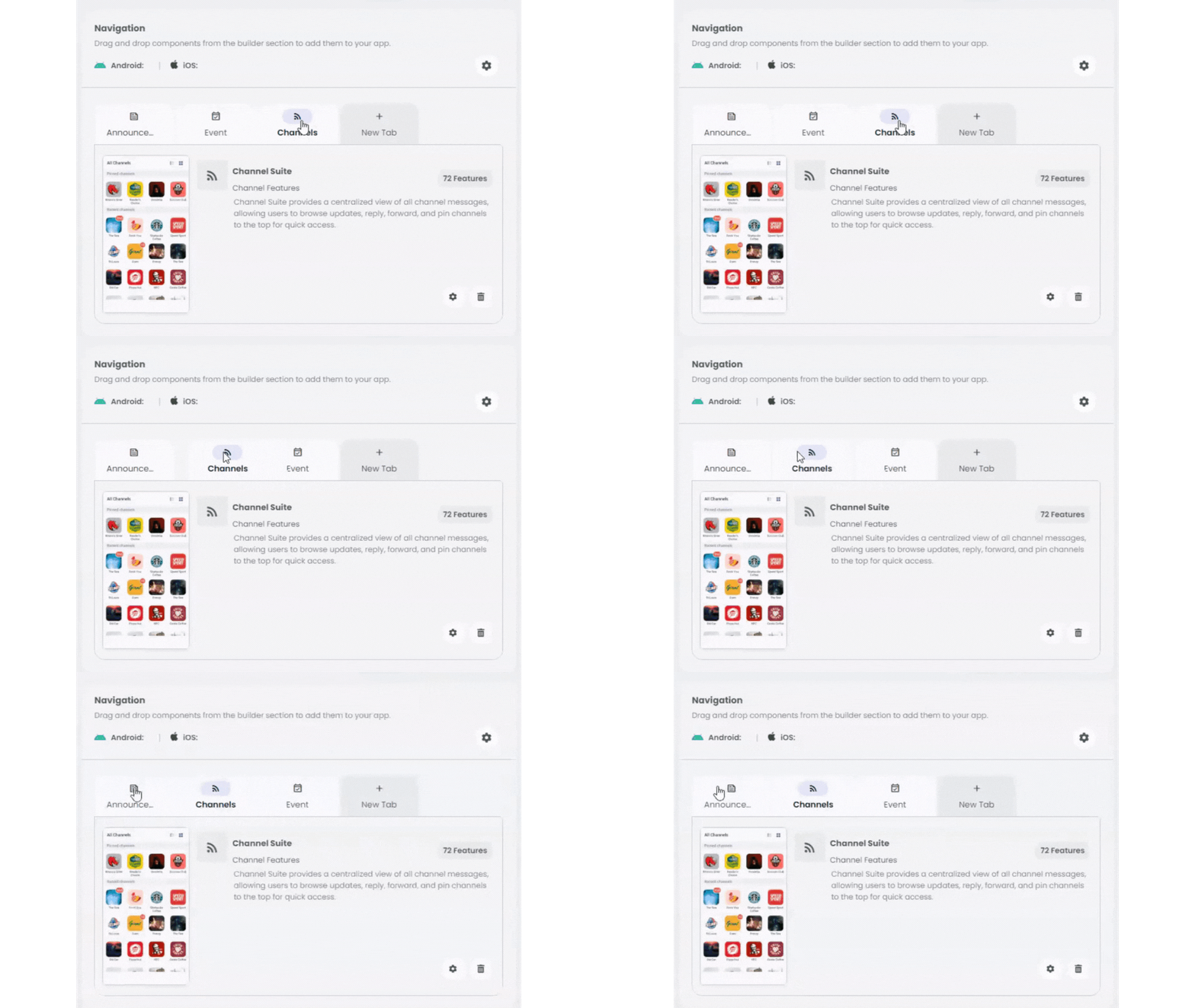
You can also move tabs to arrange your components by holding the component and dragging it right or left.
Note that the tabs will also take from the color scheme that you chose for your app. Find the suitable documentation here to know how app colors are distributed over your app.
Side Menu
The Side Menu is a slide-in menu that lets people get to different parts of your app by accessing different components you add. It's where you can design your Side Menu Theme, add, modify, or delete Components.
Side Menu Theme
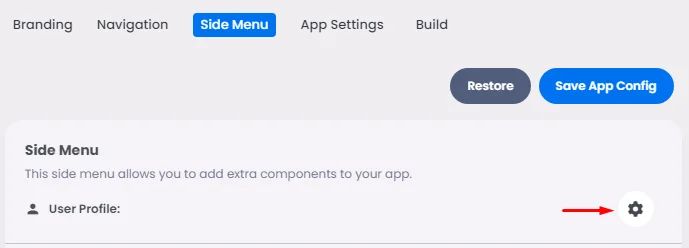
Click the 'Side Menu' tab and then click the gear icon in the Side Menu Theme section.
Android Side Menu
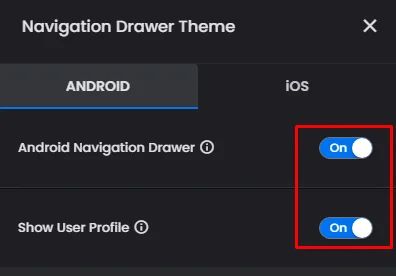
You can choose whether you want your navigation drawer or user profiles to be shown on the app or not by clicking the toggle for the ON/OFF option.
iOS Side Menu
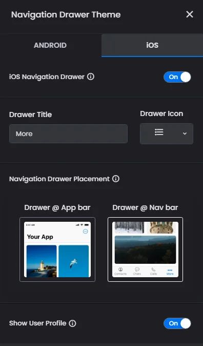
Choose if you want your navigation drawer to be shown on the app or not, add a title for your drawer (ex: More) and an icon, choose the top or the bottom navigation bar tab interface, and choose if you want to show user profiles or not.
Side Menu Tabs
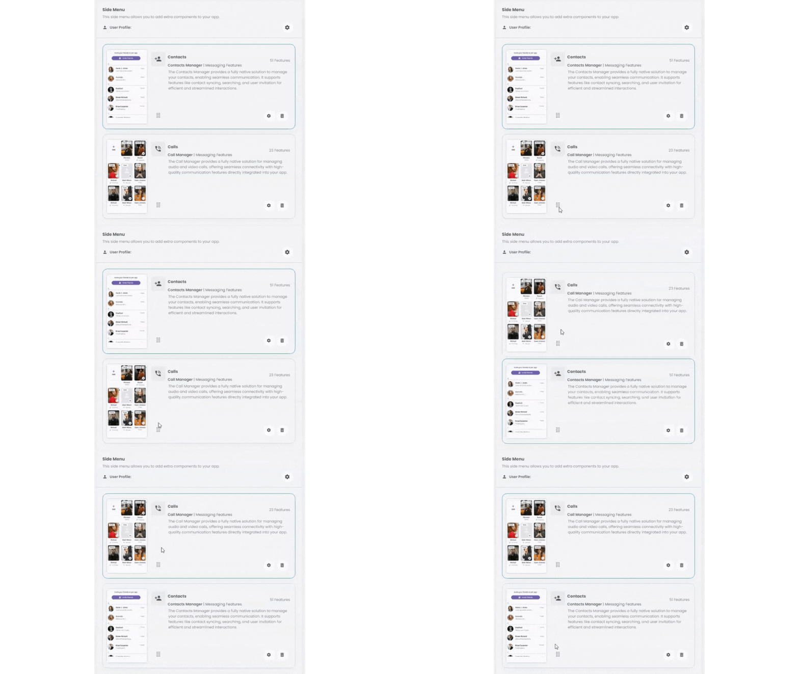
You can reallocate component tabs to arrange them by holding the component icon and moving it up and down.
There is no limit to the number of components that you can add; however, make sure to add components that best serve your app.
Components Installation
The builder components section is where you can browse through the listed component categories and choose what best fits your app.
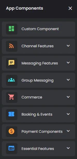
Each category has a group of components that are displayed when you drag and drop it or select it.
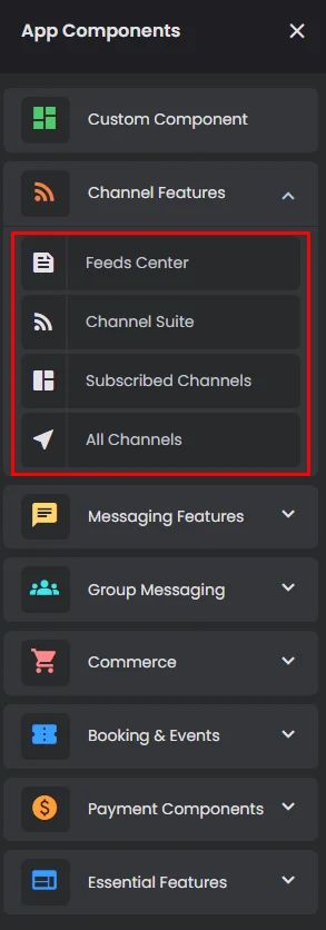
A single component is a set of features that work together to fulfil specific functions, and each one has its own configuration section.
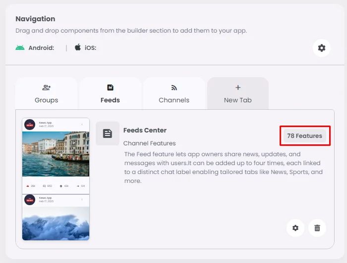
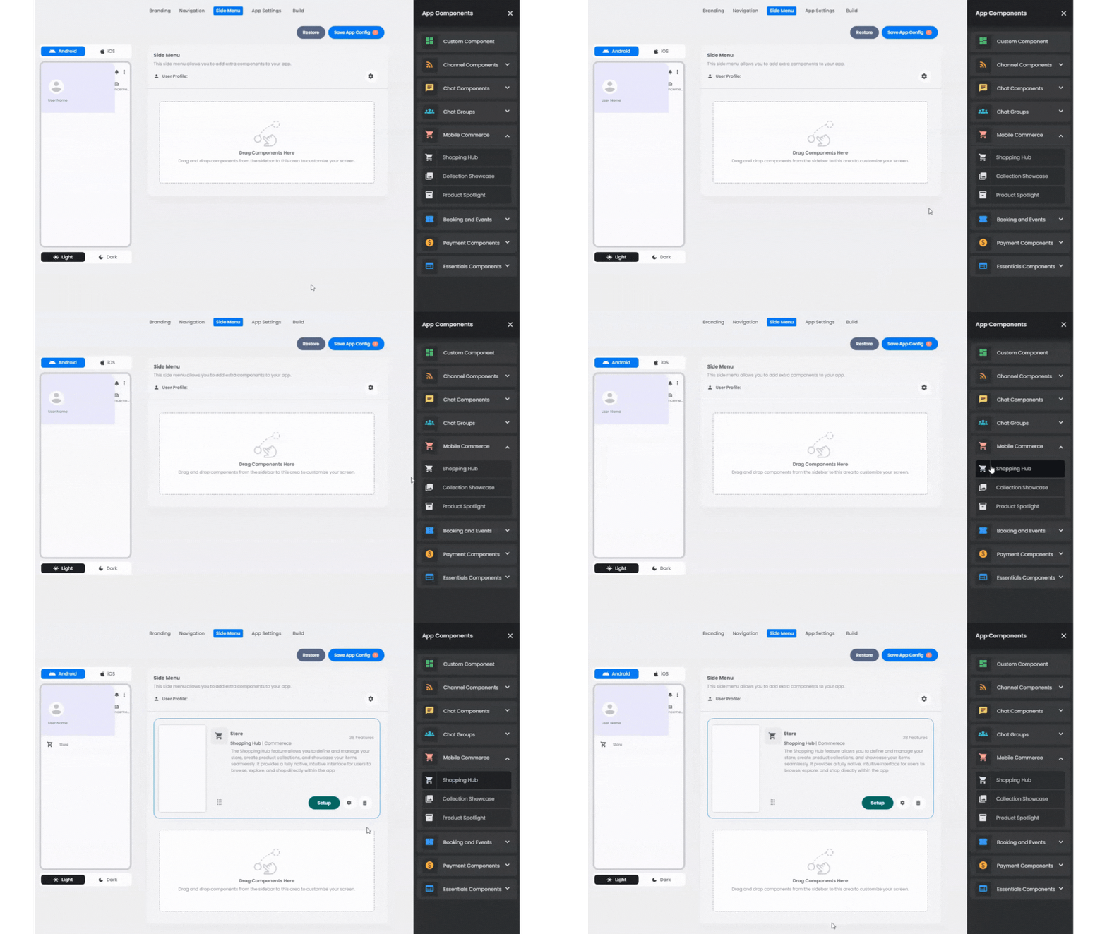
In order to install a component for both the Navigation and Side Menu, click on one of the component categories placed on the right. You can choose from 30+ components that serve different functions in your navigation bar.
- To install components, click 'New Tab' and drag or select one of the components and drop it into your navigation page's setup area.
Navigation:
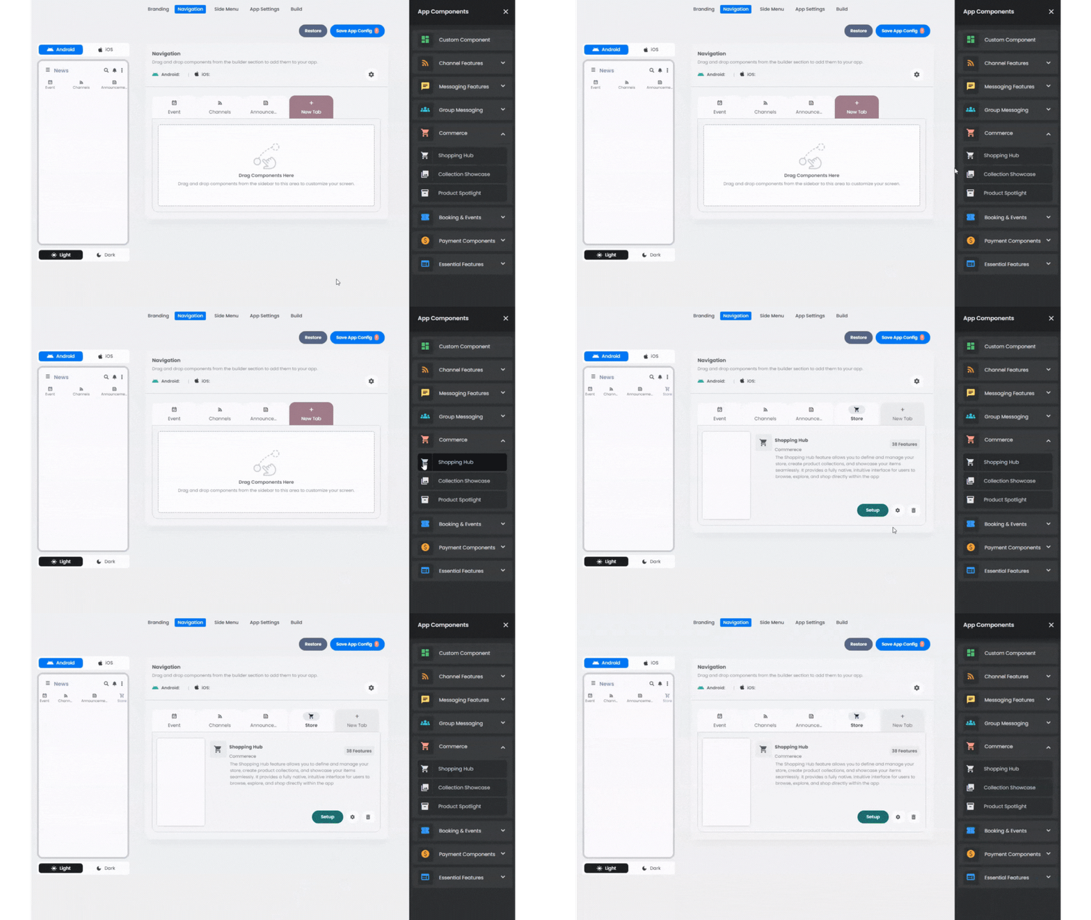
Side Menu:
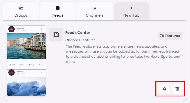
- You can check the component settings by clicking the gear icon or remove the component by clicking the ‘Delete’ icon.
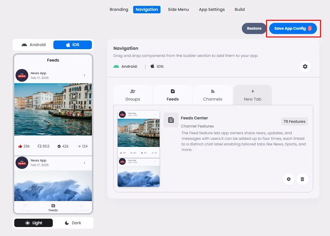
When you are done setting up your app's navigation page, click 'Save App Config'.
On the left-hand side, you can view your app's navigation page tabs represented on screens.
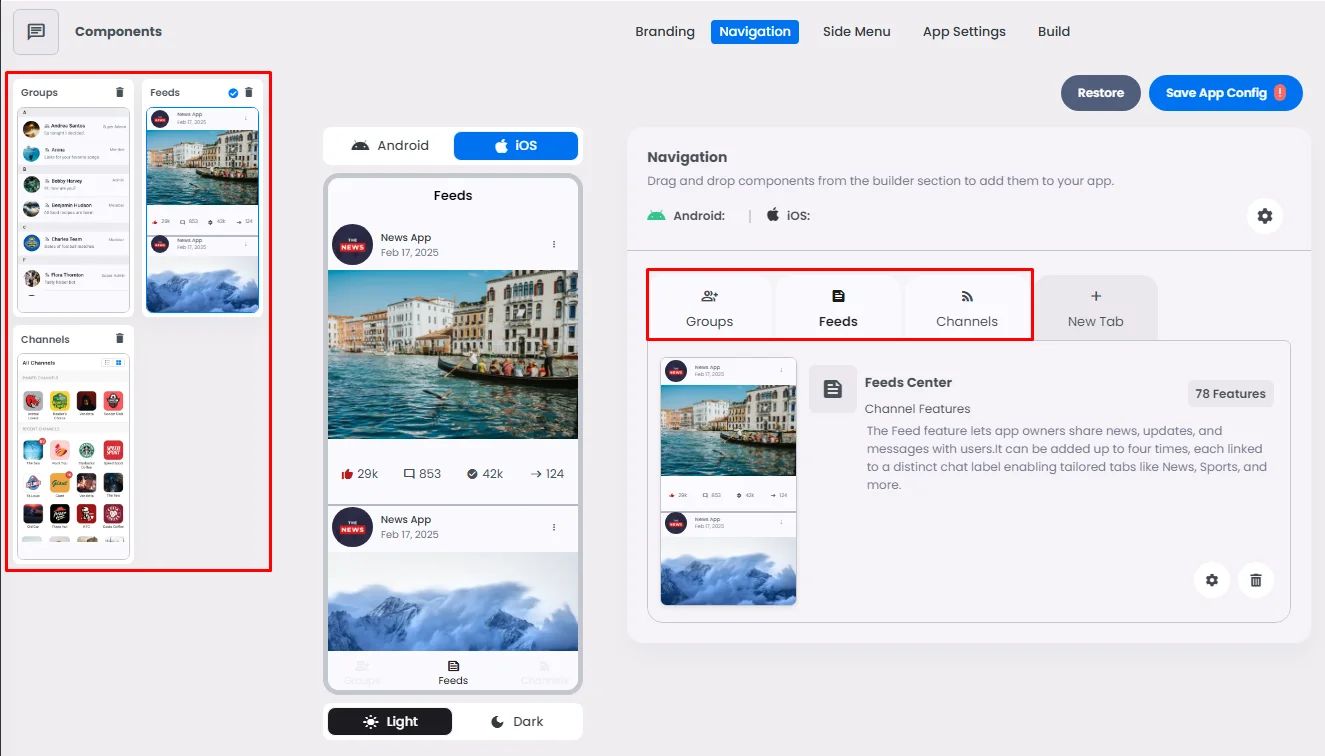
If you made some changes and you still didn’t save them yet, you can always click 'Restore' and get back your last edits.
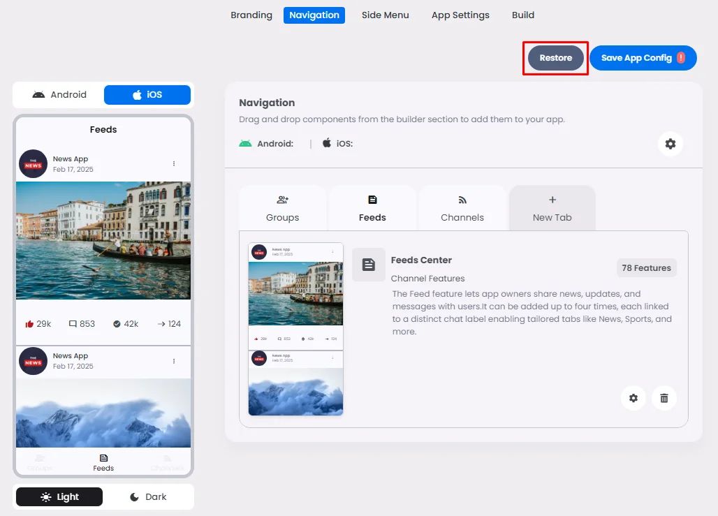
App Builder Elements
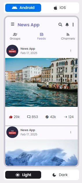
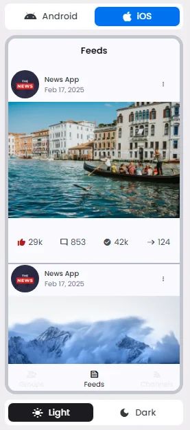
App Simulator
How your app will be displayed on Android and iOS; you can switch to see both.
Admin Settings Bar
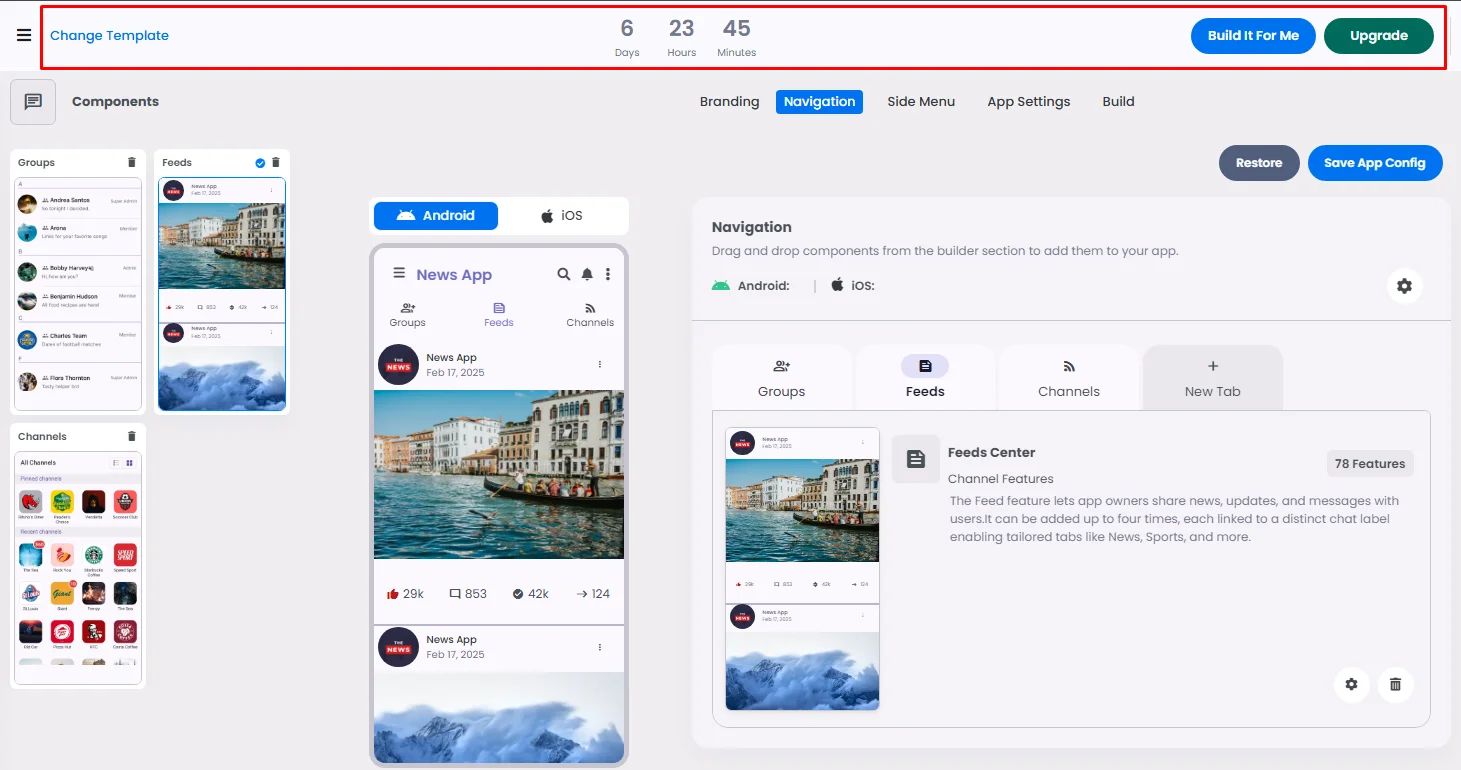
The admin settings bar, which controls multiple areas of your app builder, is located on the top bar.
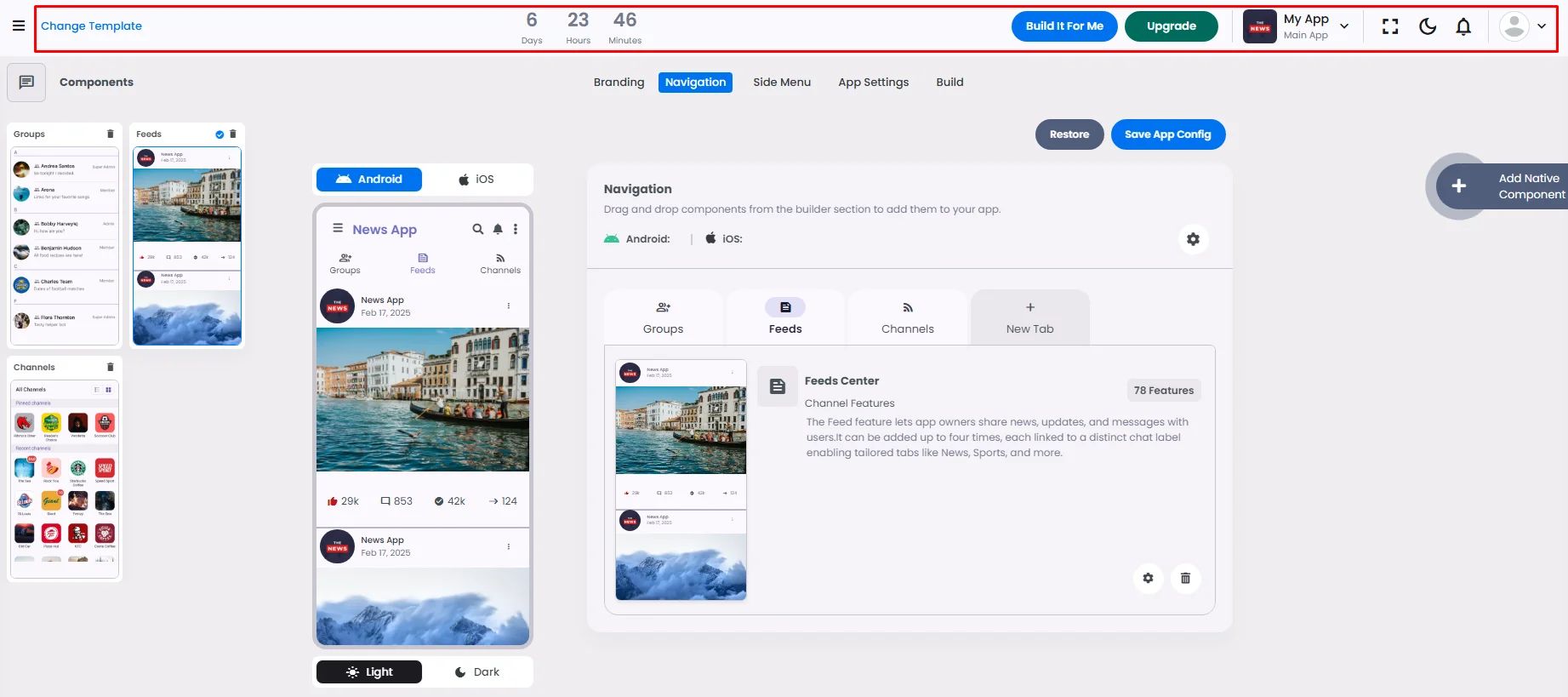
- Three Admin Buttons:
- Change Template: If you want to choose another app design.
- Build It For Me: If you need help with anything regarding the app, you can click the button and schedule a meeting.
- Upgrade: Click the button if you are already a subscriber and you want to upgrade your plan.
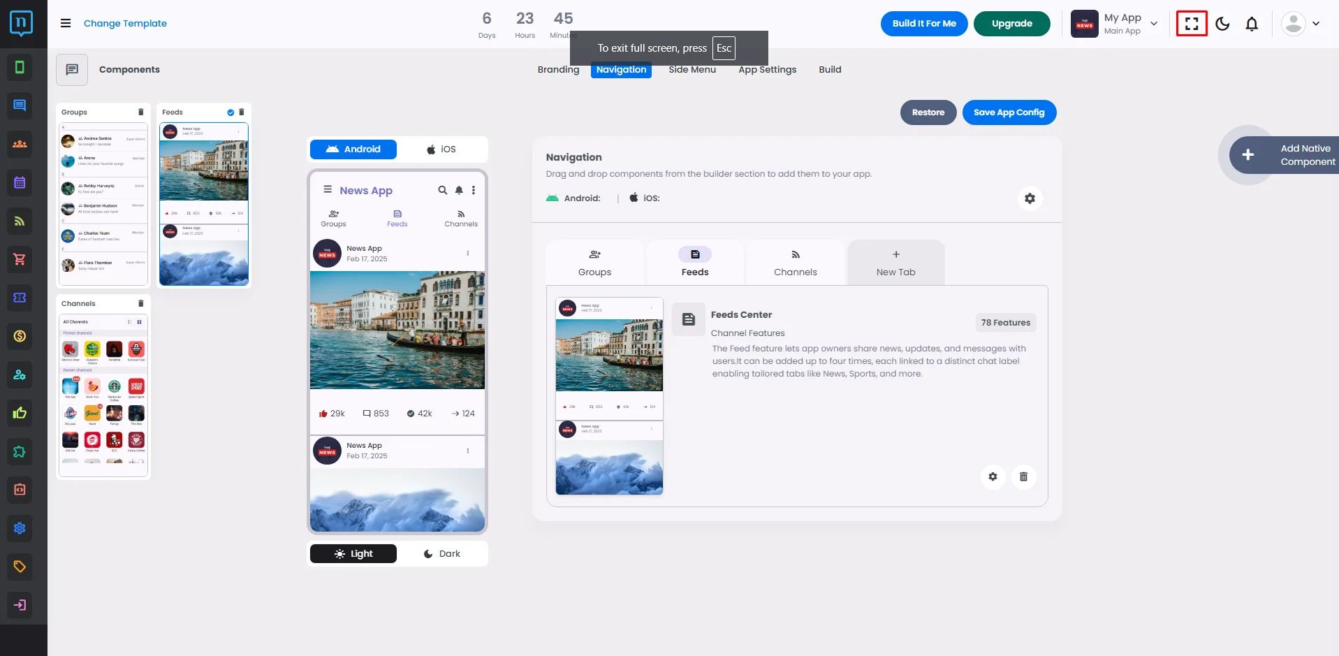
- Full screen: icon to widen up the app builder
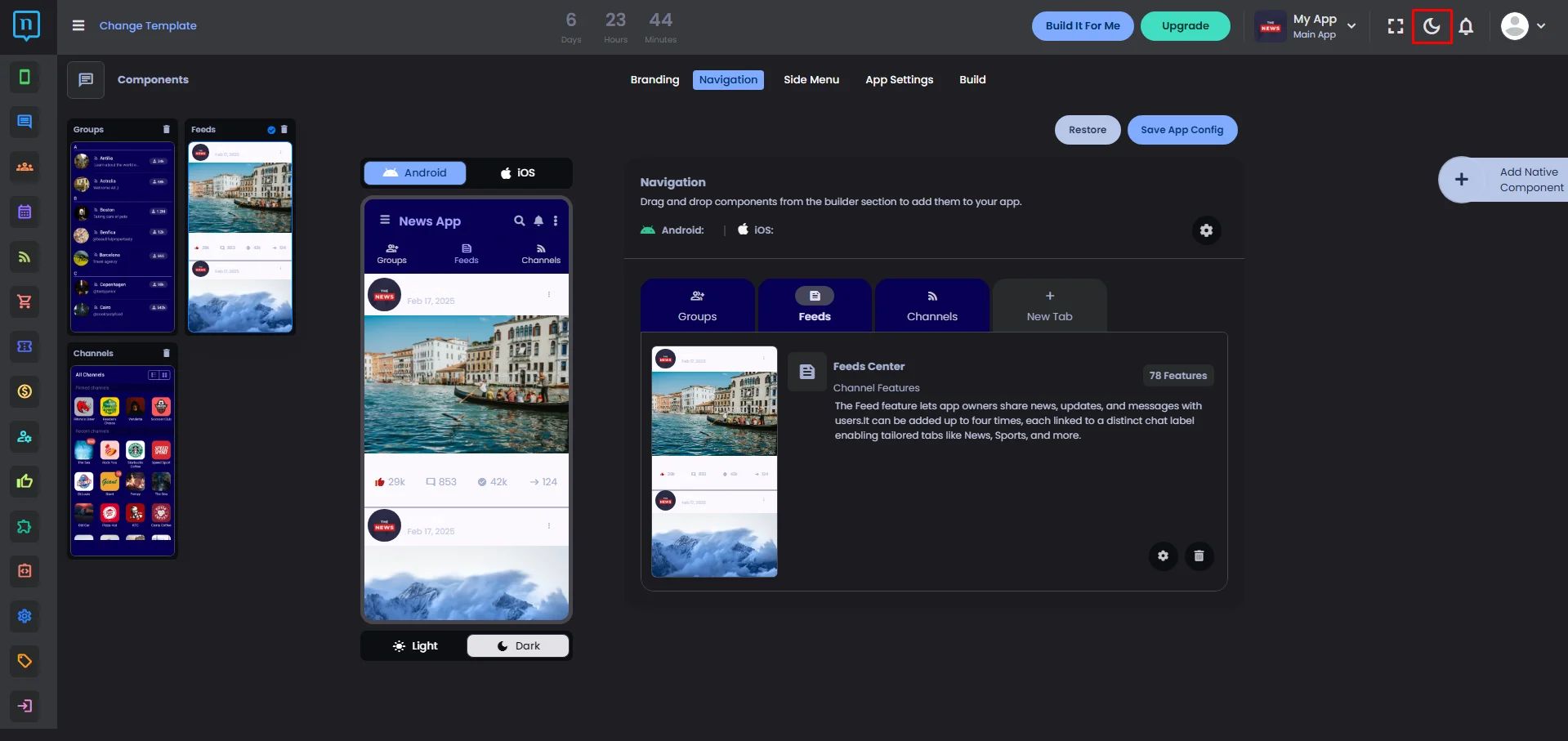
- Dark Theme: You can switch the builder to dark theme.
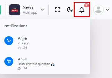
- Notification icon: This is where you get notifications on replies submitted on posts by users in the app.
- User icon:
- Billings: Where you can subscribe to a plan.
- Logout: to sign out from the app builder.

Admin Menu
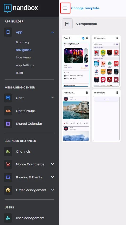
On the navigation page, you will find the admin's menu on the left-hand side, which allows you to utilize your app components.
