Make sure to drag and drop the element into your workspace.
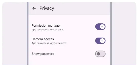
Toggles are used when each item in a list can be changed separately. When you turn a switch, the results should start right away, without having to save.

Recommended — A switch is a binary option—a single choice that can be either on or off.
Checkboxes, radio buttons, and switches help people decide what to do, like picking options or turning settings on and off.
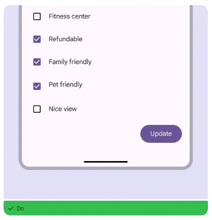
🟠Checkboxes let you choose more than one choice in a list that is related.
🟠Radio buttons let you pick one item from a list.
🟠Switches let you choose choices that stand alone or that give you more information from a list, like settings.

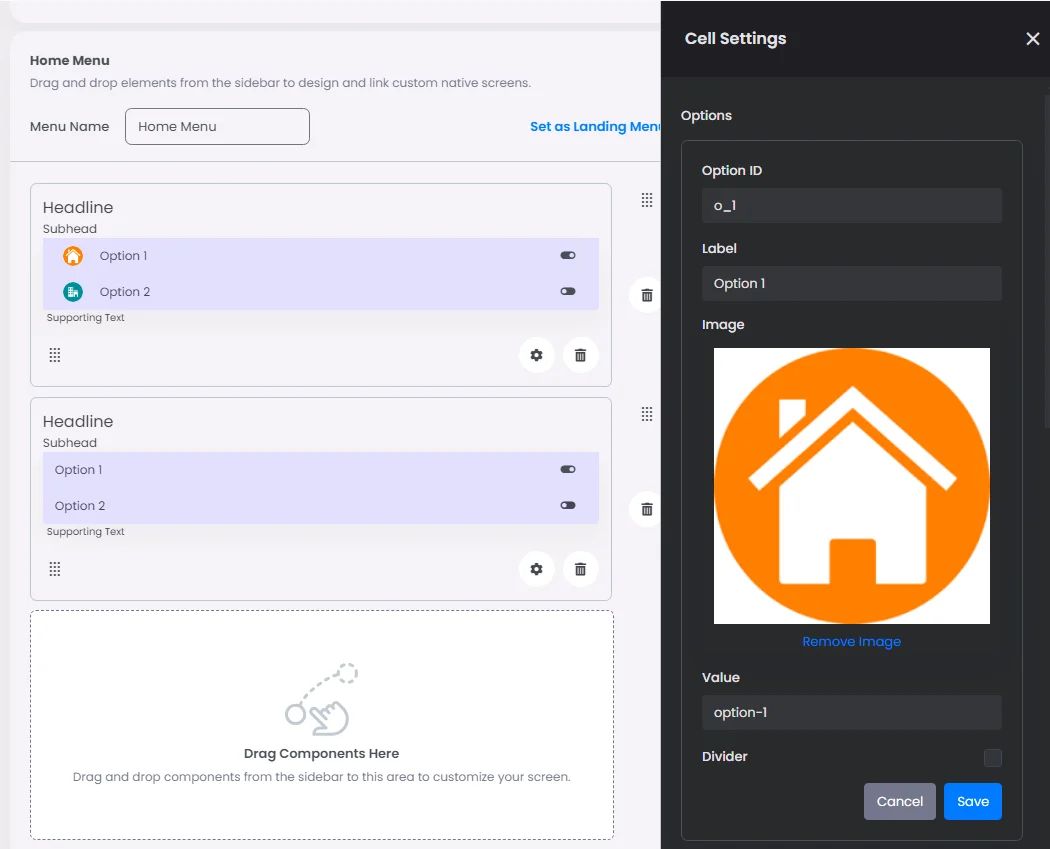
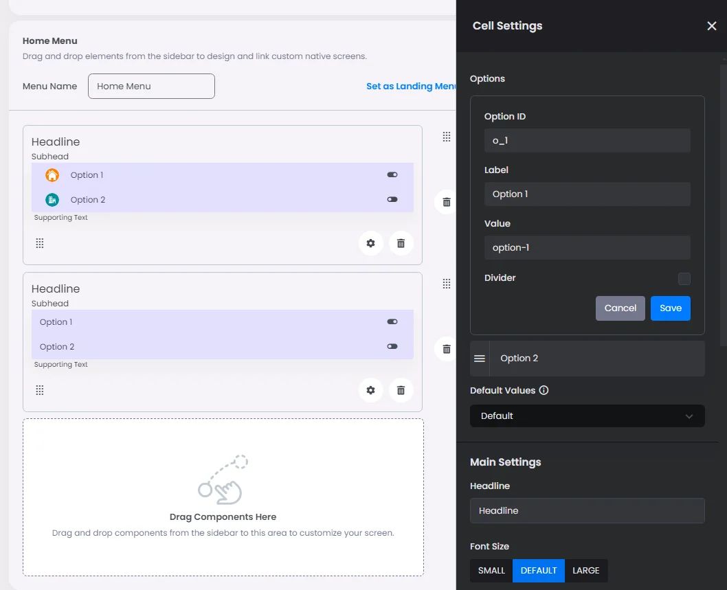
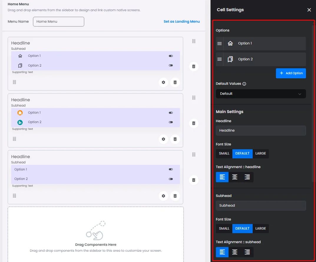
Click or drag and drop a toggle button and click the gear icon to open the toggle’s settings.
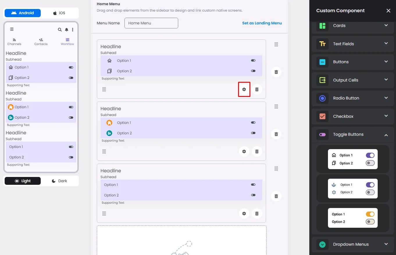
Settings
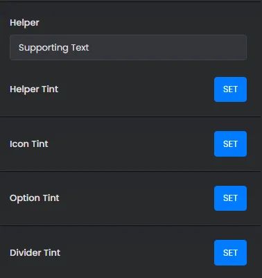
The settings for each toggle button element are identical to those for the radio button element. Customize your options, select a default value, and add your headline, subhead, and helper by adjusting their font size, alignment, and tint.
The only thing that makes each checkbox different is the style you pick; for example, you can use an image for that option or you can use the label and value only.