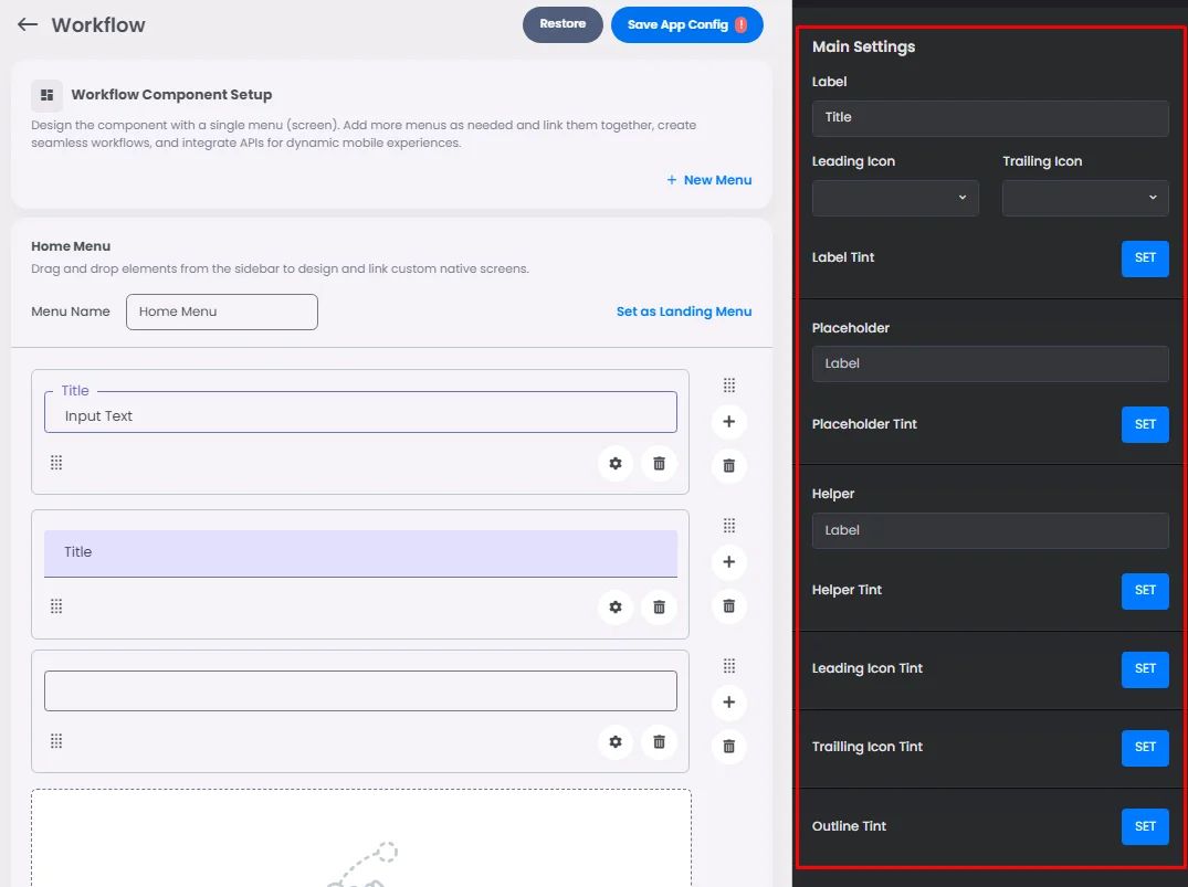
Make sure to drag and drop the element into your workspace.
A text field is used when someone needs to enter text into the app screen, such as when filling in contact or payment information to be sent to your server; therefore, it receives and understands supporting text and error messages.
There are 2 types of them: filled and outlined. Both types of text boxes have the same functionality.

Recommended—Use a style that works best with your app visuals.
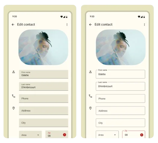
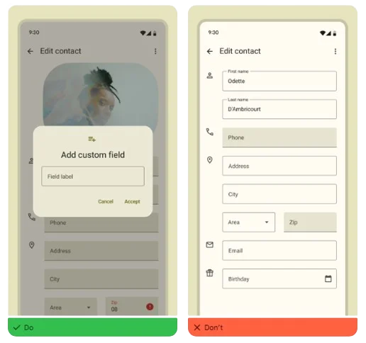
If you want to use both, you should do so in separate areas and not together in the same area. You might use drawn text fields in one part of the page and filled text fields in another.
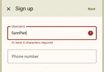
Helper is displayed in text fields to instruct users how to enter specific characters to avoid errors.
Click or drag and drop a text field and click the gear icon to open the text field’s setting.
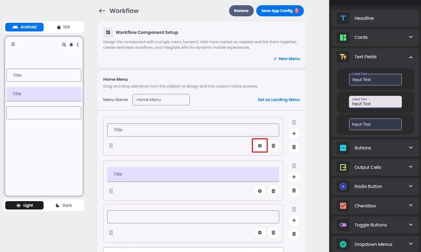
Settings
The settings for each text field element are identical. Add your field label, leading and trailing icons, label tint, placeholder and its tint, the helper text you want to include for any support that the app user needs to enter specific data, and finally the tint of the helper, leading icon, trailing icon and outline.
The only thing that makes each text field different is the style you pick.
