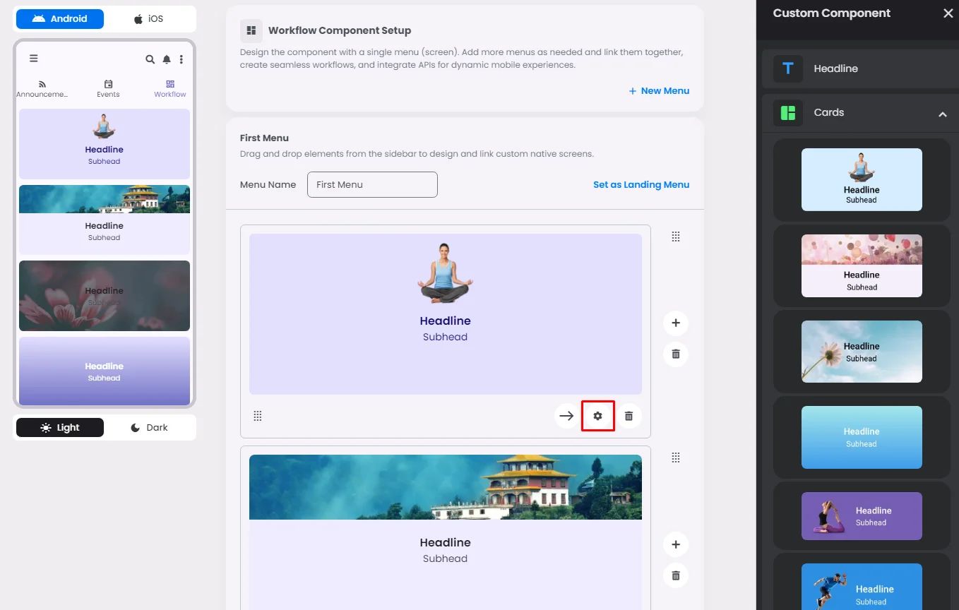
Make sure to drag and drop the element into your workspace.
Cards can be used to contain related elements or other components, such as images, headlines, supporting text, buttons, and lists. There are 3 types of them: elevated, filled, and outlined.

Each one does the same thing, so the only thing that matters is style.
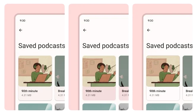
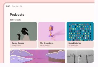
Recommended—Let cards make the best use of space while filling the part of a screen that meets functional needs. For a better user experience, it's recommended to keep the number of cards (grid) to no more than three.
Drag and drop a card and click the gear icon to access the card’s settings.
Settings
The settings for each card are identical to those for the Headline element. Include your headline and subhead, their tint, alignment, and font size. And don’t forget to upload an image if the card has an image-including option.
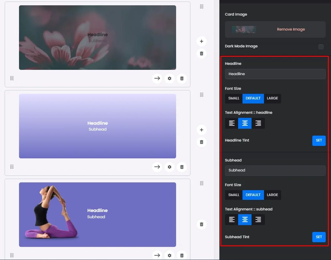
The only thing that makes each card different is the style you pick, such as the image's layout, adding a gradient background, etc.
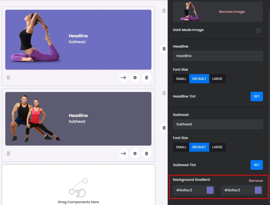
Keep in mind that the color scheme is based on easy-to-understand color pairs. These color pairs give you a minimum 3:1 difference that’s simple to see. Check out this documentation to understand how the color scheme you have chosen affects the colors of your elements.
‣ onClick
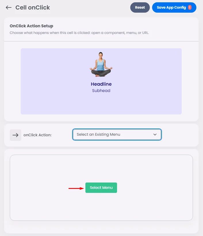
Now it's time to set up the card action. The onClick offers a few options that will direct users to the part you want your card to show when they click it.
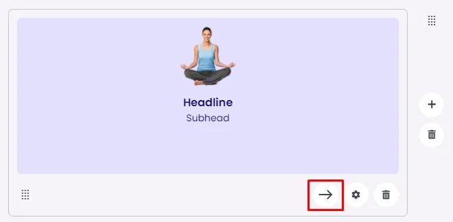
You have 4 options:
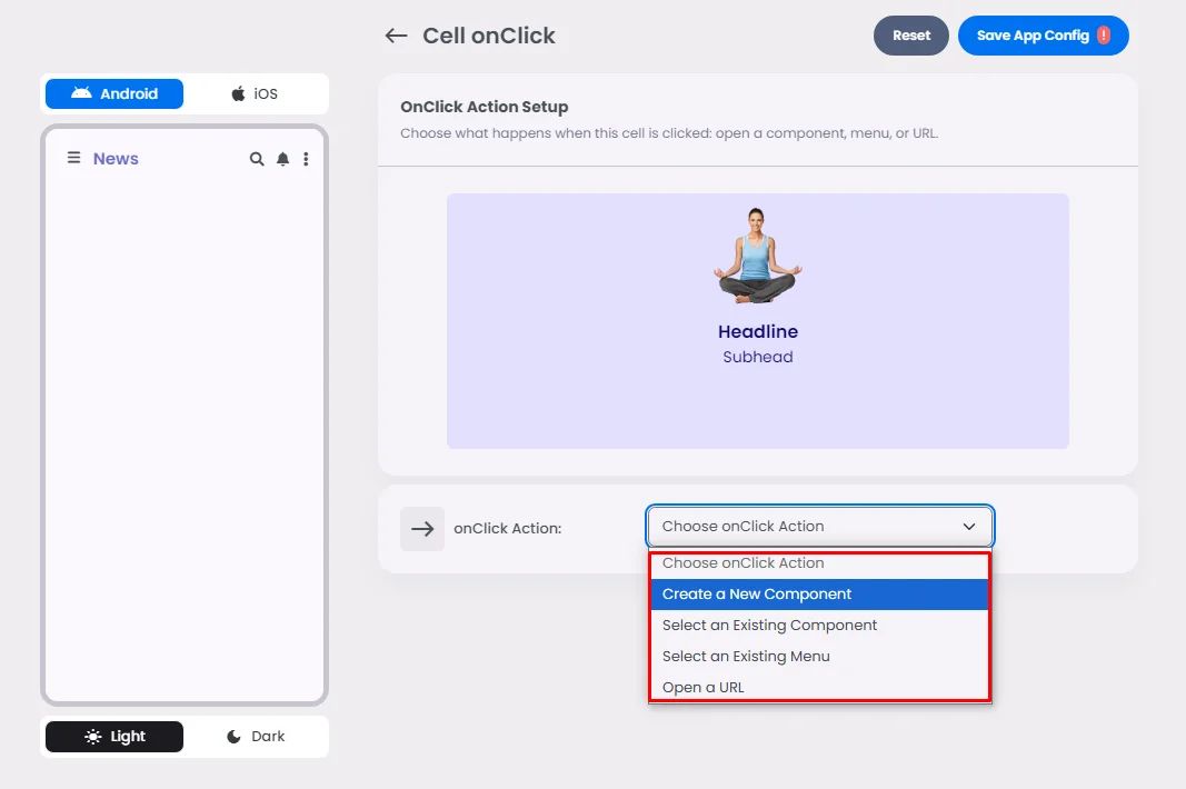
Create a New Component
The card is receiving an order to open a component.
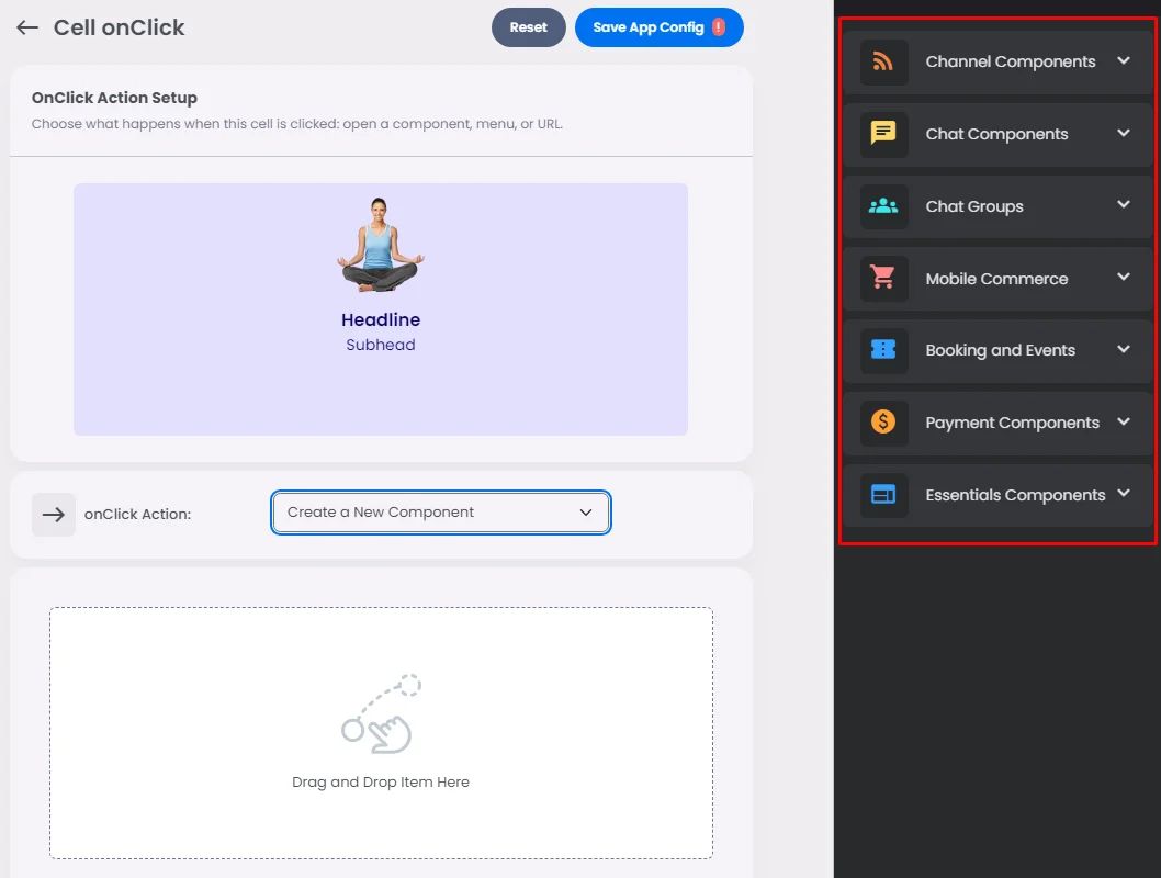
Select an Existing Component
Give the card the order to access and open an installed component in your navigation or side menu.
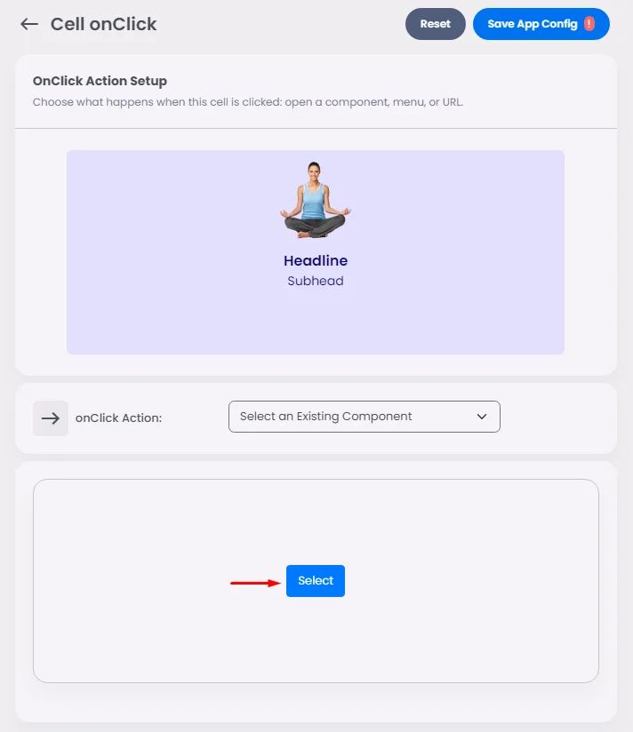
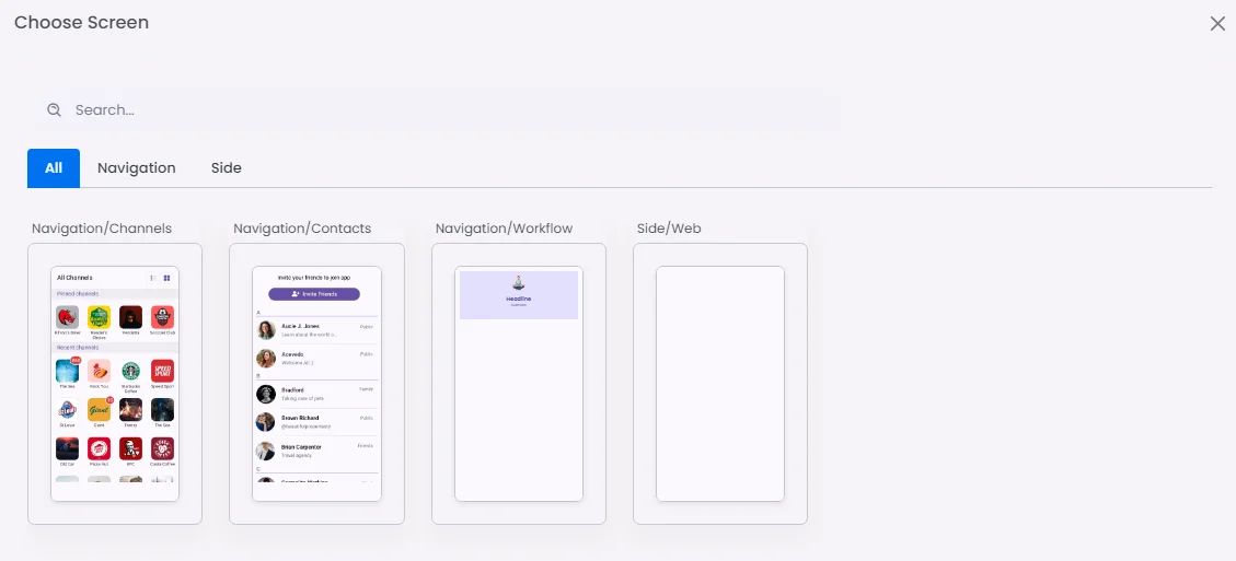
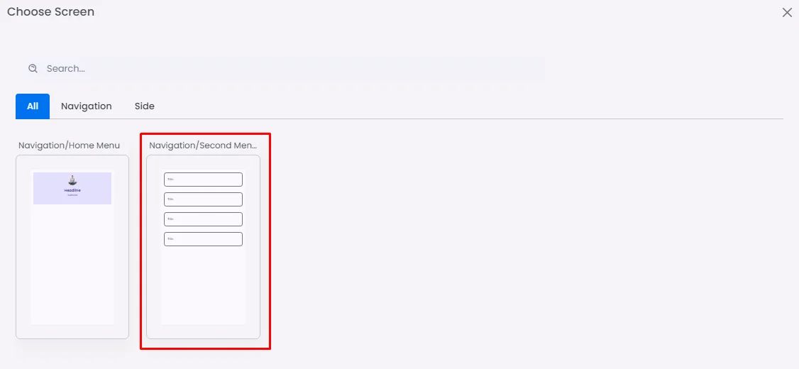
Select an Existing Screen
Give the card the order to open a screen created in your custom component. You can add multiple new screens by clicking ‘+ New Menu’ and start dragging & dropping your elements.
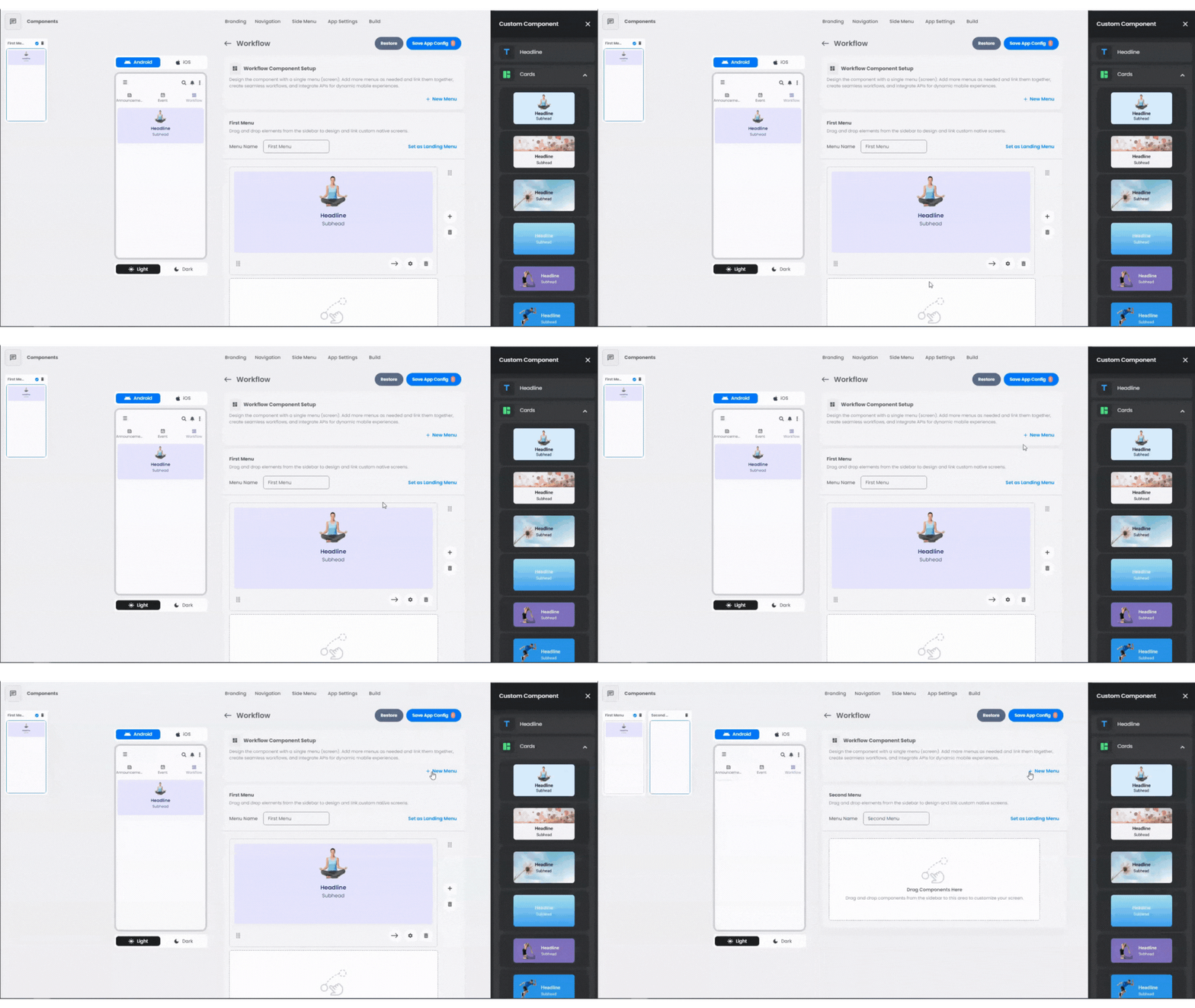
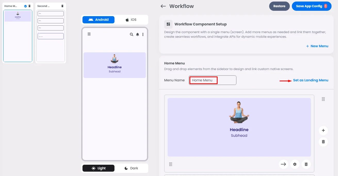
Each screen can have a name, and you can choose one to be the main one that shows up by clicking ‘Set as Landing Menu’.
Open URL
Give the card the order to open a web page in your custom component.
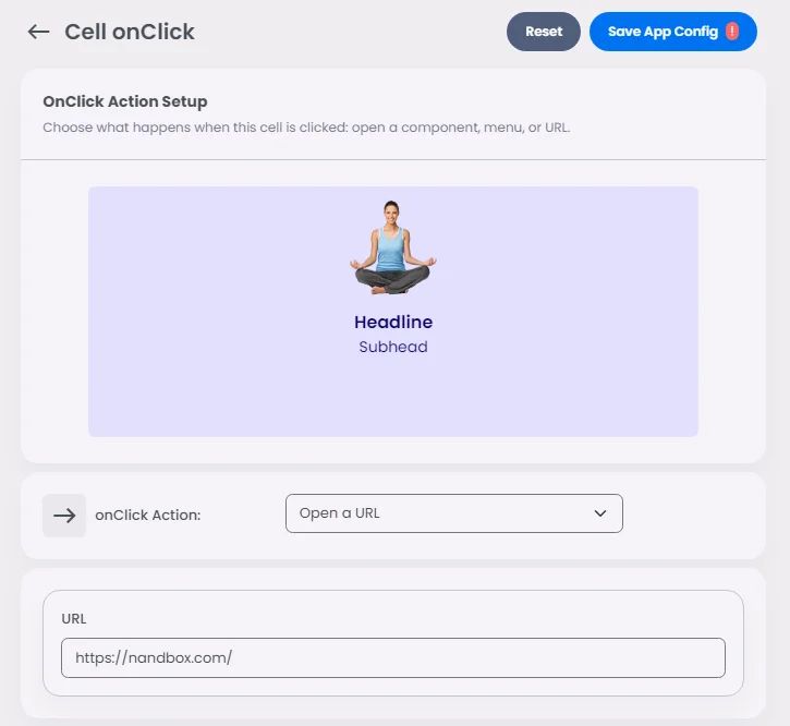
When you are done, choose whether you want your onClick action to be opened in a new screen or not, and choose who can access this menu screen.


