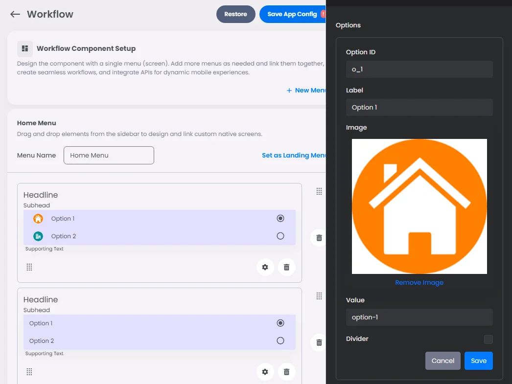
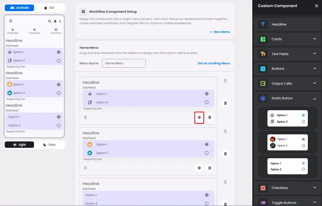
Make sure to drag and drop the element into your workspace.
A radio button is used to allow users to make single selections from a list of available options.
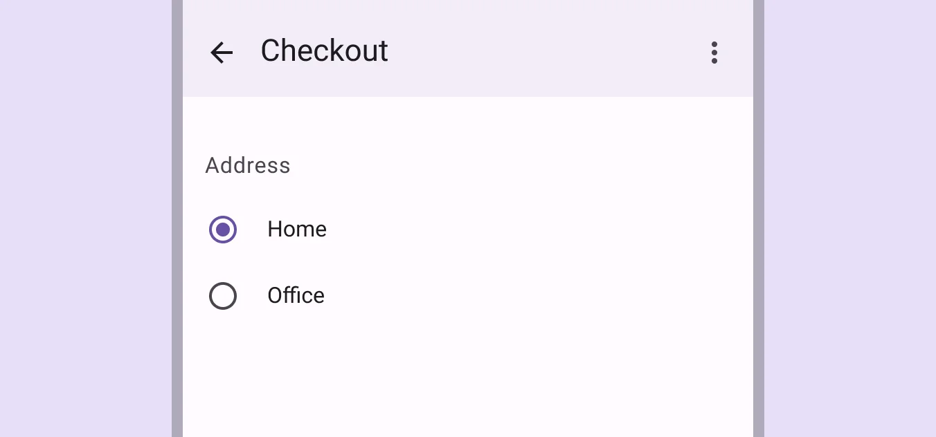
Recommended—Avoid nesting radio buttons or using radio buttons to select multiple options.
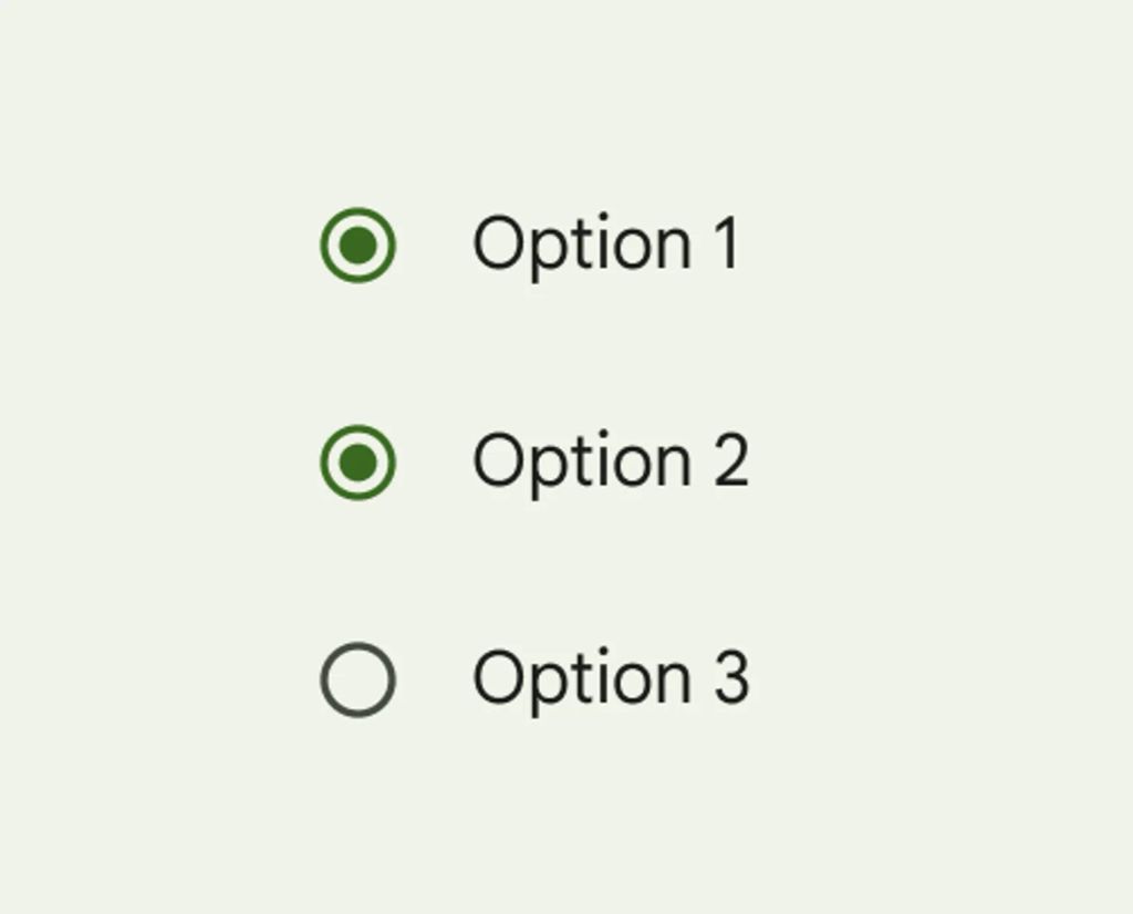
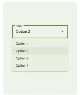
Use radio buttons when there are six or fewer options—When you need to save screen space, you might want to use a drop-down menu instead of radio buttons.
Click or drag and drop a radio button and click the gear icon to open the radio button’s settings.
Settings
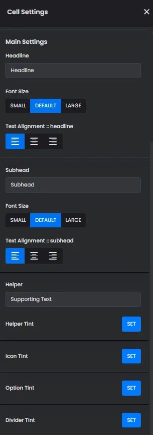
The settings for each radio button element are identical. Customize your options, select a default value, and add your headline, subhead, and supporting text by adjusting their font size, alignment, and tint.
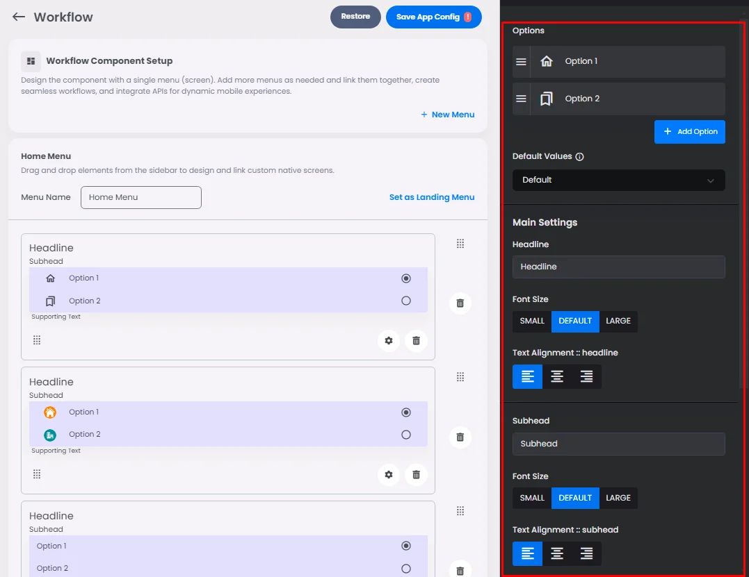
Options Customization
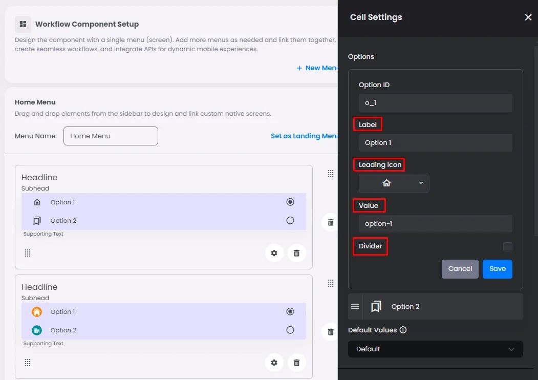
Click the gear icon to customize.
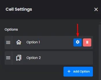
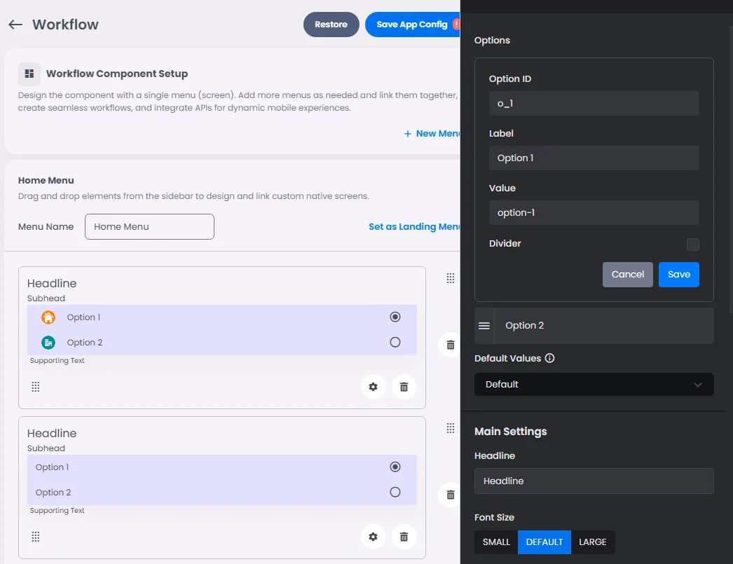
Add your label, leading icon, and value, and you can include a divider so that you can separate them by it.
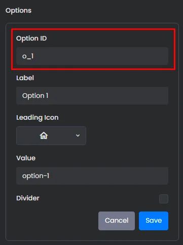
Option ID is the ID of the choice button.
If you're a developer and you have your backend system, you can add the ID that you want to use to test your option.
You can add more options and arrange them based on your preference.
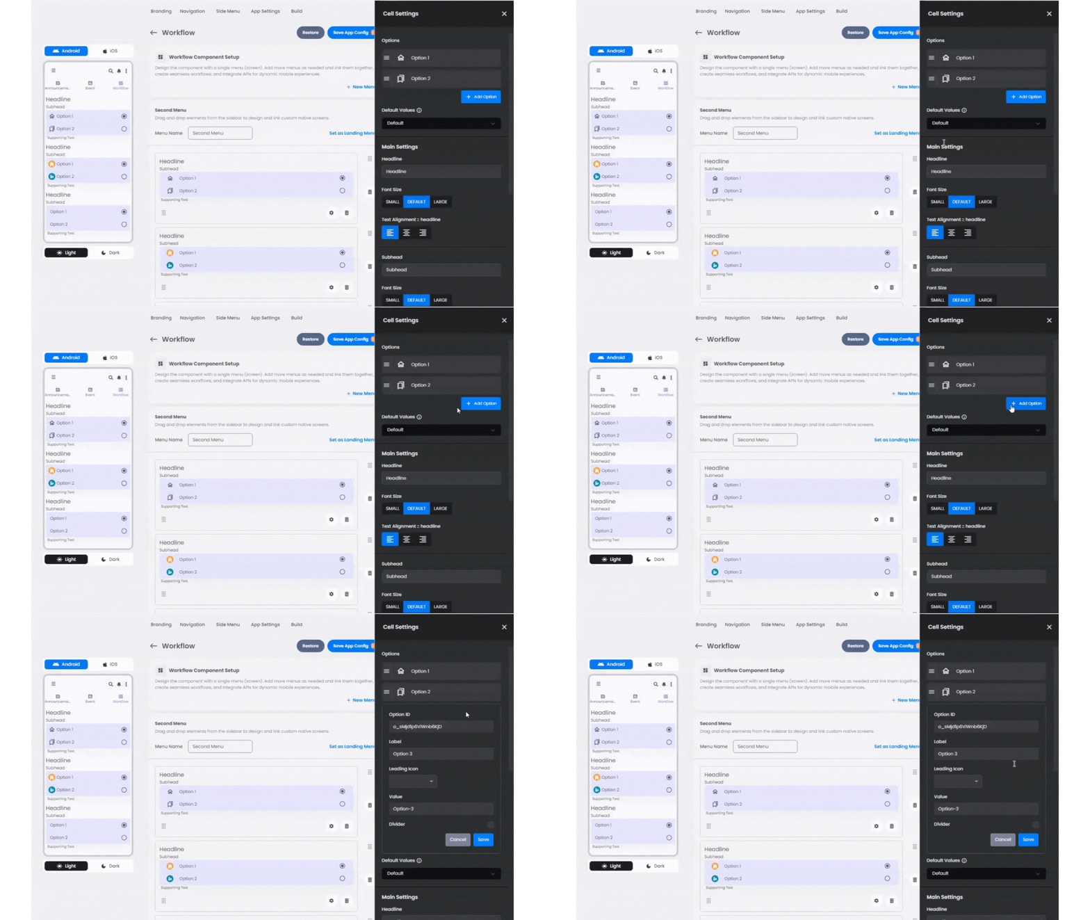
And don’t forget to save so you can see the changes.
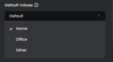
Default Values
Here, you can select the option that users will see by default.
Settings
Include your headline and subhead, font size, and alignment. Add your helper, which is a supporting text for the user to make the right choice, and choose the right tint of them, including your divider.
And don’t forget to save to see the result.
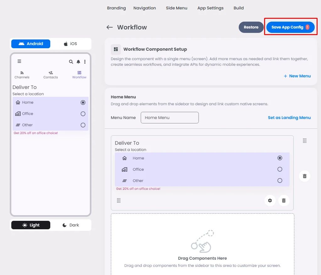
The only thing that makes each radio button different is the style you pick; for example, you can upload an image for that option or you can use the label and value only.
