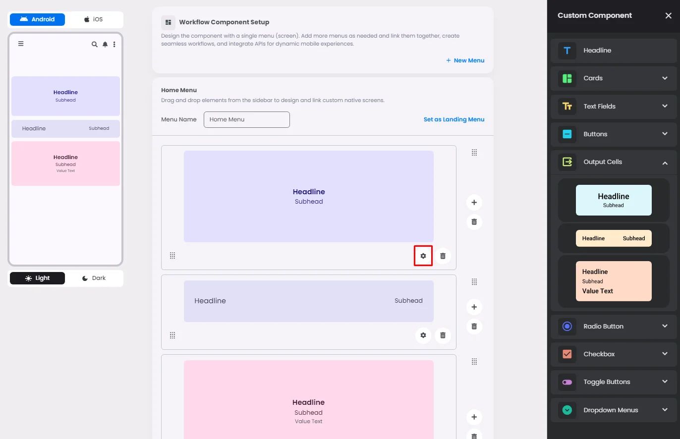
Make sure to drag and drop the element into your workspace.
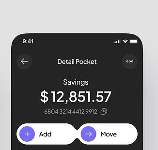
Although the style of output cells is similar to that of cards, their primary function is to transmit specific information from your server to the user; these cells are particularly effective when used with text fields.
For example, they can serve as a greeting theme for users as soon as they launch the app, or they can serve as a notification informing the user that the transaction was completed successfully.

Click or drag and drop an output cell and click the gear icon to open the output cell’s setting.
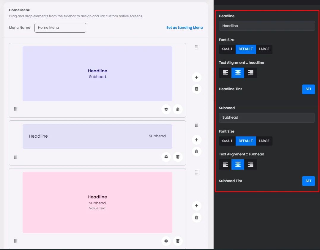
Settings
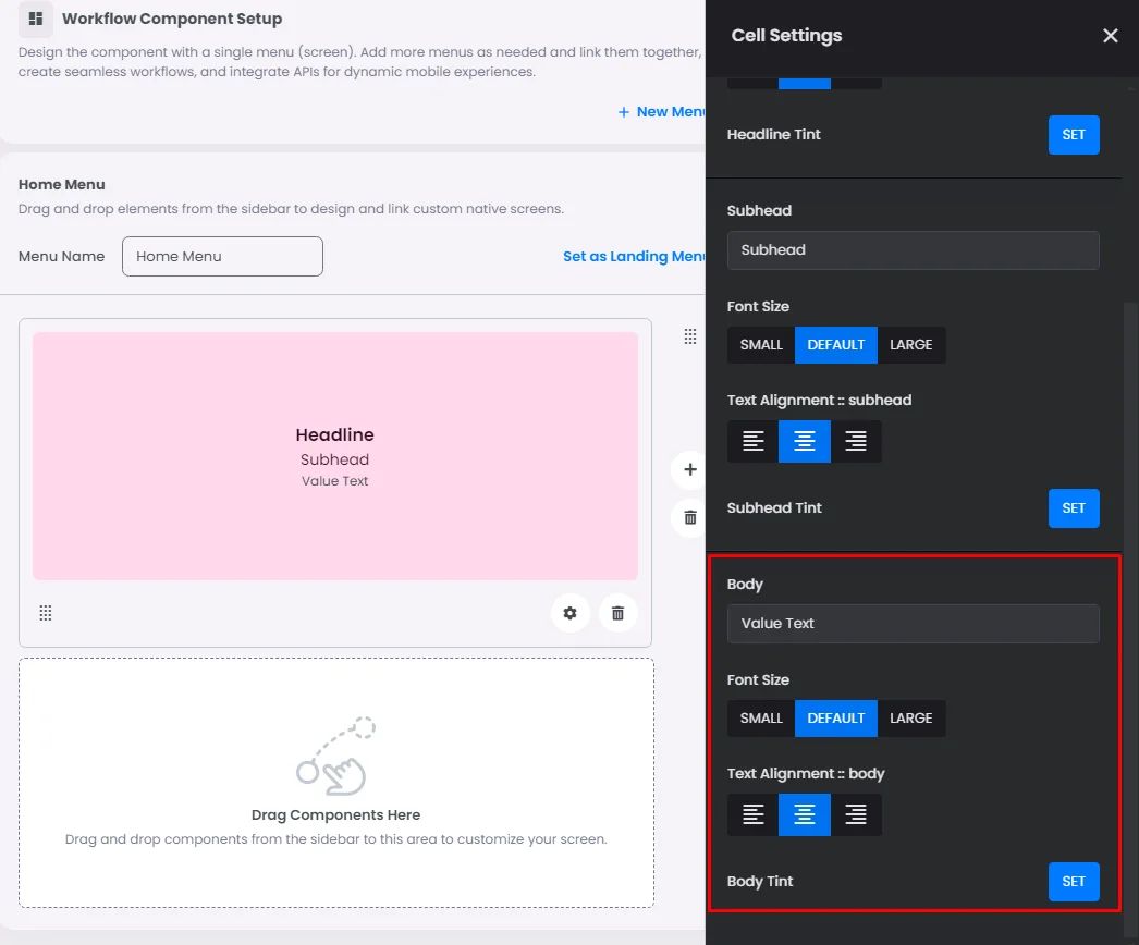
The settings for each output cell element are identical. Add a headline, font size, alignment, and headline tint, and the same goes for the subhead.
The only different output cell is the last one! You have the ability to add a value text and set its tint.