
Custom components—also known as Workflows, Forms, or screens—are modular UI blocks designed using the App Builder. They are composed of structured menus, rows, and cells, enabling powerful front-end interactions for complex flows.
Components are created and structured visually using the App Builder. They cannot be created via API, but the API can interact with them in real time to build dynamic, integrated experiences.
It is an adaptable part that helps you design a full interface for your app. You can make your own interface by combining items such as buttons, cards, text areas, etc. to organize and navigate through all your app screens.

This component is the best for any type of app.
Included Features
- Design Flexibility
Make your interface look the way you want it to.
- Interactive elements
Add buttons, cards, carousels, and many more elements to your app menu screens to make the user experience more engaging and to make navigating among them simple.
- Action Configuration
You can tell elements to do certain things, like moving around the screen, opening a URL, connecting with other components, or performing a certain function.
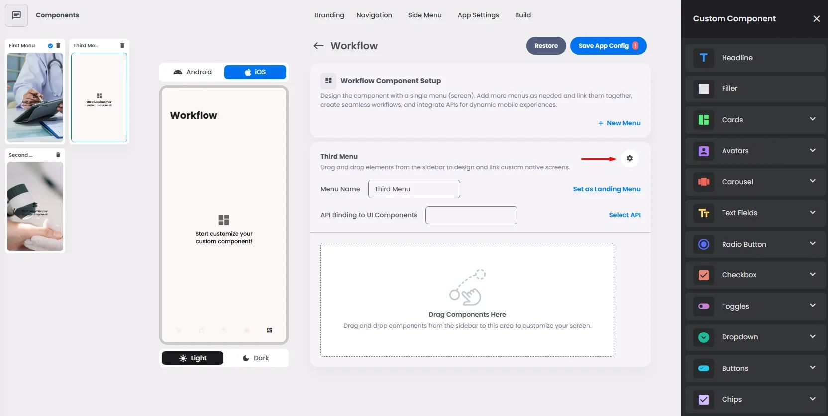
- Create Menus
Use the component menus to build integrated forms, multi-step workflows, and custom logic-driven screens.
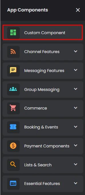
How To Install The Component
This component can be installed in:
- App's Navigation Page ✓
- App's Side Menu ✓
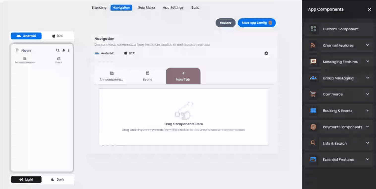
Click or drag and drop the Custom Component into your navigation or side menu to install it.
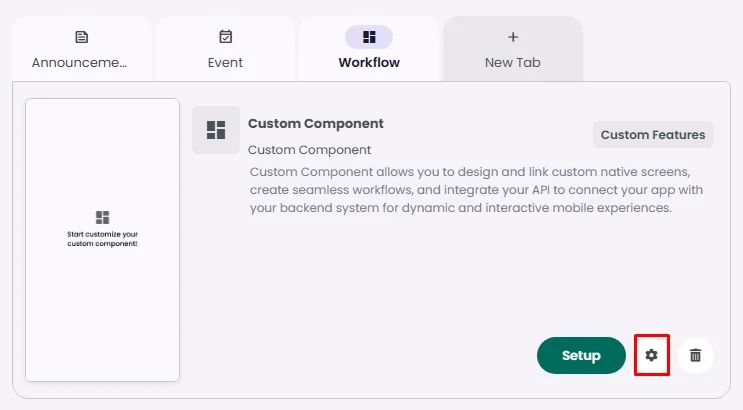
How To Configure The Component
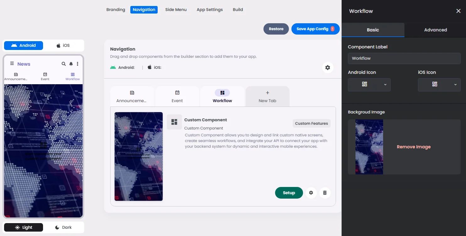
Click the gear icon to configure the component’s settings.
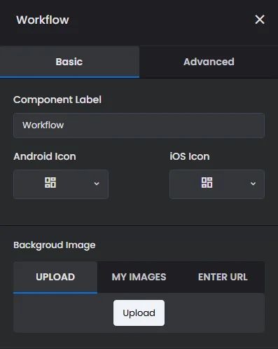
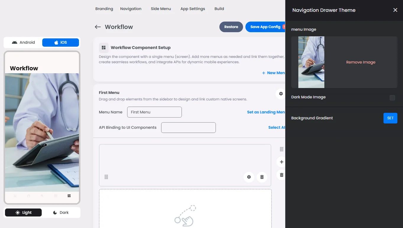
Background Menu Screens
Rename the component and choose an Android and an iOS icon for it.
- Upload a background image for all your workflow menu screens.
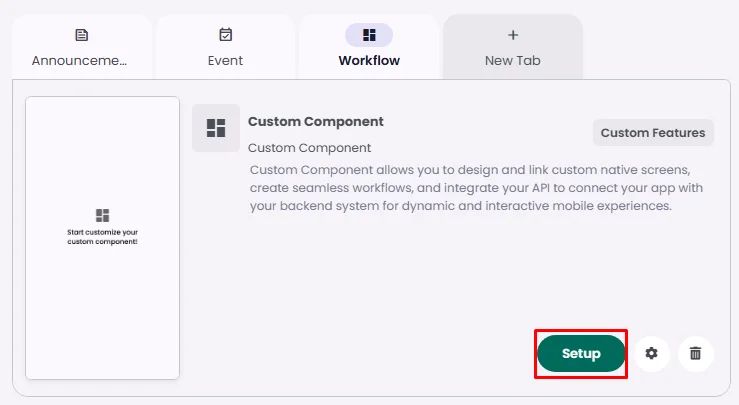
Click ‘Setup’ to set up your component design.
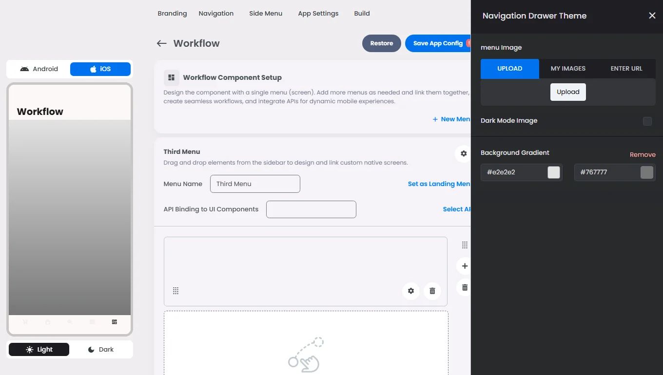
- Upload a background image for a single menu screen. If you have multiple menus, select your chosen one and click the cog gear icon to open the menu background settings.
You have the option to upload an image or add a gradient background color.
Grids Layout SystemElements Settings OverviewAdvanced SettingsActions (onClick)Elements