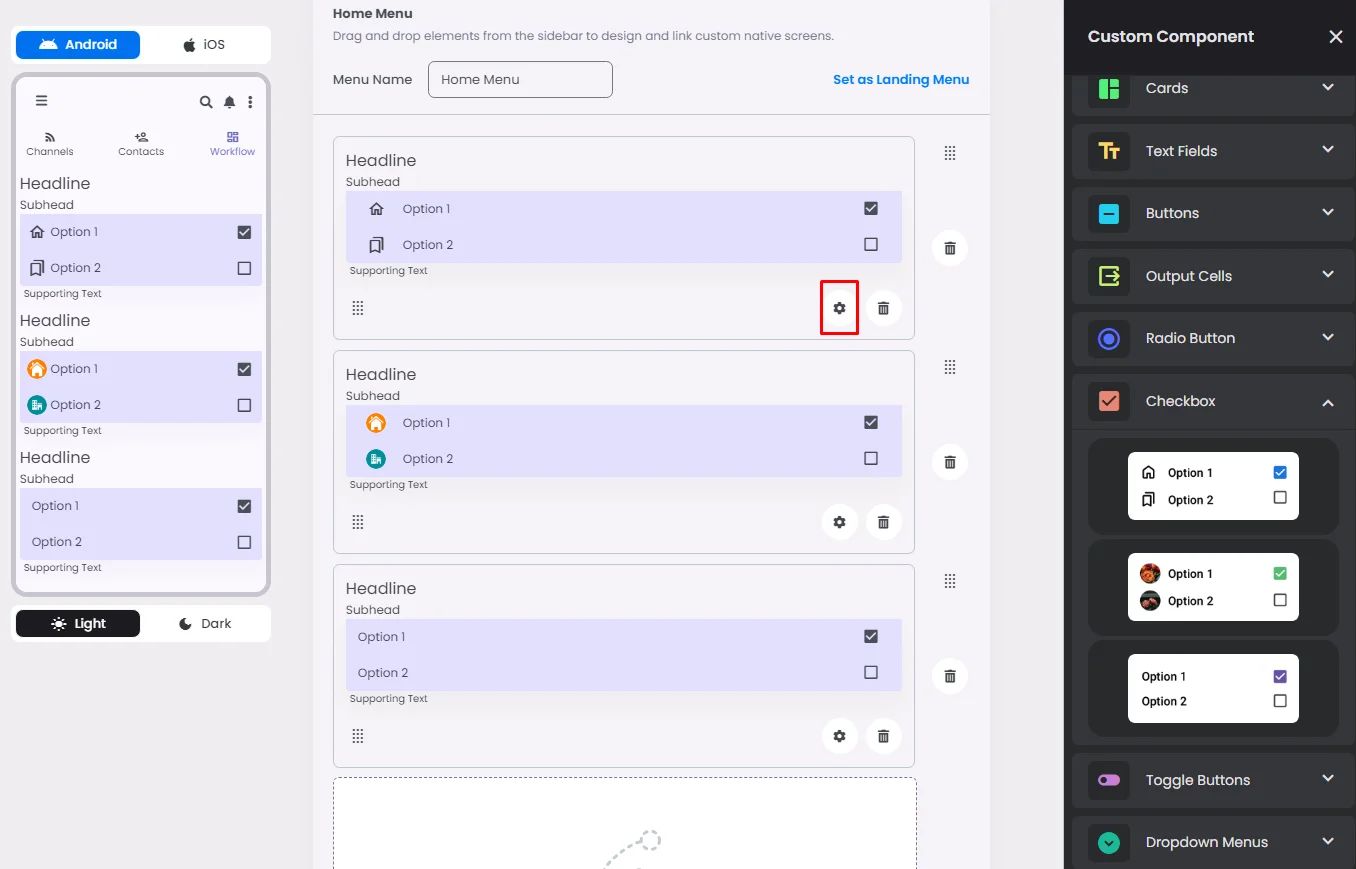
Make sure to drag and drop the element into your workspace.
A checkbox is used to allow users to make multiple selections from a list of available options.
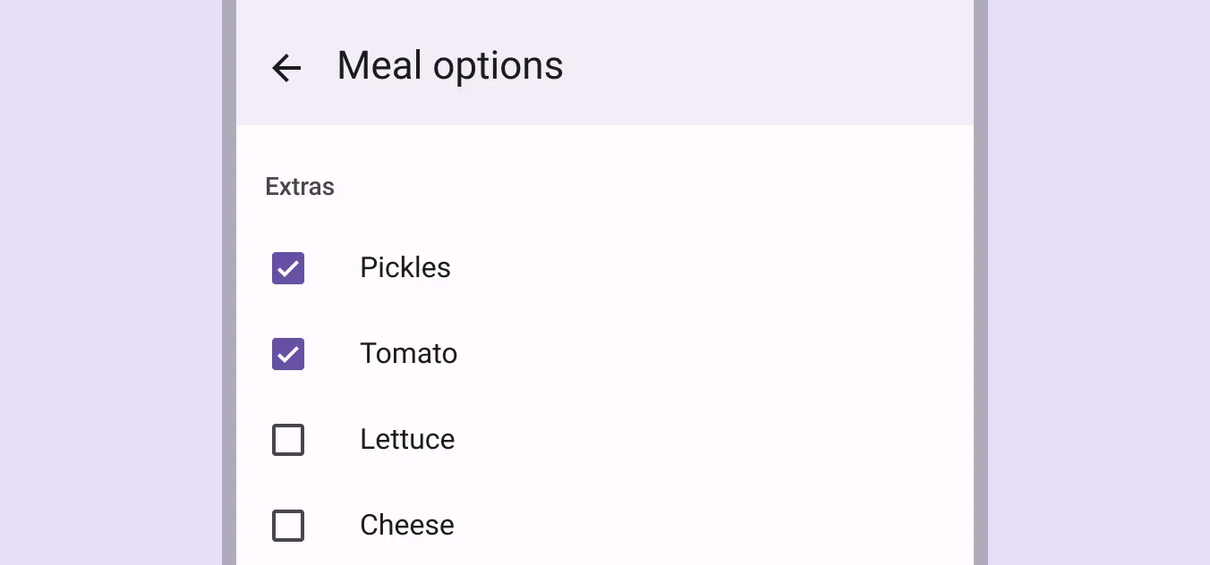
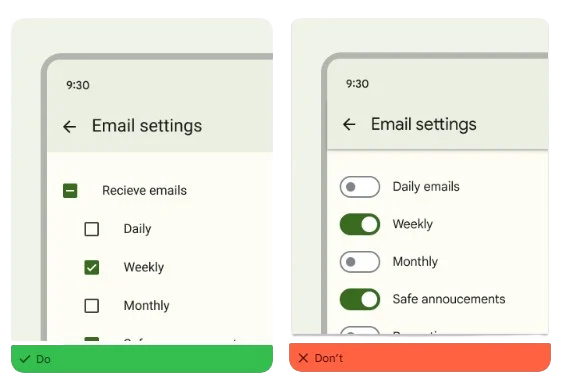
Recommended—If you can choose more than one related choice from a list, you should use checkboxes instead of switches.
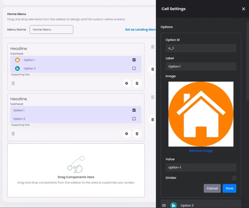
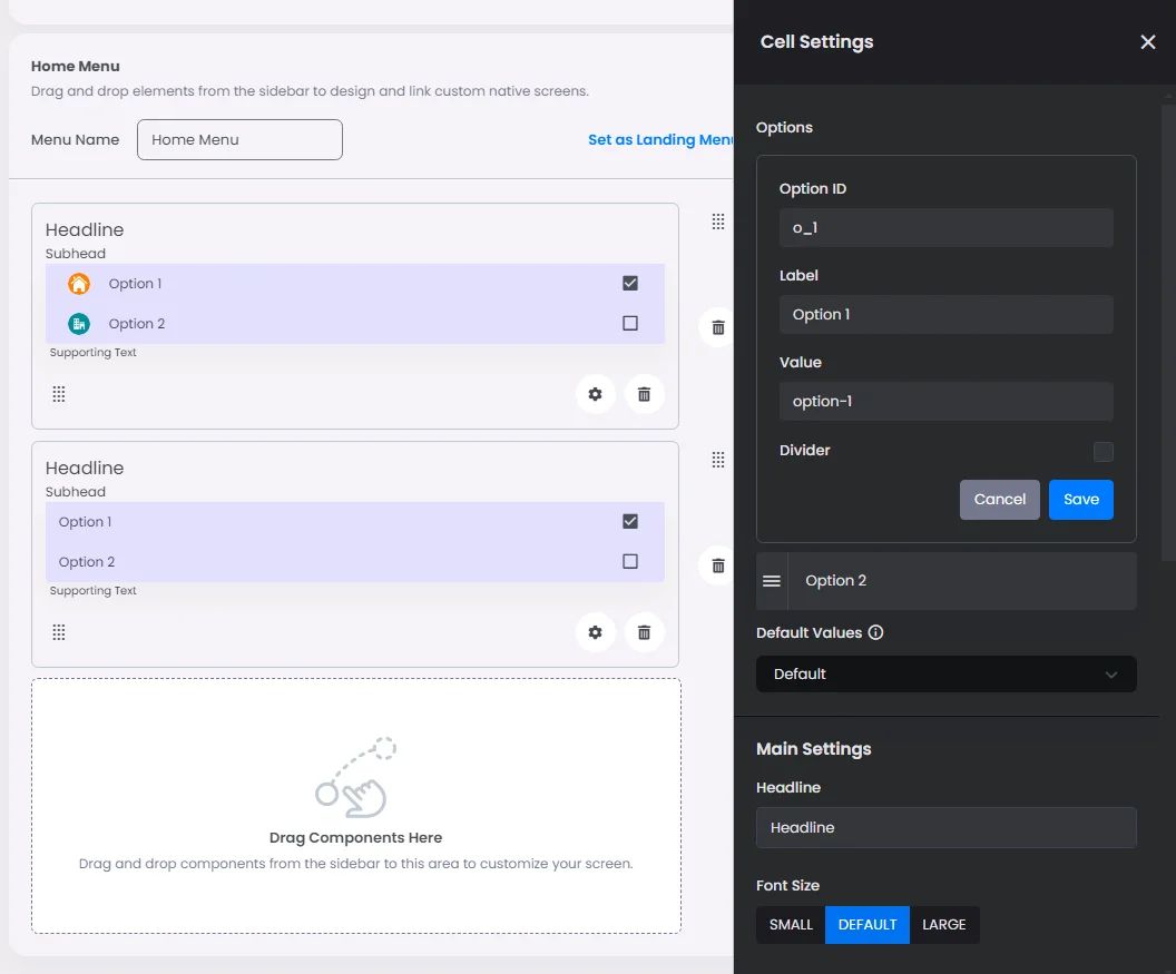
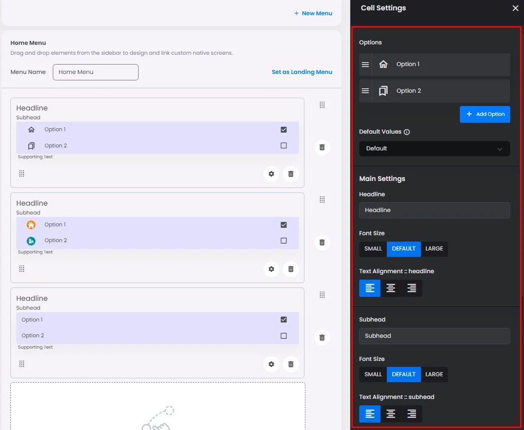
Click or drag and drop a checkbox, then click the gear icon to open the checkbox’s settings.
Settings
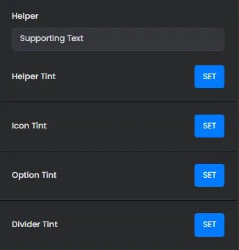
The settings for each checkbox are identical to those for the radio button element. Customize your options, select a default value, and add your headline, subhead, and helper by adjusting their font size, alignment, and tint.
Just like a radio button, the only thing that makes each checkbox different is the style you pick; for example, you can image for that option or you can use the label and value only.