
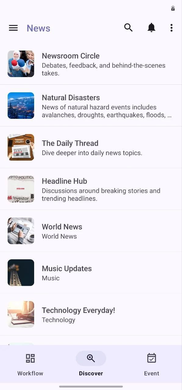
The List View component combines a search bar (top-level text field) with a scrollable list of items. This pattern enables users to quickly locate and interact with content from a larger dataset, enhancing both usability and discoverability. It consists of a high-emphasis Search Bar element placed above a vertically scrolling List View. This design ensures a seamless experience, where users can filter content in real time while maintaining accessibility and Material usage.

This component is the best for all types of apps.
How To Install The Component
This component can be installed in:
- App's Navigation Page ✓
- App's Side Menu ✓
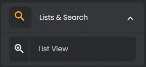
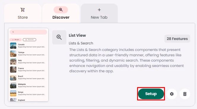
You can find the List View component in the List & search section. Click or drag and drop the component into your navigation or side menu to install it.
How To Configure The Component
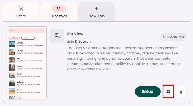
Click the gear icon to configure the component’s settings.
Rename the component and choose an Android and an iOS icon.
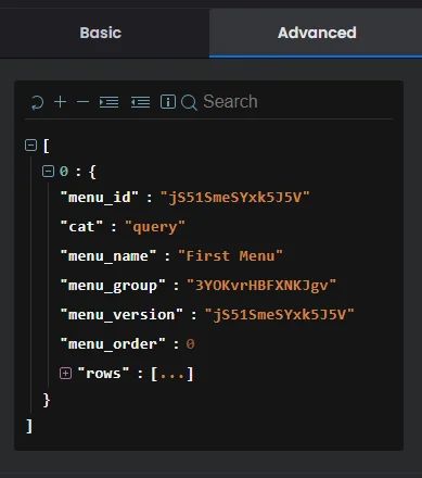
The Query section is only a reflection to the setup done inside the component
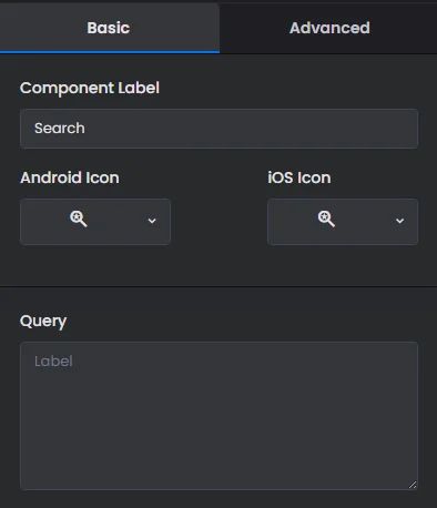
The Advanced Settings section is intended for developers who want to integrate cells (elements) with their backend using JSON requests. It provides the necessary information for API integration.
Click ‘Setup’ to set up your component list or search query.
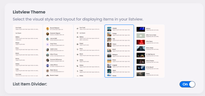
🎨 ListView Theme
The first step is to configure the ListView theme.
You can choose from four available layouts, each offering a different visual presentation for your data. Select the one that best fits your app's style and use case, then choose whether to set a divider between items listed or not.
🔗 Data Binding & Query setup
Elements