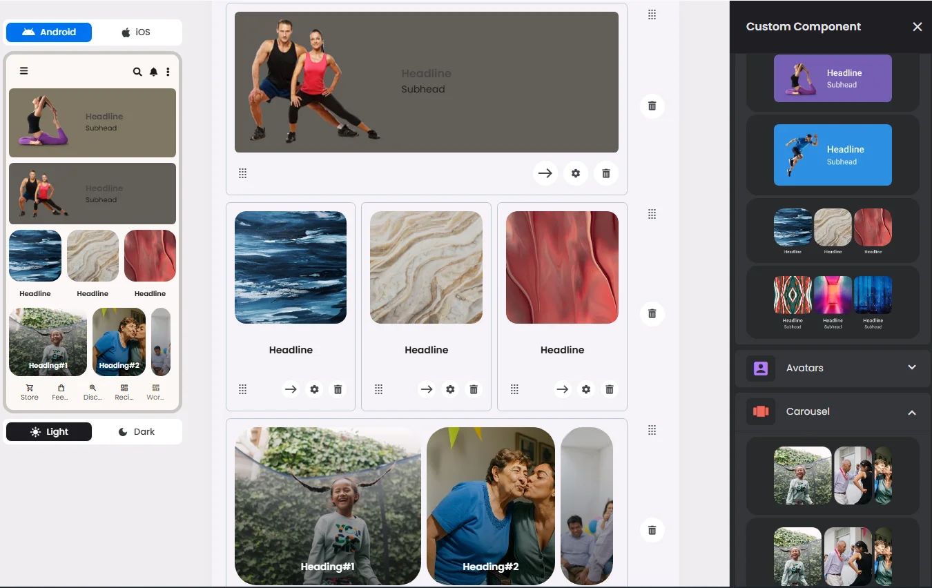
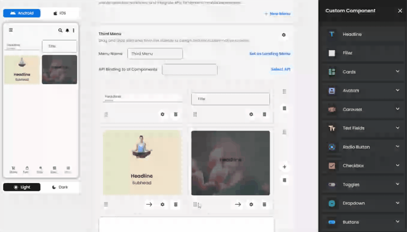
The Custom Component allows users to build advanced, personalized interfaces using modular elements. A key part of this system is the Grids layout, which defines how components are structured visually within a screen.
The Grids system introduces flexible row-based layouts where each element has a predefined width unit. These widths determine how many components can fit in a single row.
For instance, some components are designed to take one-third of a row, allowing three elements per row, while others span the full width, meaning only one element can be placed per row.
This approach gives you total control over the visual flow of your app, ensuring a clean, responsive layout across different devices. Whether you're designing a compact toolset or showcasing a large visual module, the Grids system adapts to your needs while maintaining a consistent design structure.
🧮 Layout & Width Logic
The layout system uses a 60-unit row model, where each cell's
width defines how much of that row it consumes. This allows for flexible compositions of elements in various proportions.📐 Width
- Each row can hold up to 60 units total.
- A
width: 60means the element takes the full row.
- Smaller widths, such as
20, allow up to 3 elements per row (20 + 20 + 20 = 60).
- You can combine widths — for example:
width: 20+width: 40= full rowwidth: 30+width: 30= full row
⚠️ Important: All cells in a row must share the same type (e.g., all buttons or all inputs).
🔁 Equalization & Expansion
- The
allow_expansionflag allows cells to expand proportionally and fill unused space.
- Example:
If you place two cells with
width: 20 each and enable allow_expansion, the remaining 20 units will be evenly distributed or filled using filler cells if needed.🎯 Centering Elements
To center an element horizontally in a row, use filler cells:
- For a
width: 20element: - Place a
filler, then thecell, then anotherfiller - Or place two fillers first, then the
cell
- Example:
filler (20)+cell (20)+filler (20)→ centered in rowfiller (40)+cell (20)→ right-aligned
This approach allows for precise layout control without breaking the 60-unit constraint.
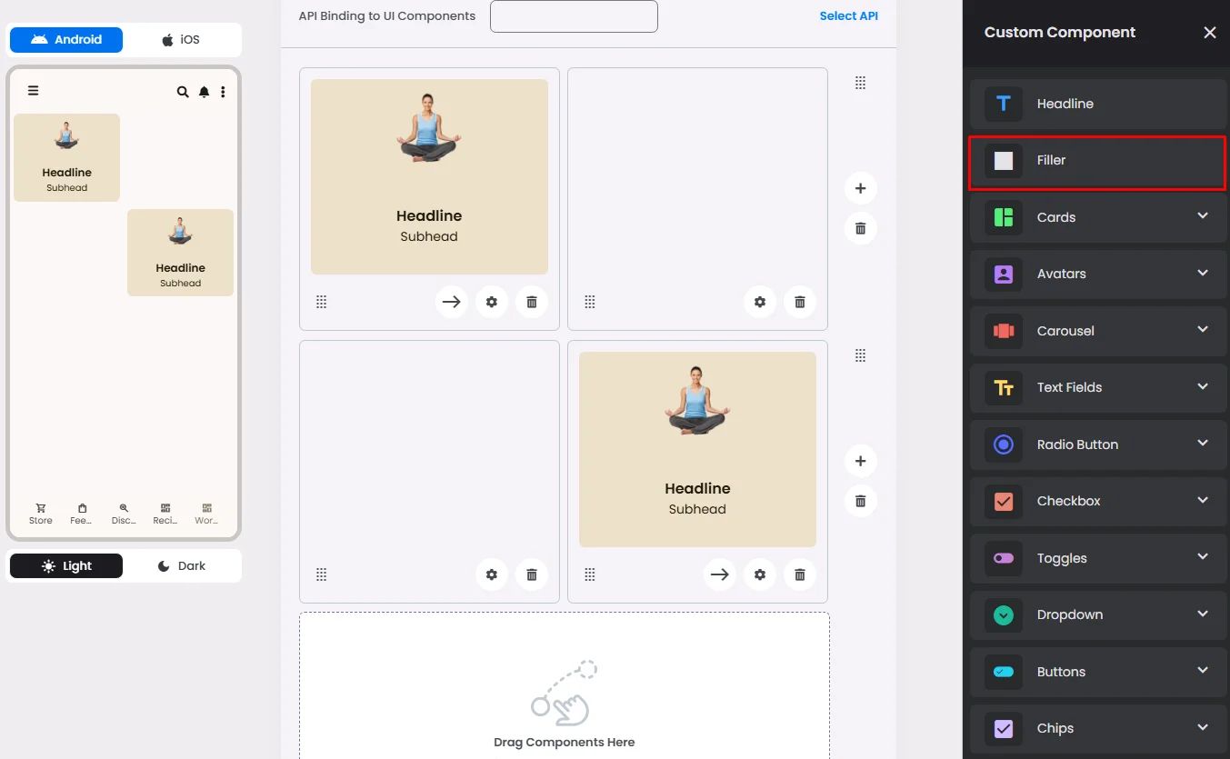
Three Elements Per Row
Click the (+) icon and drag & drop one or more elements to the row.
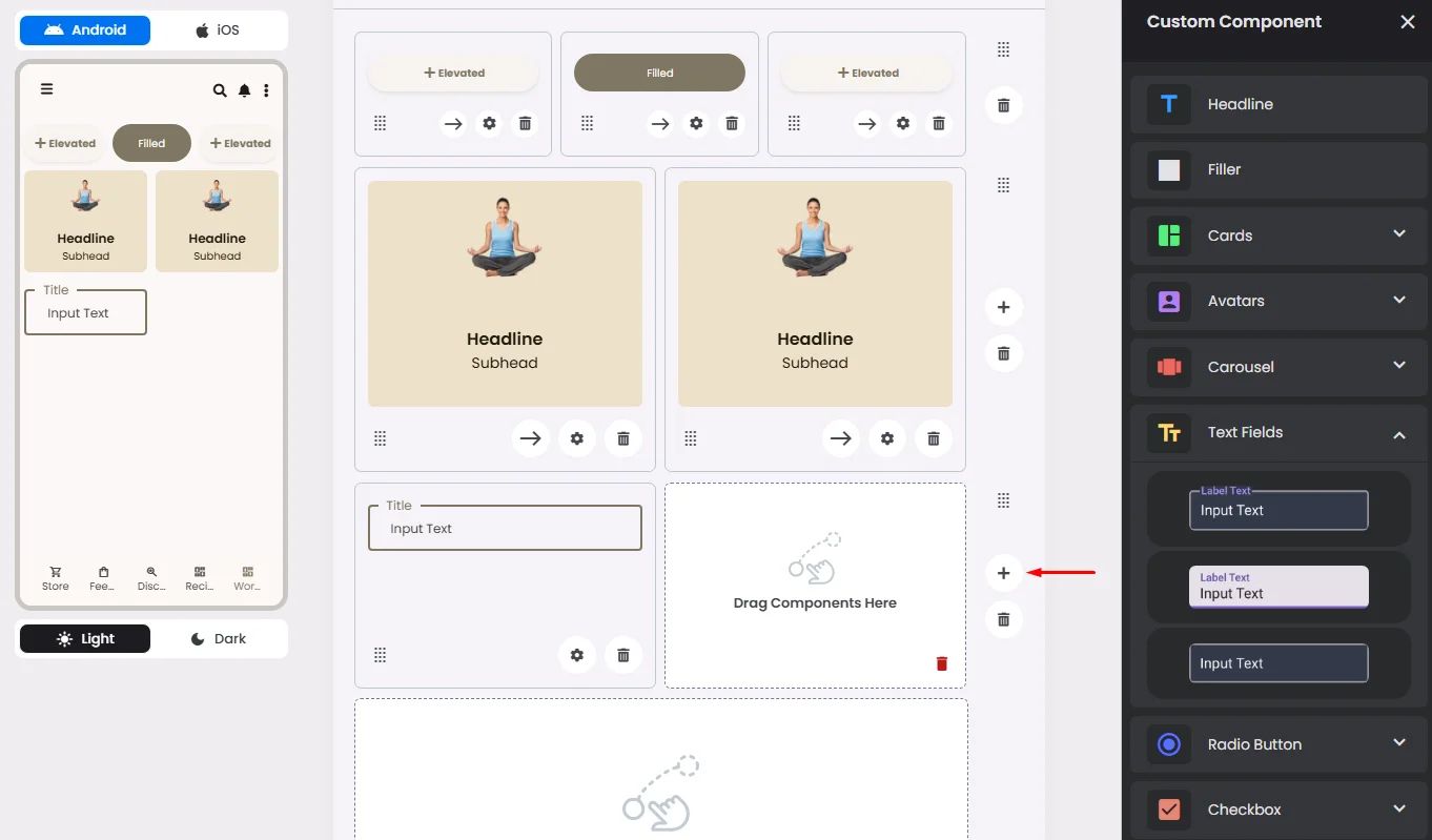
Use Empty Filler for Separation and Arrangement
To create a specific interface, you can use an empty cell (Filler) to separate between elements in a row.
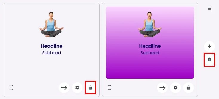
Moving Rows and Columns
You can arrange your rows and elements in the row by holding the row itself and moving it up and down or moving the elements left and right in the row by holding the elements themselves.
Delete Rows and Columns
You can delete a certain element in the row or delete the row itself.
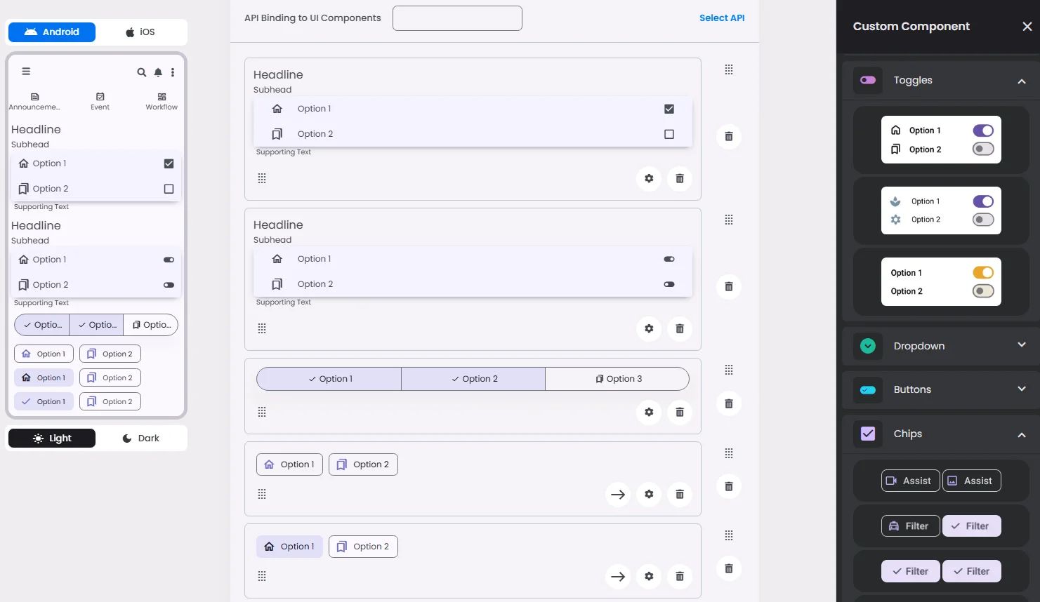
One Element Per Row
The row can only have one of these elements: wide cards, carousels, some types of choice elements (such as radio buttons, checkboxes, and toggle buttons), and some types of buttons and chips.