
In the Custom Component builder, each element comes with its set of configurable settings to help you fine-tune the user experience and maintain visual consistency across your app. This page provides a general overview of all available element settings, without going into the specifics of individual components.
From visual styles like icons and images to functional configurations like labels, toggles, and input options — this flexible settings model allows you to tailor each element to its role within your app.
🧩 General Element Settings
Cell_id
This is the unique name for the cell. It's used to find or manage the cell later. If both
cell_id and callback are provided, the system will use cell_id.Callback
This is the action name linked to the cell when a user interacts with it. You must add this when creating the cell. Once the cell is saved, this value can’t be changed.
Cell_order
This controls where the cell appears inside the row (from left to right). Like callback, it must be set when creating the cell and can’t be changed later.
Form
The type of the element, like a dropdown, radio button, or text input. You must choose this when creating the cell, and it can't be changed later.
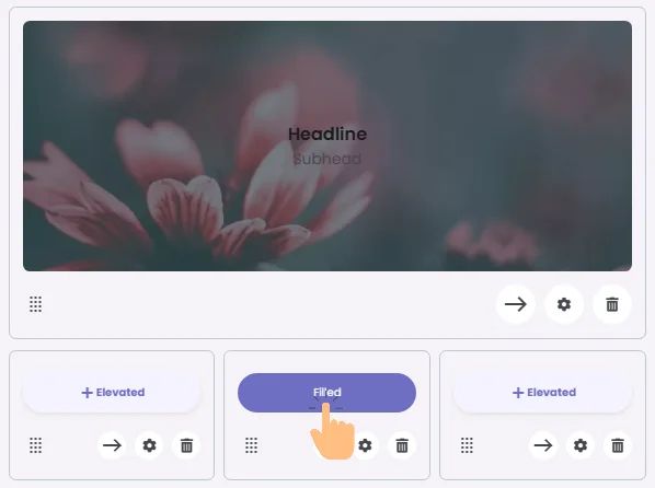
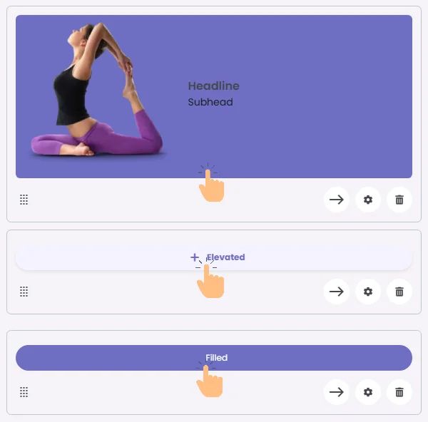
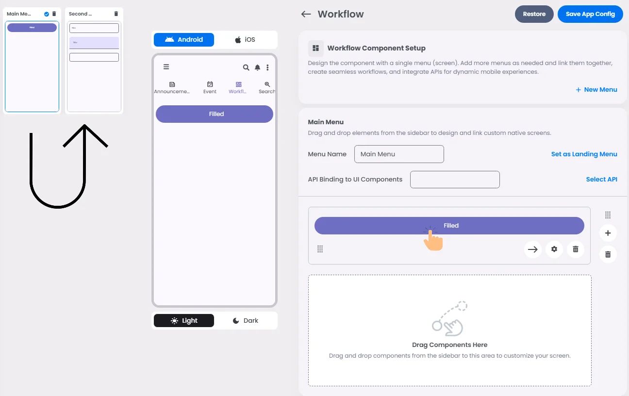
Style
The visual style of the element (e.g., filled, outlined). You need to set this when creating the cell, and it can't be changed after saving.
Version
A system-generated version number that updates automatically whenever the cell is changed.
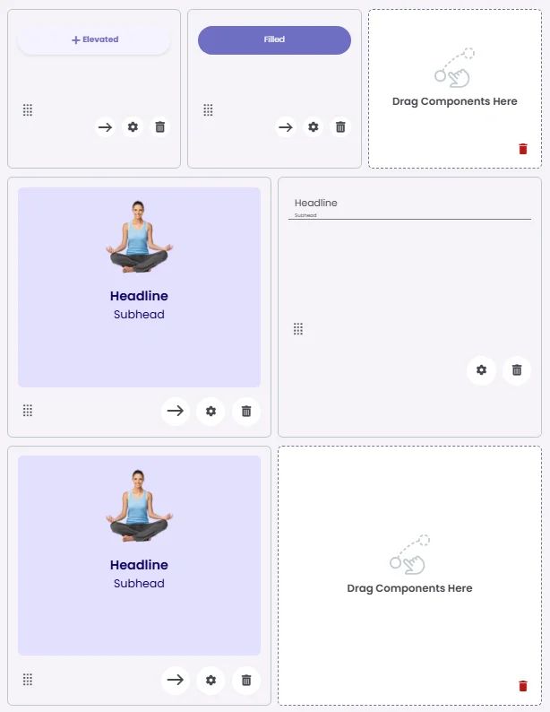
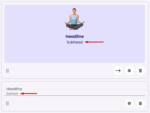
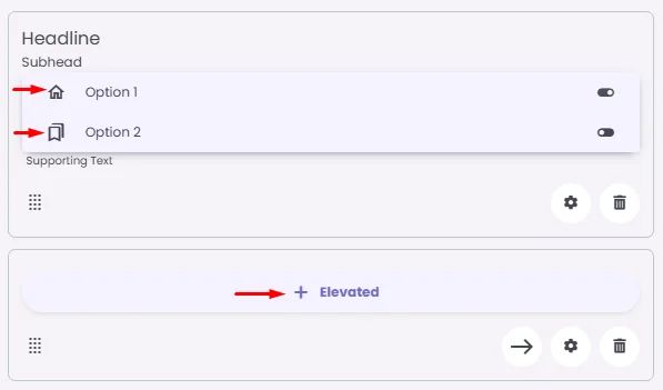
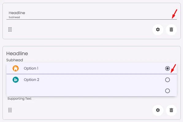
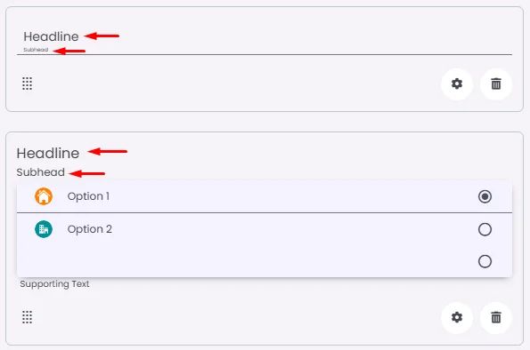
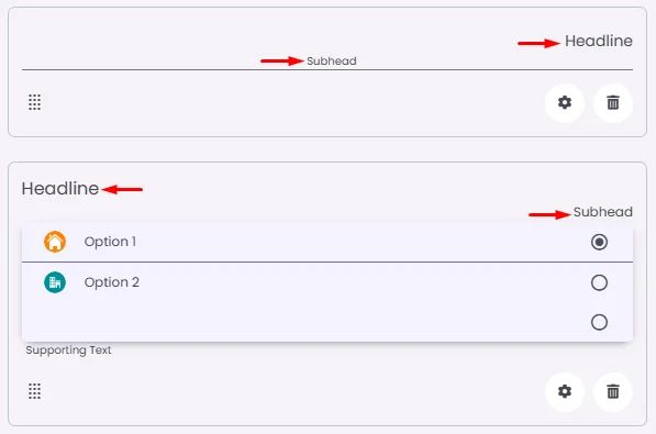
Headline
A main title is shown in the cell if supported by the element type.

Subhead
A smaller, secondary title is shown below the headline.
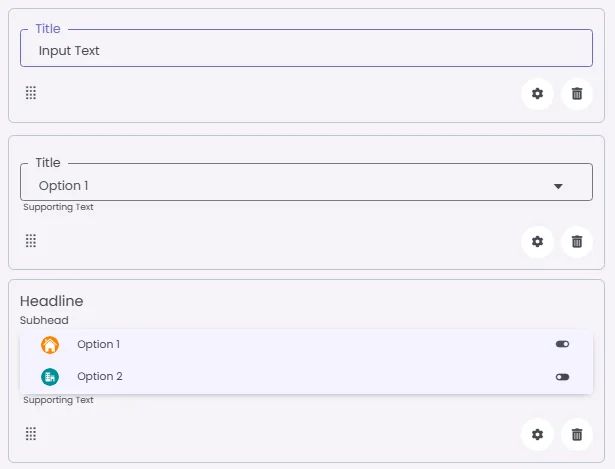
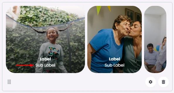
Label
The main label for form fields like inputs or dropdowns.
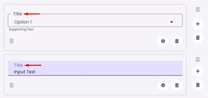
Sublabel
Extra information shown below the label, usually for clarification.
Body
Main text content displayed inside the cell.
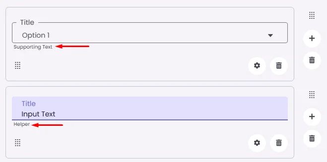
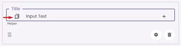
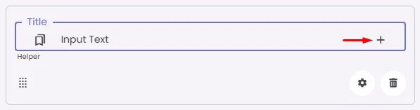
Helper
Helpful text shown below the cell to guide the user. Usually used for tips or extra context.
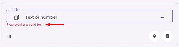
Error
Error message shown when the user enters something wrong. It usually replaces the helper text.
Prefix
Text that appears at the beginning of an input field (before the user's input).
Suffix
Text that appears at the end of an input field (after the user's input).
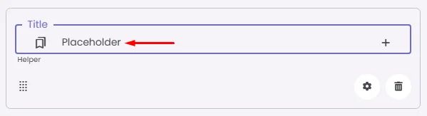
Placeholder
Light grey text is shown inside an input before anything is typed, giving a hint on what to enter.
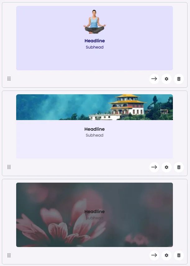
BG Image
Background image for the cell when using light mode.
BG Image Dark
Background image for the cell when using dark mode.
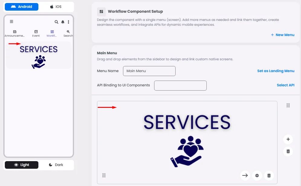
Image
An image shown inside the cell when light mode is active.
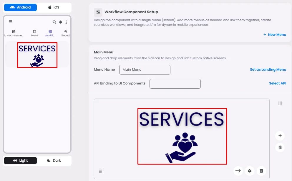
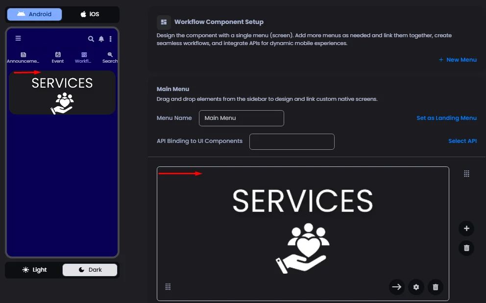
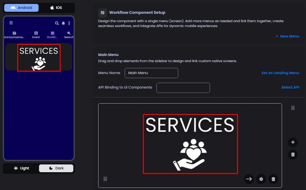
Image Dark
An image shown inside the cell when dark mode is active.
Icon
An icon shown at the start (left side) of the cell.
Trailing Icon
An icon shown at the end (right side) of the cell.
Trailing Text
Text that appears after the cell's main content, usually aligned to the end.
Second Trailing Icon
An extra icon you can place after the first trailing icon.
Maximum
The highest value a user can enter in the field.
Minimum
The lowest value a user can enter in the field.

Step
The interval between values for number or range inputs (like stepping by 1, 5, or 10).
Divider
Shows a line under the cell to separate it from others, if supported. Default is off.
Font Size
Controls how large or small the text appears in the cell.
Text Alignment
Adjusts how the content inside the cell is aligned — left, center, or right.
Submit
Defines which values get submitted when this cell is triggered:
Option | Description |
Cell | Sends only the value from this specific element. |
Menu | Sends all values from the current menu. |
All | Sends values from all menus across the workflow. |
You must set this when creating the cell, and it can’t be changed later.
Next
What happens after the cell is triggered — open another screen or menu, or run a function. You must set this during creation, and it can’t be changed afterward.
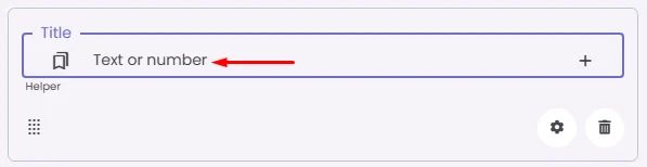
Value Type
The kind of data expected (like text or number). Must be set when creating the cell and stays fixed.
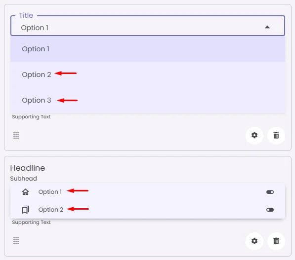
Options
A list of choices is shown to the user in dropdowns, radio buttons, or multi-select elements. Only needed for cells that require selection.
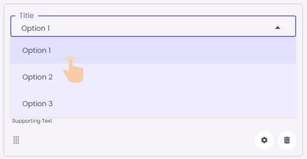
Value
The default or current value for the cell (like a pre-selected option).
Cache
If turned on, the value stays saved until it's changed manually. Default is off.
Cell Query
Allows you to ask the user for special data like their location or contact number.
Navigation Type
Controls the navigation button in chats. Leave empty for the default user button. Use ‘Admin’ to show an admin-specific button.