
In the workflow system of the custom component builder, each element can serve more than just a visual purpose — many elements are capable of triggering specific actions that define how users interact with your app.
An action represents a response or behavior assigned to an element when it's tapped, clicked, or interacted with. These actions are a core part of building dynamic workflows, enabling seamless navigation and interaction between screens, menus, and features.
🔗Supported Actions
- Create New Component—Instantly initiate a new instance of a predefined component or screen.
- Select Existing Component—Navigate to an existing screen or component within the app structure.
- Select Existing Menu—Redirect the user to a specific menu previously defined in the system.
- Open URL—Launch an external link in the user's browser or an embedded WebView.
- Execute Function—Trigger a specific logic block or server-side operation for advanced behavior.
By assigning the right action to the right element, creators can design powerful user flows that guide interactions, automate transitions, and connect different parts of the app with or without writing code.
🛠️ Implementation
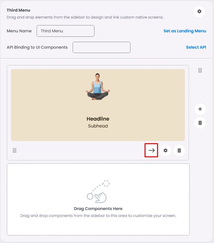
Only certain elements—such as cards and buttons—are designed to be actionable within a workflow. These interactive elements can trigger behaviors like navigation, function execution, or menu transitions.
Tap the onClick icon to access the element’s options.
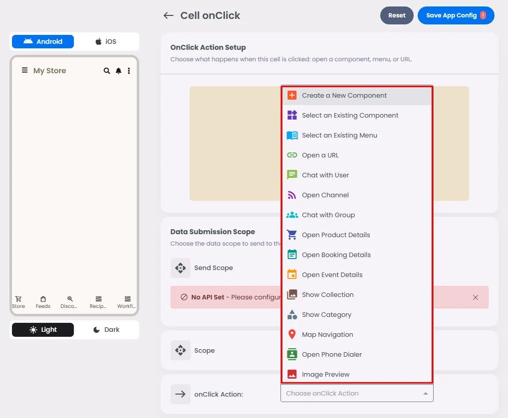
 Create a New Component
 Select an Existing Component
 Select an Existing Menu
 Open URL
 Chat with User
 Open Channel
 Chat with Group
 Open Product Details
 Open Booking Details
 Open Event Details
 Show Collection
 Show Category
 Map Navigation
 Open Audio Directory
 Open Phone Dialer
 Image Preview
 Open Video Directory