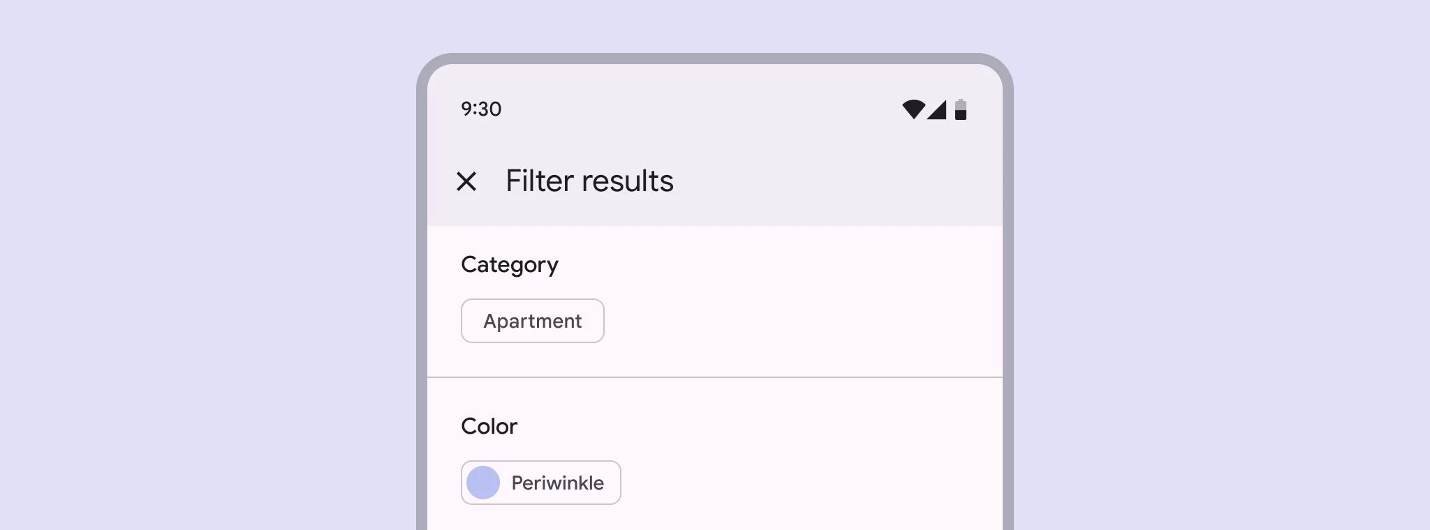
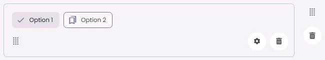
Filter chips are an element that allows users to select or deselect options to refine content based on categories or filters.
🧱 Gridding Rules
You can place the Filter Chips element alone in the row using a flexible grid system.
Max |
60 grids |
⚙️ Applicable Settings
The following table outlines the available configuration options for this element. Each setting defines how the element behaves or appears within your app’s UI.
Field | Description |
Label | The main label for form fields like inputs or dropdowns. |
Icon | An icon shown at the start (left side) of the cell. |
Custom Color | controls the color styling of text or divider. |
Cell ID | This is the unique name for the cell. It's used to find or manage the cell later. If both cell_id and callback are provided, the system will use cell_id. |
Callback | This is the action name linked to the cell when a user interacts with it. You must add this when creating the cell. Once the cell is saved, this value can’t be changed. |
Cell Order | This controls where the cell appears inside the row (from left to right). Like callback, it must be set when creating the cell and can’t be changed later. |
Form | The type of the element. You must choose this when creating the cell, and it can't be changed later. |
Style | The visual style of the element (e.g., filled, outlined). You need to set this when creating the cell, and it can't be changed after saving. |
Version | A system-generated version number that updates automatically whenever the cell is changed. |
Prefix | Text that appears at the beginning of an input field (before the user's input). |
Options | A list of choices is shown to the user in dropdowns, radio buttons, or multi-select elements. Only needed for cells that require selection. |
Value | The default or current value for the cell (like a pre-selected option). |
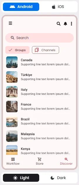
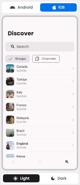
📱 Android & iOS Interface
The Filter Ships element adapts its appearance and layout behavior based on the platform to align with native UI guidelines:
👇🏻 Action (onClick)
Element | Purpose | Supports Actions | Notes |
Filter Chips | To allow users to apply or remove filters on content or results. | ❌ | Used for filtering only. Selection triggers data queries, not actions. |
🃏 Filter Chips Style Overview
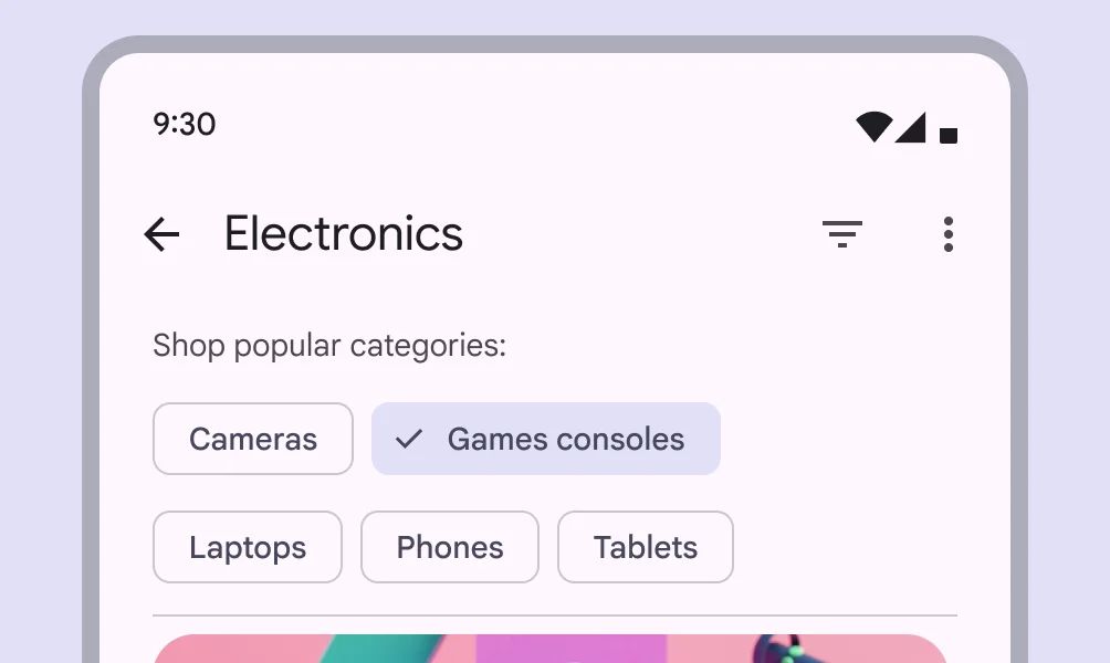
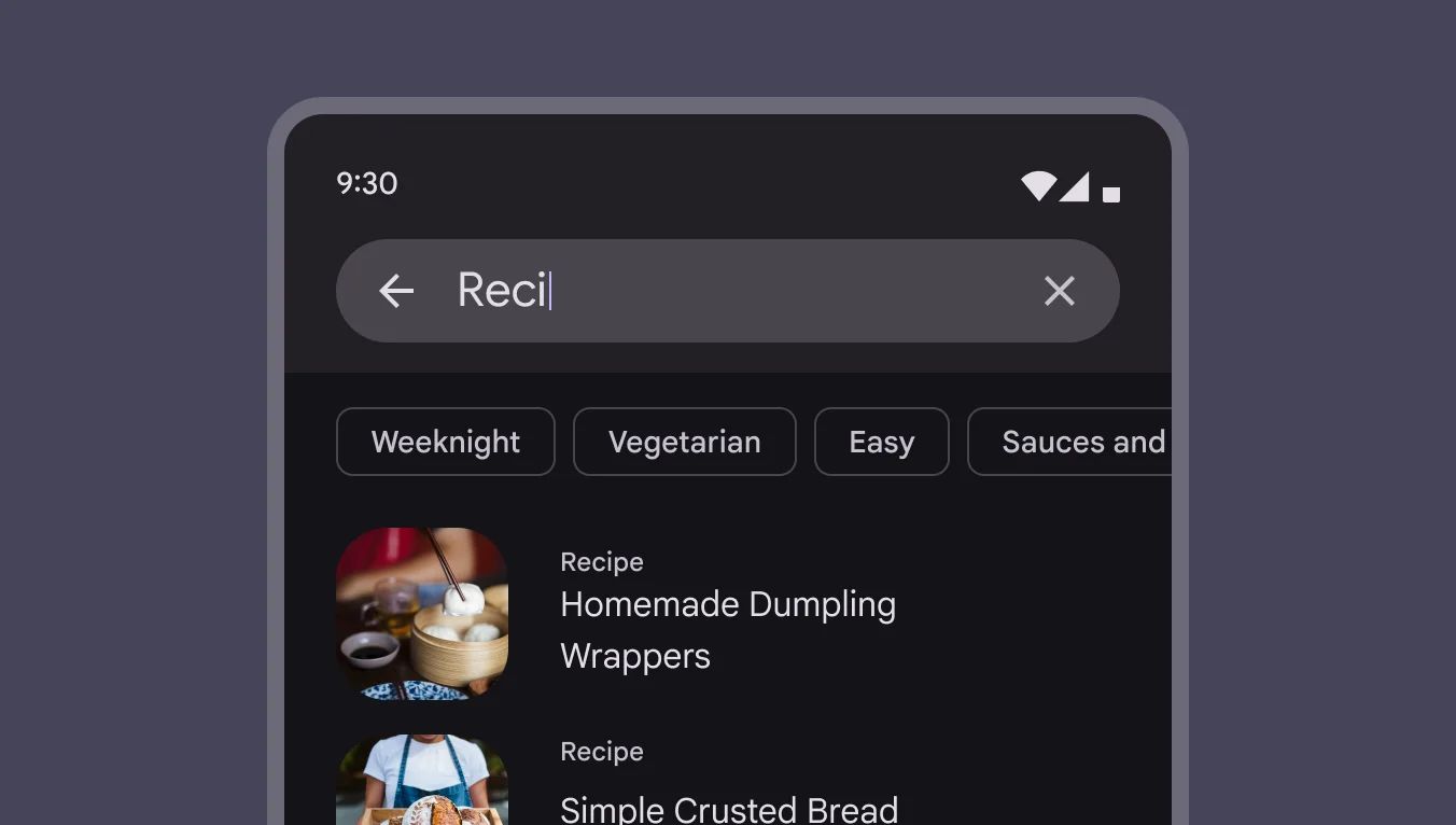
Filter chips are elements that allow users to filter a dataset or content by toggling specific criteria on or off. They represent a set of options, and multiple filter chips can be selected simultaneously to refine results.

🧰 Usage
Write filter chips with nouns that describe the category to include in the results. Avoid negative phrases like "Exclude images.”
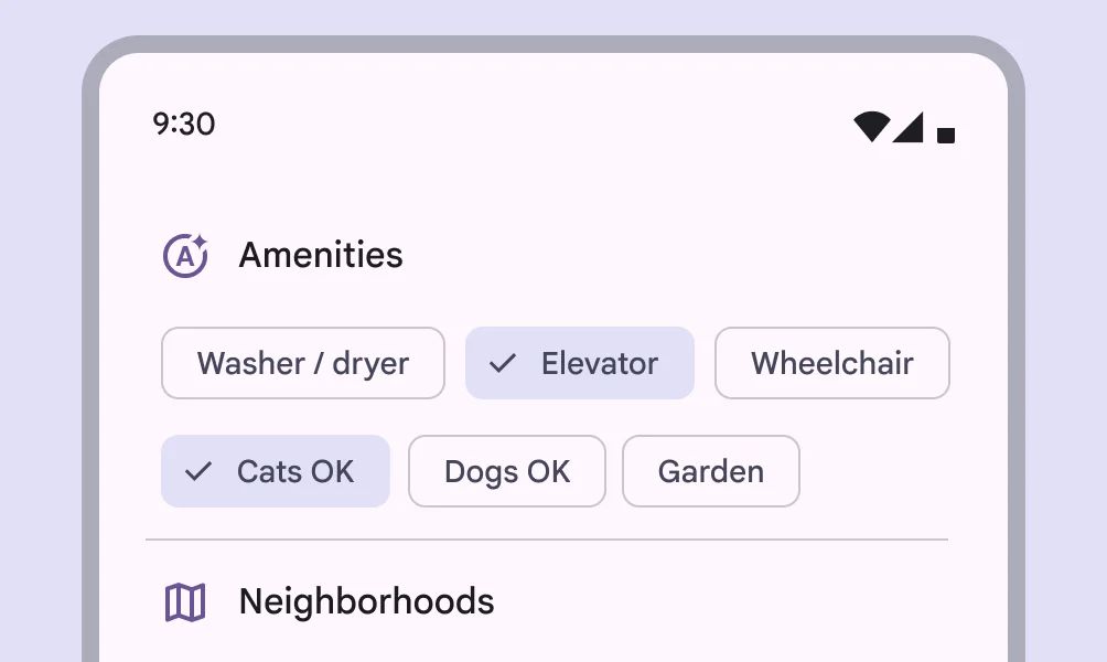
Filter chips should not present only a single option