A List is a structured collection of items presented in a vertical layout, used for displaying content in a scannable and accessible format.
⚙️ Applicable Settings
The following table outlines the available configuration options for this element. Each setting defines how the element behaves or appears within your app’s UI.
Field | Description |
Label | The main label for form fields like inputs or dropdowns. |
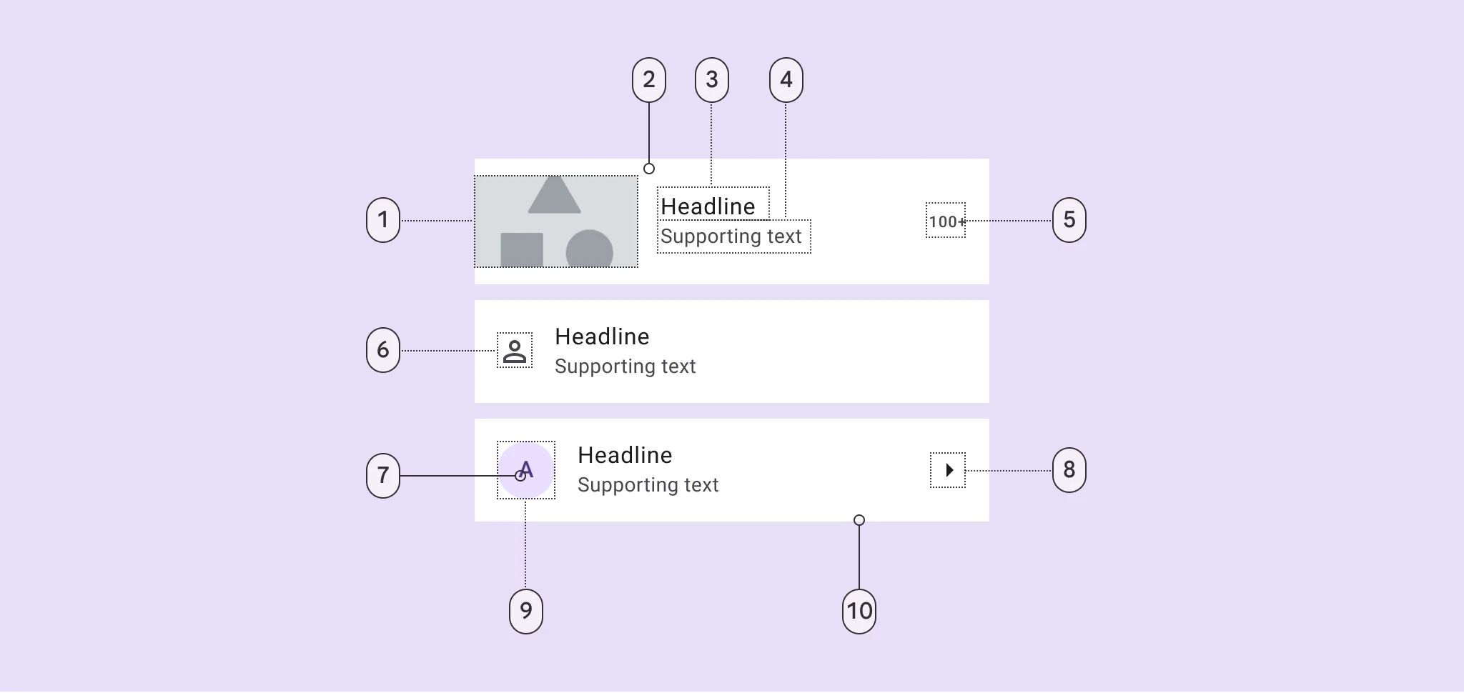
Icon | An icon shown at the start (left side) of the cell. |
Custom Color | controls the color styling of text or divider. |
Cell ID | This is the unique name for the cell. It's used to find or manage the cell later. If both cell_id and callback are provided, the system will use cell_id. |
Callback | This is the action name linked to the cell when a user interacts with it. You must add this when creating the cell. Once the cell is saved, this value can’t be changed. |
Cell Order | This controls where the cell appears inside the row (from left to right). Like callback, it must be set when creating the cell and can’t be changed later. |
Form | The type of the element. You must choose this when creating the cell, and it can't be changed later. |
Style | The visual style of the element (e.g., filled, outlined). You need to set this when creating the cell, and it can't be changed after saving. |
Version | A system-generated version number that updates automatically whenever the cell is changed. |
Prefix | Text that appears at the beginning of an input field (before the user's input). |
Options | A list of choices is shown to the user in dropdowns, radio buttons, or multi-select elements. Only needed for cells that require selection. |
Value | The default or current value for the cell (like a pre-selected option). |
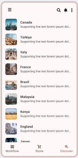
📱 Android & iOS Interface
The List element adapts its appearance and layout behavior based on the platform to align with native UI guidelines:
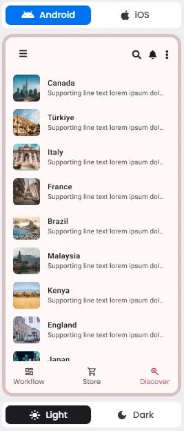
🃏 List Style Overview
A List is a vertically stacked layout used to display a series of related items in a clean, scrollable format.
🧰 Usage
Use lists for communicating or selecting discrete items, such as choosing from a set of colors.
A list should be easily scannable, and any element of a list can be used to anchor and align list item content. Scannability is improved when elements (such as supporting visuals and primary text) are placed in consistent locations across list items.