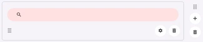
A Search Bar is a designed element for searching and filtering content. It allows users to type text queries and view suggestions or results dynamically.
🧱 Gridding Rules
The Search Bar element follows a flexible grid system where it can be placed alone or alongside one other element in the same row.
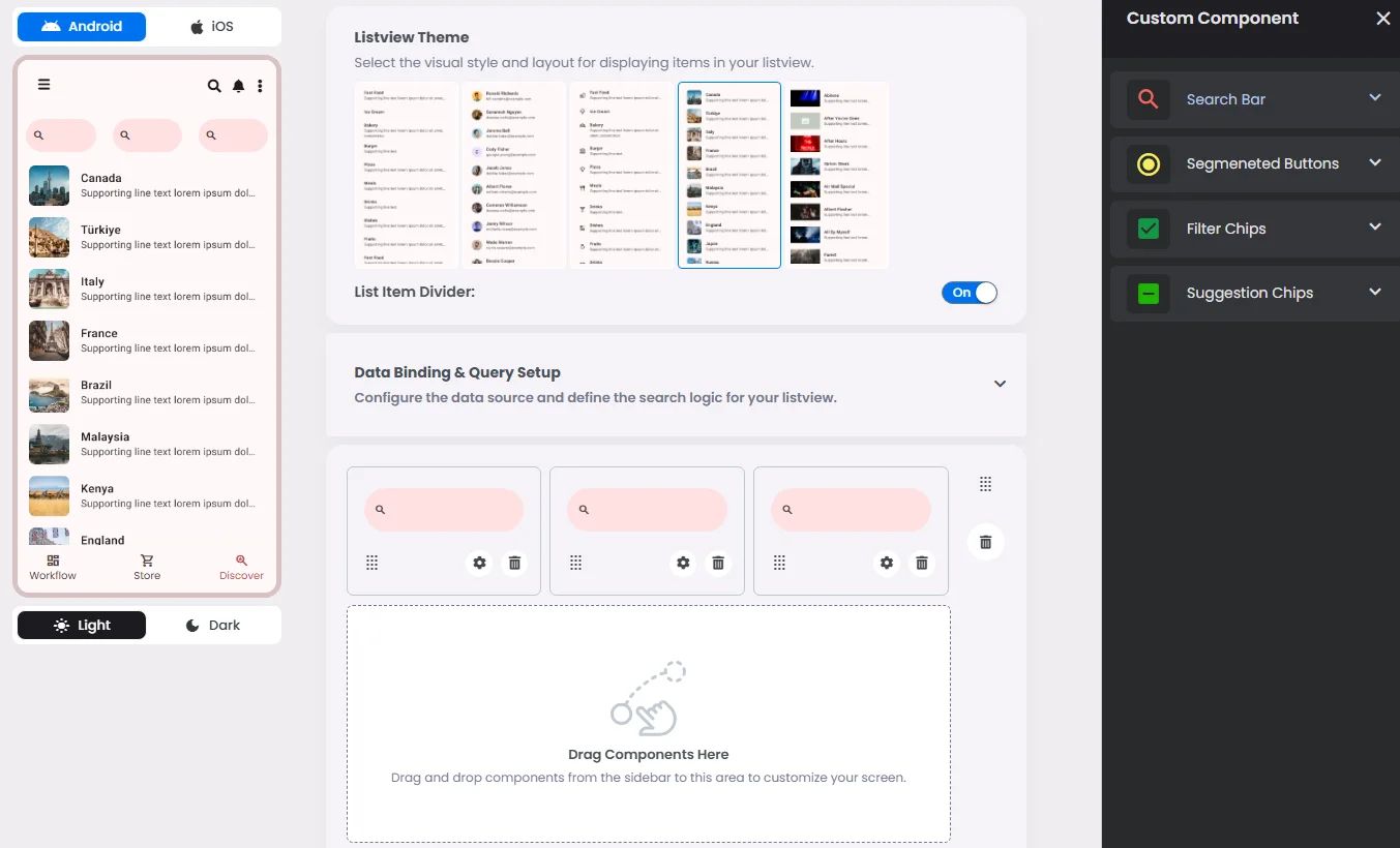
Min | Max |
20 grids | 60 grids |
⚙️ Applicable Settings
The following table outlines the available configuration options for this element. Each setting defines how the element behaves or appears within your app’s UI.
Field | Description |
Cell_id | This is the unique name for the cell. It's used to find or manage the cell later. If both cell_id and callback are provided, the system will use cell_id. |
Callback | This is the action name linked to the cell when a user interacts with it. You must add this when creating the cell. Once the cell is saved, this value can’t be changed. |
Cell_order | This controls where the cell appears inside the row (from left to right). Like callback, it must be set when creating the cell and can’t be changed later. |
Label | The main label for form fields like inputs or dropdowns. |
Body | Main text content displayed inside the cell. |
Custom Color | controls the color styling of text or divider. |
Prefix | Text that appears at the beginning of an input field (before the user's input). |
Placeholder | Light grey text is shown inside an input before anything is typed, giving a hint on what to enter. |
BG Image | Background image for the cell when using light mode. |
BG Image Dark | Background image for the cell when using dark mode. |
Icon | An icon shown at the start (left side) of the cell. |
Value Type | The kind of data expected (like text or number). Must be set when creating the cell and stays fixed. |
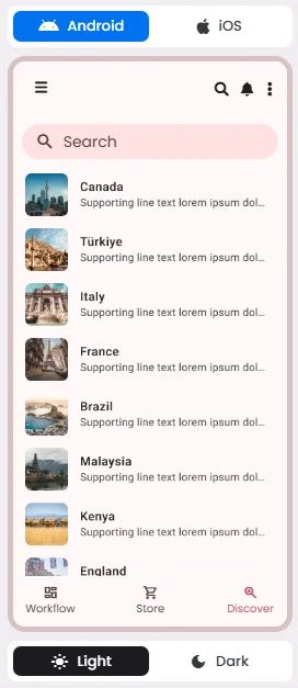
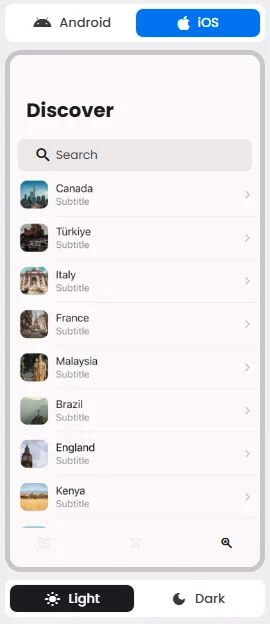
📱 UI for Android & iOS
The Search Bar element adapts its appearance and layout behavior based on the platform to align with native UI guidelines:
👇🏻 Action (onClick)
Element | Purpose | Supports Actions | Notes |
Search Bar | To allow users to input and submit search queries. | ❌ | Input-only element used for filtering or triggering query logic. Best paired with chips or buttons for dynamic search experiences. |
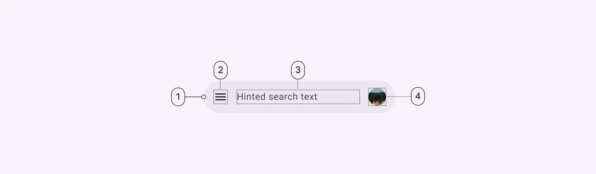
🃏 Search Bar Style Overview
The Search Bar is a user input component that allows users to type keywords or phrases to dynamically filter and retrieve relevant results from a connected data source.
🧰 Usage
Search is a navigation method that allows people to quickly find information across an app. Users input a query into the search bar or text field of the search view and then see related results.