Date Picker is a calendar-based component that allows users to select a specific date, often used in forms or booking interfaces.
🧱 Gridding Rules
The Date Picker element follows a flexible grid system where it can be placed alone or alongside one other element in the same row.
Min | Max |
20 grids | 60 grids |
⚙️ Settings
The following table outlines the available configuration options for this element. Each setting defines how the element behaves or appears within your app’s UI.
Field | Description |
Label | The main label for form fields like inputs or dropdowns. |
Icon | An icon shown at the start (left side) of the cell. |
Custom Color | controls the color styling of text or divider. |
Cell ID | This is the unique name for the cell. It's used to find or manage the cell later. If both cell_id and callback are provided, the system will use cell_id. |
Callback | This is the action name linked to the cell when a user interacts with it. You must add this when creating the cell. Once the cell is saved, this value can’t be changed. |
Cell Order | This controls where the cell appears inside the row (from left to right). Like callback, it must be set when creating the cell and can’t be changed later. |
Form | The type of the element. You must choose this when creating the cell, and it can't be changed later. |
Style | The visual style of the element (e.g., filled, outlined). You need to set this when creating the cell, and it can't be changed after saving. |
Version | A system-generated version number that updates automatically whenever the cell is changed. |
Prefix | Text that appears at the beginning of an input field (before the user's input). |
Options | A list of choices is shown to the user in dropdowns, radio buttons, or multi-select elements. Only needed for cells that require selection. |
Value | The default or current value for the cell (like a pre-selected option). |
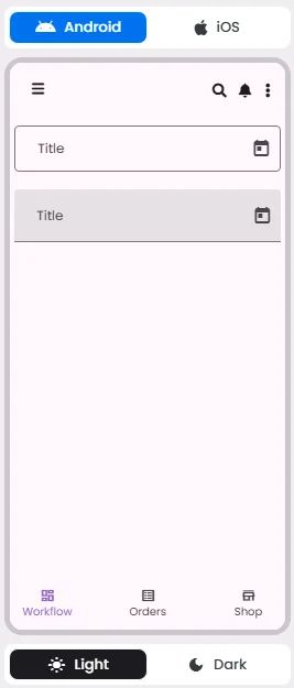
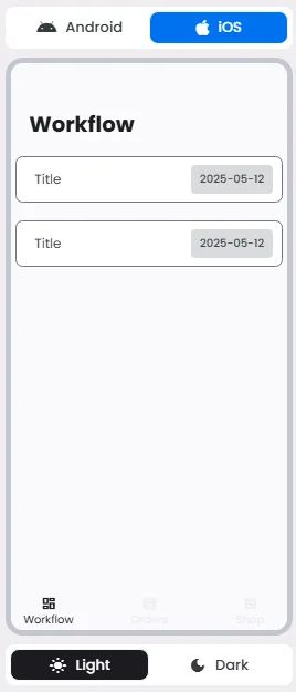
📱 Android & iOS Interface
The Date Pickers element adapts its appearance and layout behavior based on the platform to align with native UI guidelines:
👇🏻 Action (onClick)
Element | Purpose | Supports Actions | Notes |
Date Picker | To let users select a date from a calendar interface. | ❌ | Allows date input only. Cannot be linked to actions. Typically used in forms and scheduling flows. |
🃏 Date Pickers Style Overview
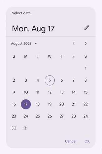
Date Pickers provides a calendar interface that allows users to select a single date or a range of dates. They are designed to be intuitive, accessible, and responsive, making them ideal for use in forms, booking flows, and scheduling features.
There are 3 types of them: Docked date picker, Modal date picker & Modal date input.
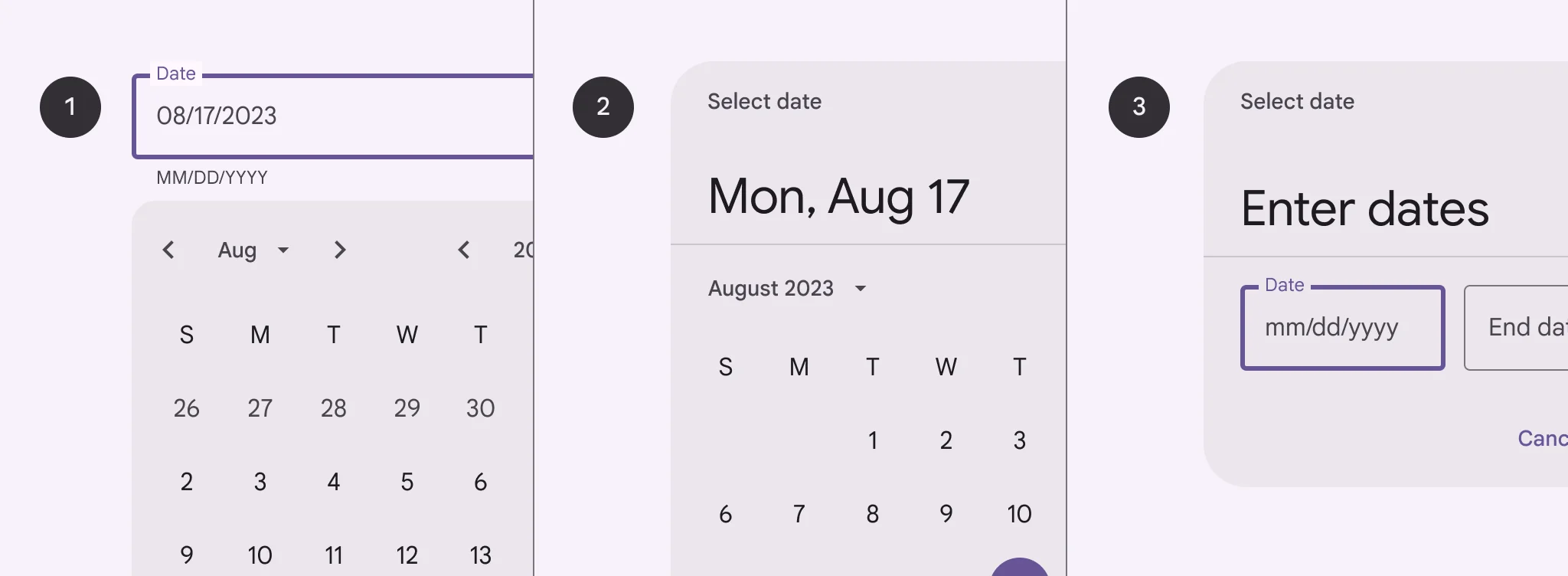
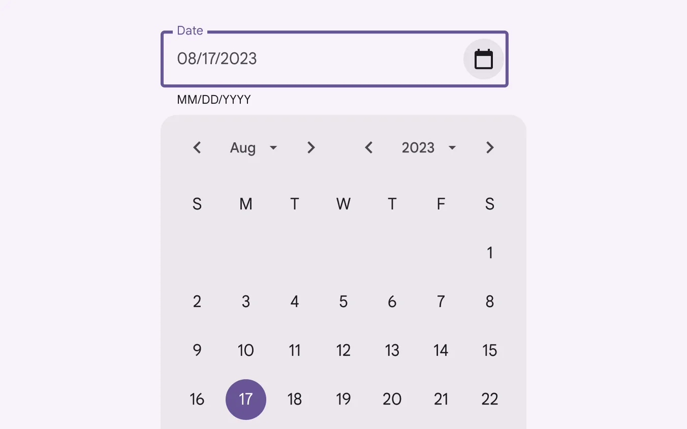
Docked date picker
🧰 Usage
Docked date pickers are ideal for navigating dates in both the near future or past and the distant future or past, as they provide multiple ways to select dates.
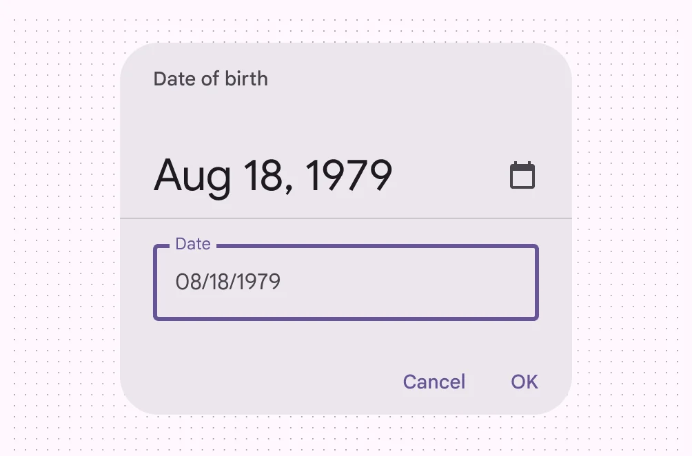
Modal date picker
🧰 Usage
Don’t use a modal date picker to prompt for dates in the distant past or future, such as a date of birth. In these cases, use a modal input picker or a docked date picker instead.
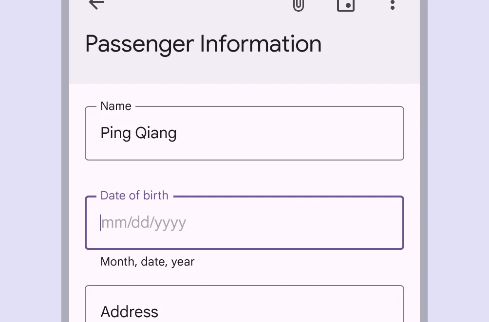
Modal Date picker
🧰 Usage
Allow users to manually enter dates by using the number keys on a keyboard.