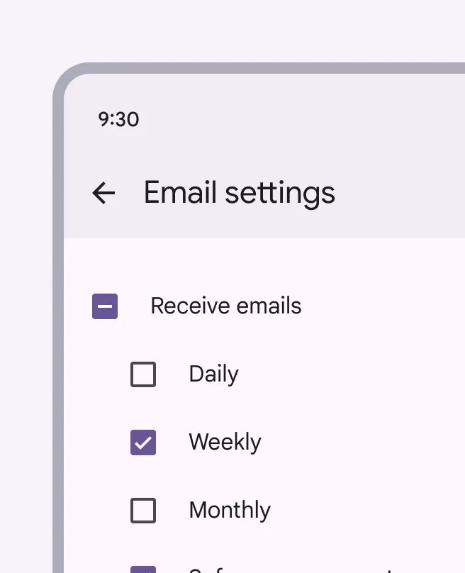
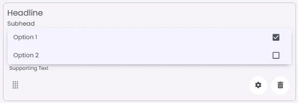
A checkbox lets users select one or multiple options from a set. It’s ideal for toggling settings or making multi-select choices.
🧱 Gridding Rules
You can place the Checkbox element alone in the row using a flexible grid system.
Max |
60 grids |
⚙️ Settings
The following table outlines the available configuration options for this element. Each setting defines how the element behaves or appears within your app’s UI.
Field | Description |
Headline | A main title is shown in the cell if supported by the element type. |
Subhead | A smaller, secondary title is shown below the headline. |
Image | An image shown inside the cell when light mode is active. |
Icon | An icon shown at the start (left side) of the cell. |
Divider | Shows a line under the cell to separate it from others, if supported. Default is off. |
Font Size | Controls how large or small the text appears in the cell. |
Text Alignment | Adjusts how the content inside the cell is aligned — left, center, or right. |
Options | A list of choices is shown to the user in dropdowns, radio buttons, or multi-select elements. Only needed for cells that require selection. |
Custom Color | controls the color styling of text or divider. |
Cell ID | This is the unique name for the cell. It's used to find or manage the cell later. If both cell_id and callback are provided, the system will use cell_id. |
Callback | This is the action name linked to the cell when a user interacts with it. You must add this when creating the cell. Once the cell is saved, this value can’t be changed. |
Cell Order | This controls where the cell appears inside the row (from left to right). Like callback, it must be set when creating the cell and can’t be changed later. |
Form | The type of the element. You must choose this when creating the cell, and it can't be changed later. |
Value | The default or current value for the cell (like a pre-selected option). |
Style | The visual style of the element (e.g., filled, outlined). You need to set this when creating the cell, and it can't be changed after saving. |
Version | A system-generated version number that updates automatically whenever the cell is changed. |
Body | Main text content displayed inside the cell. |
Helper | Helpful text shown below the cell to guide the user. Usually used for tips or extra context. |
Error | Error message shown when the user enters something wrong. It usually replaces the helper text. |
Prefix | Text that appears at the beginning of an input field (before the user's input). |
Suffix | Text that appears at the end of an input field (after the user's input). |
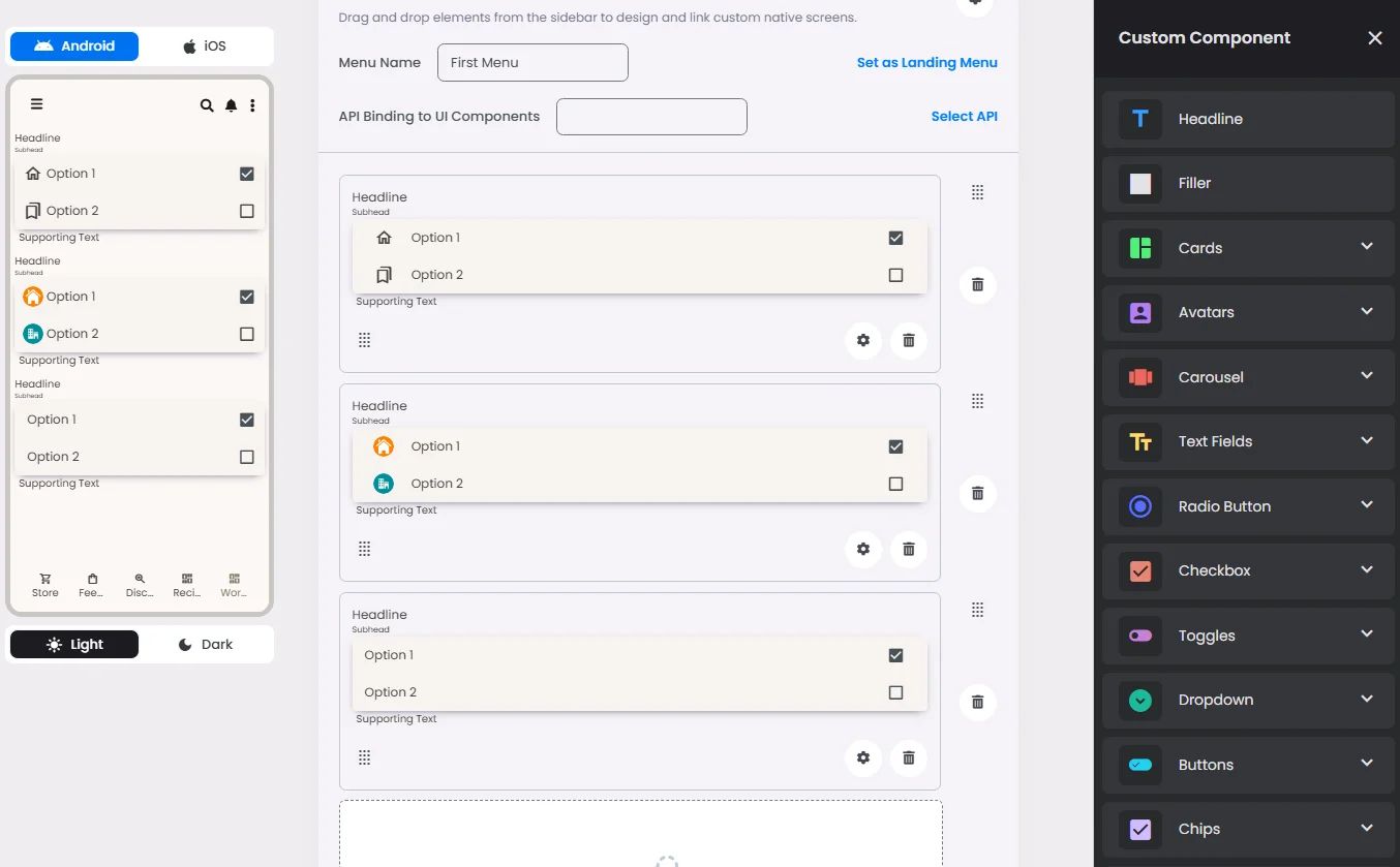
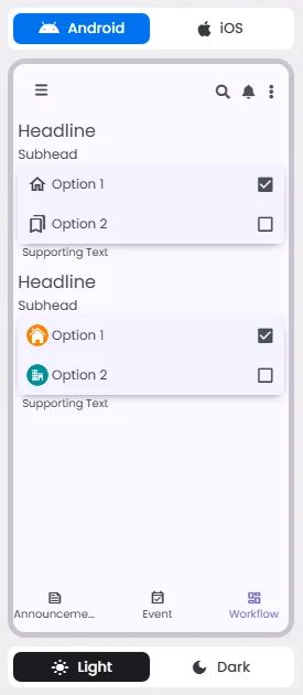
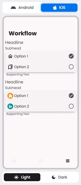
📱 Android & iOS Interface
The Checkbox element adapts its appearance and layout behavior based on the platform to align with native UI guidelines:
👇🏻 Action (onClick)
Element | Purpose | Supports Actions | Notes |
Checkbox | To provide a set of selectable choices for the user. | ❌ | Informational/structural use only. No interactive actions are triggered from this element. |
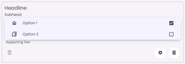
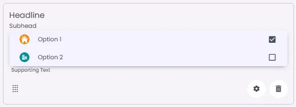
🃏 Checkbox Style Overview
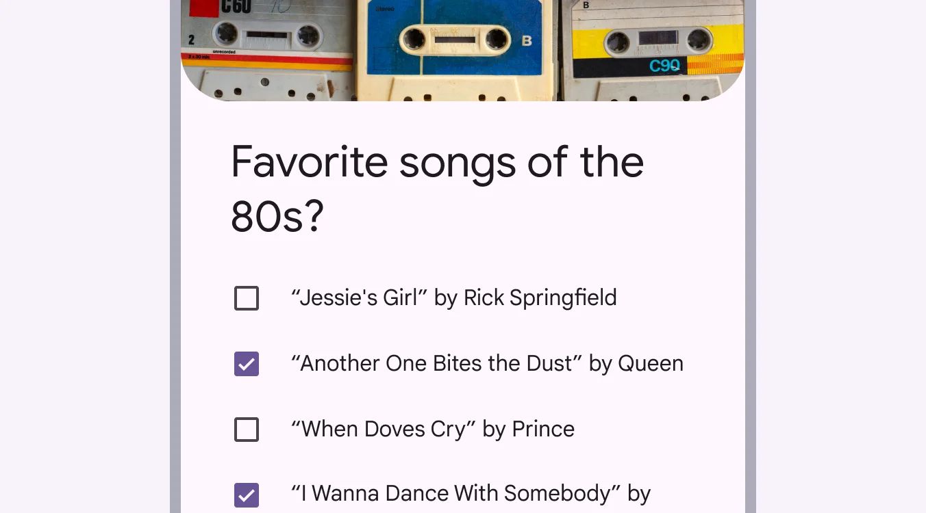
A checkbox is used to allow users to make multiple selections from a list of available options.

🧰 Usage
Use checkbox when:
- Select one or more options from a list
- Present a list containing sub-selections
- Turn an item on or off in a desktop environment
- Visually group similar options together
Checkboxes visually group similar items effectively and take up less space than switches.
🎨 Our Styles
Standard
Image
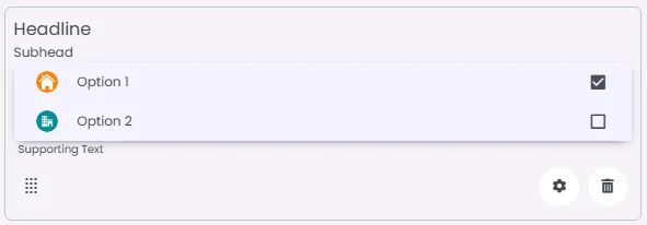
Iconic