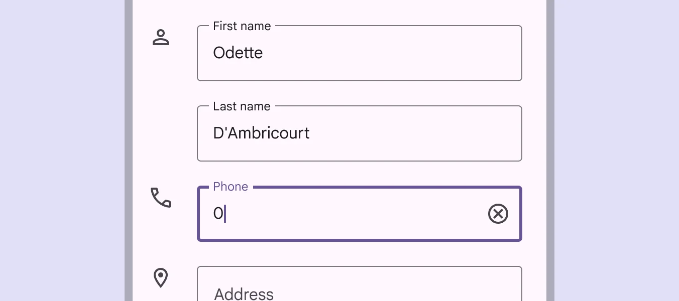
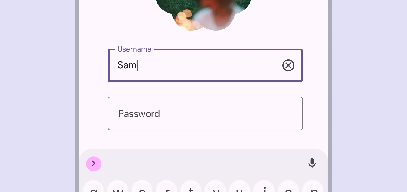
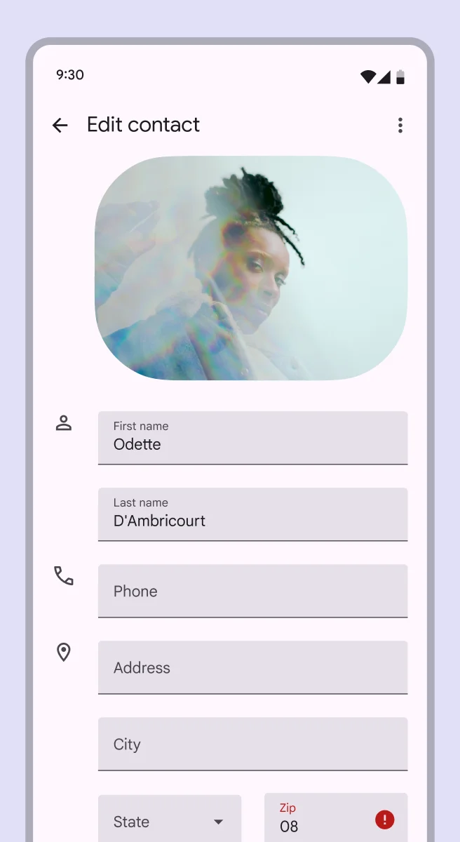
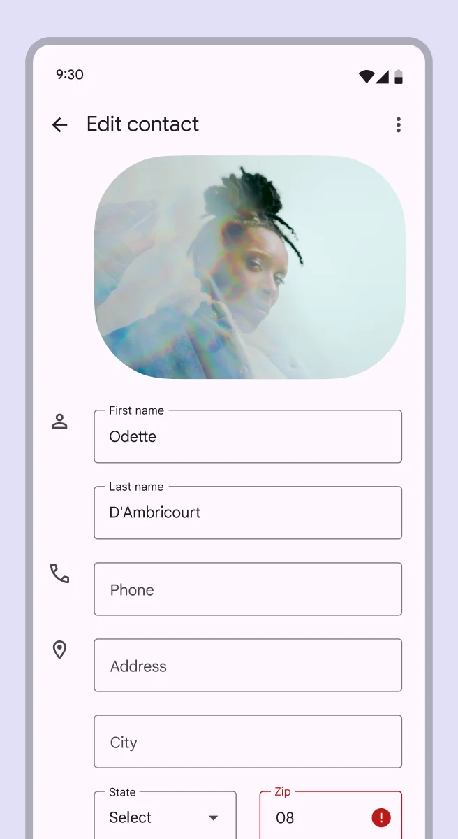
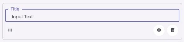
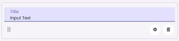
Text Field is an input element that allows users to enter and edit text. It supports labels, helper text, icons, and visual states like focused or error.
🧱 Gridding Rules
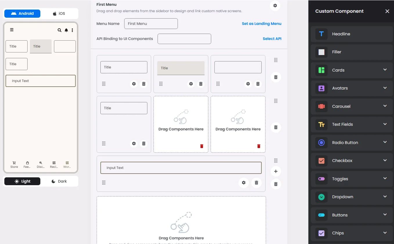
The Text Field element follows a flexible grid system where it can be placed alone or alongside one other element in the same row.
Min | Max |
20 grids | 60 grids |
⚙️ Settings
The following table outlines the available configuration options for this element. Each setting defines how the element behaves or appears within your app’s UI.
Field | Description |
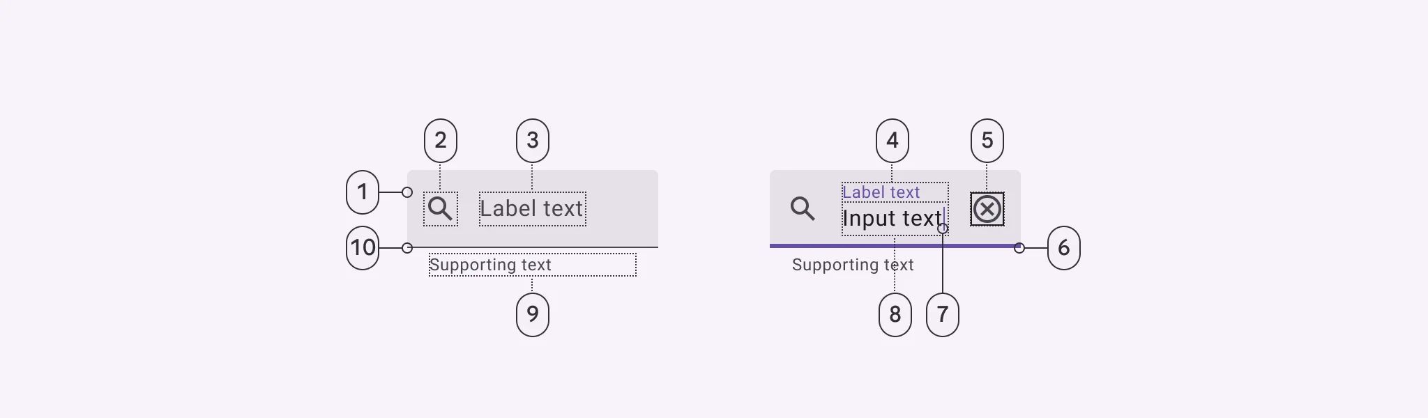
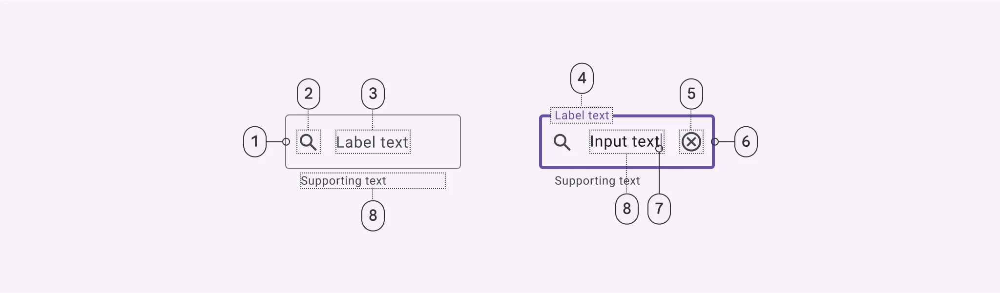
Label | The main label for form fields like inputs or dropdowns. |
Custom Color | controls the color styling of text or divider. |
Cell ID | This is the unique name for the cell. It's used to find or manage the cell later. If both cell_id and callback are provided, the system will use cell_id. |
Callback | This is the action name linked to the cell when a user interacts with it. You must add this when creating the cell. Once the cell is saved, this value can’t be changed. |
Cell Order | This controls where the cell appears inside the row (from left to right). Like callback, it must be set when creating the cell and can’t be changed later. |
Form | The type of the element. You must choose this when creating the cell, and it can't be changed later. |
Style | The visual style of the element (e.g., filled, outlined). You need to set this when creating the cell, and it can't be changed after saving. |
Version | A system-generated version number that updates automatically whenever the cell is changed. |
Body | Main text content displayed inside the cell. |
Helper | Helpful text shown below the cell to guide the user. Usually used for tips or extra context. |
Error | Error message shown when the user enters something wrong. It usually replaces the helper text. |
Prefix | Text that appears at the beginning of an input field (before the user's input). |
Suffix | Text that appears at the end of an input field (after the user's input). |
Placeholder | Light grey text is shown inside an input before anything is typed, giving a hint on what to enter. |
Trailing Icon | An icon shown at the end (right side) of the cell. |
Maximum | The highest value a user can enter in the field. |
Minimum | The lowest value a user can enter in the field. |
Value Type | The kind of data expected (like text or number). Must be set when creating the cell and stays fixed. |
Cell Query | Allows you to ask the user for special data like their location or contact number. |
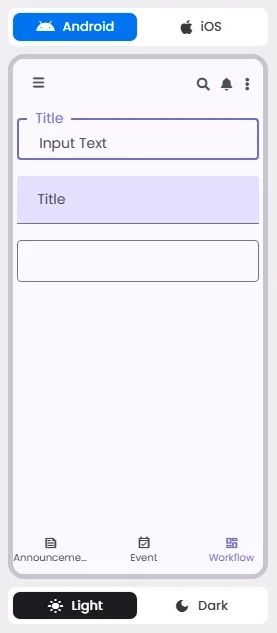
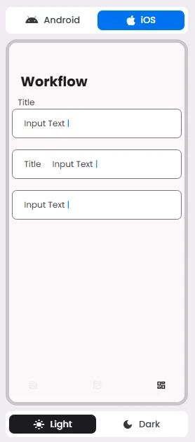
📱 Android & iOS Interface
The Text Field element adapts its appearance and layout behavior based on the platform to align with native UI guidelines:
👇🏻 Action (onClick)
Element | Purpose | Supports Actions | Notes |
Text Field | To receive a data type used for informational and structural purposes. | ❌ | Does not support actions. Used for data input, not interaction triggers. |
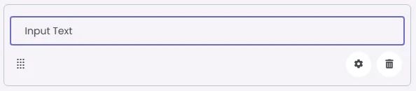
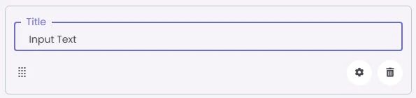
🃏 Text Fields Style Overview
Text Fields include label text in addition to leading icon, trailing icon, placeholder, error text and helper.
There are two types of them: filled and outlined.
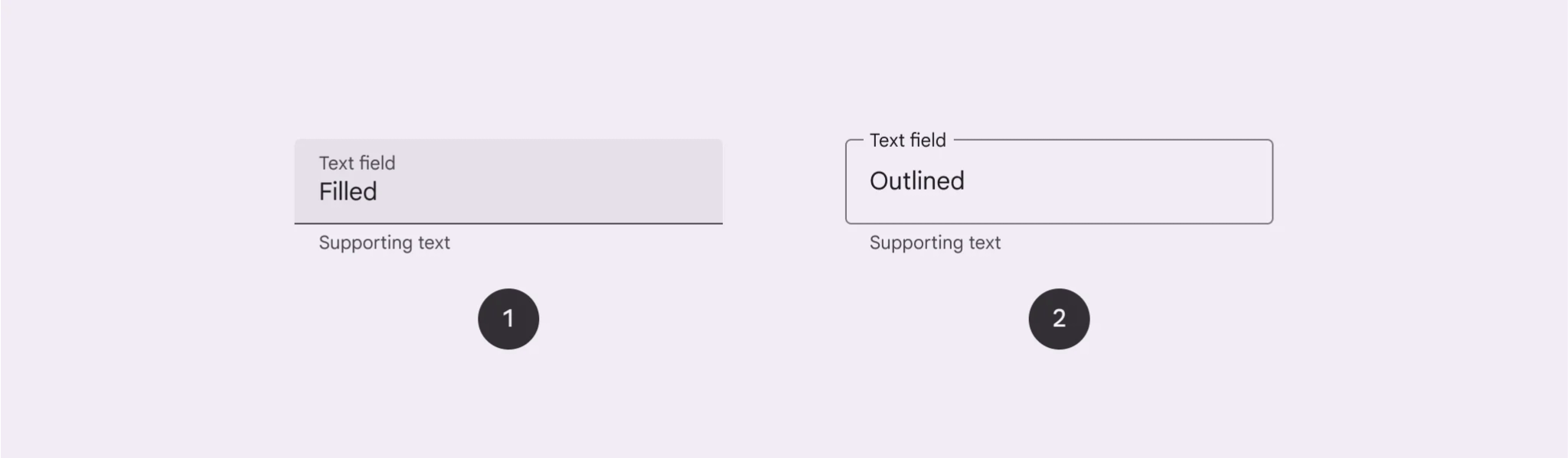
Filled text field
They have more visual emphasis than outlined text fields. They're often used in dialogs and short forms where their style draws more attention.
Outlined text field
They have less visual emphasis than filled text fields. They're often used in long forms where their reduced emphasis helps simplify the layout.
🧰 Usage
A text field is used when someone needs to enter text into the app screen, such as when filling in contact or payment information to be sent to your server; therefore, it receives and understands supporting text and error messages.
Outlined text fields don't stand out as much as filled text fields. They are less noticeable when they are in places like forms, which makes the style easier to read.
If you want to use both, you should do so in separate areas and not together in the same area. You might use drawn text fields in one part of the page and filled text fields in another.
🎨 Our Styles
Filled
Floating
Outlined