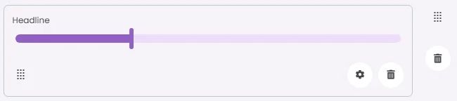
Slider controls that let users select a value or range by sliding a handle along a track are commonly used for volume, brightness, or price filtering.
🧱 Gridding Rules
You can place the Sliders element alone in the row using a flexible grid system.
Max |
60 grids |
⚙️ Settings
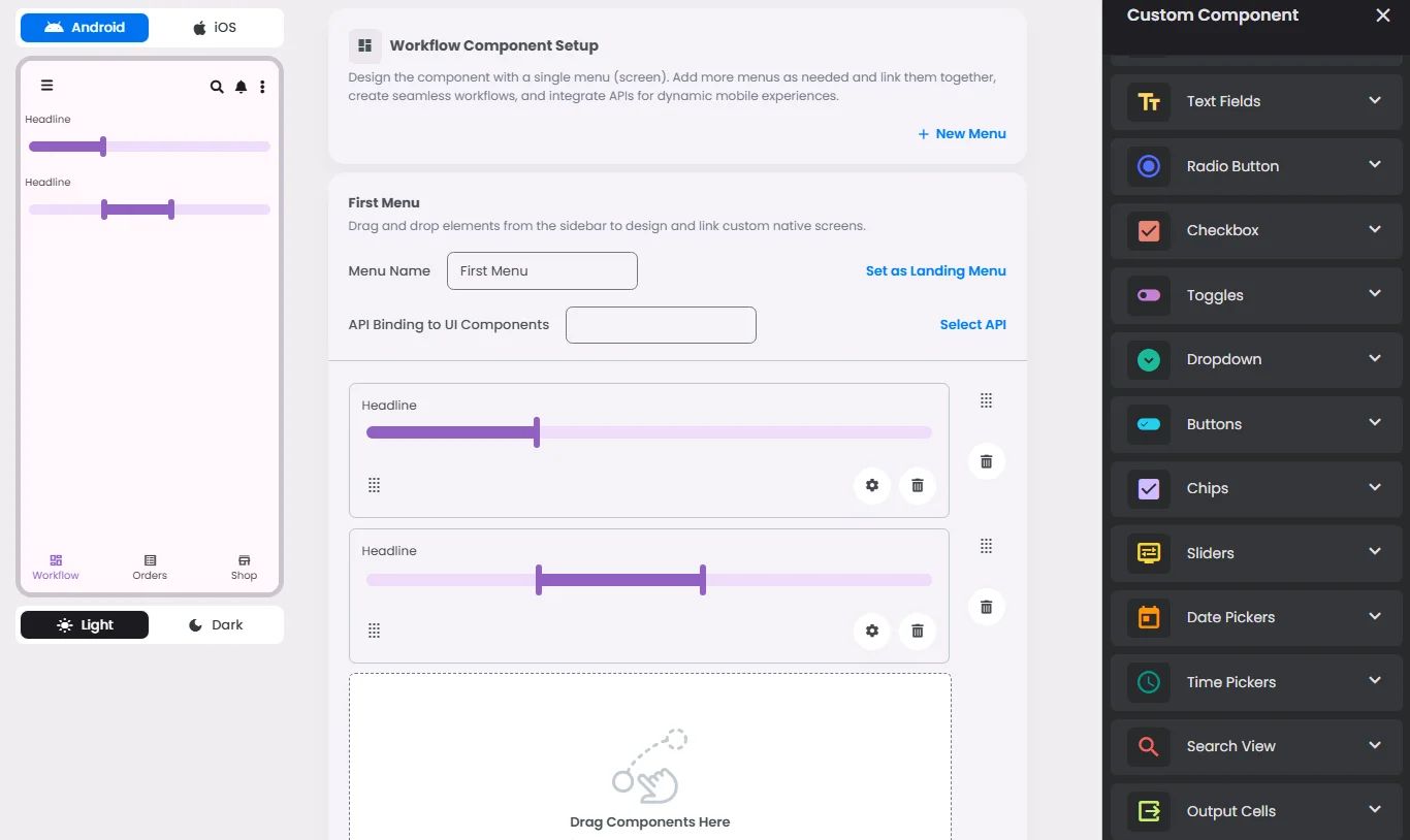
The following table outlines the available configuration options for this element. Each setting defines how the element behaves or appears within your app’s UI.
Field | Description |
Label | The main label for form fields like inputs or dropdowns. |
Icon | An icon shown at the start (left side) of the cell. |
Custom Color | controls the color styling of text or divider. |
Cell ID | This is the unique name for the cell. It's used to find or manage the cell later. If both cell_id and callback are provided, the system will use cell_id. |
Callback | This is the action name linked to the cell when a user interacts with it. You must add this when creating the cell. Once the cell is saved, this value can’t be changed. |
Cell Order | This controls where the cell appears inside the row (from left to right). Like callback, it must be set when creating the cell and can’t be changed later. |
Form | The type of the element. You must choose this when creating the cell, and it can't be changed later. |
Style | The visual style of the element (e.g., filled, outlined). You need to set this when creating the cell, and it can't be changed after saving. |
Version | A system-generated version number that updates automatically whenever the cell is changed. |
Prefix | Text that appears at the beginning of an input field (before the user's input). |
Options | A list of choices is shown to the user in dropdowns, radio buttons, or multi-select elements. Only needed for cells that require selection. |
Value | The default or current value for the cell (like a pre-selected option). |
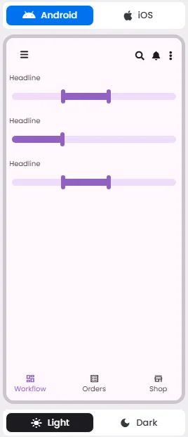
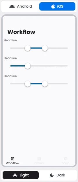
📱 Android & iOS Interface
The Sliders element adapts its appearance and layout behavior based on the platform to align with native UI guidelines:
👇🏻 Action (onClick)
Element | Purpose | Supports Actions | Notes |
Sliders | To allow users to select a single value or range from a defined scale. | ❌ | Used for input only. Does not support linking or triggering actions. Ideal for numeric or range-based selections. |
🃏 Sliders Style Overview
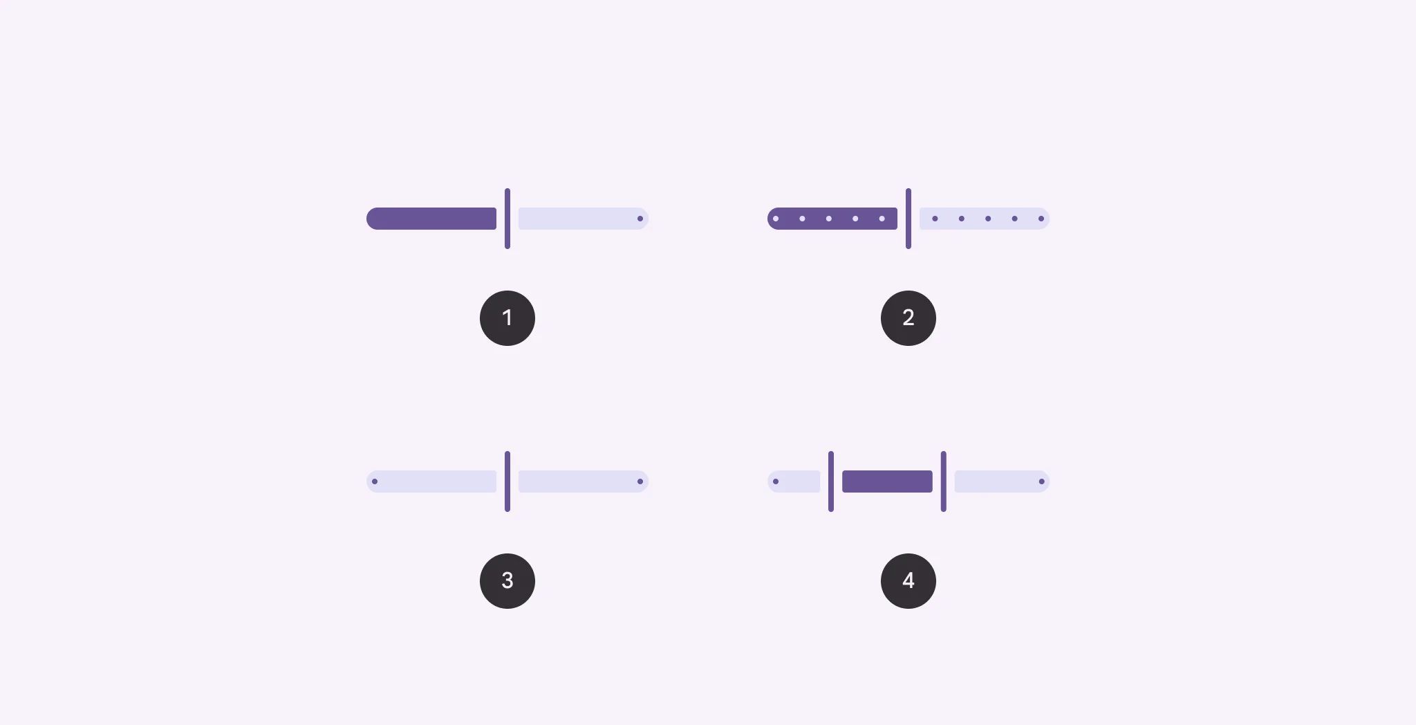
Sliders are UI controls that allow users to select a value—or a range of values—by moving a thumb along a track. They offer a visual and intuitive way to adjust settings, such as volume, brightness, or price ranges, while supporting both continuous and discrete selections.

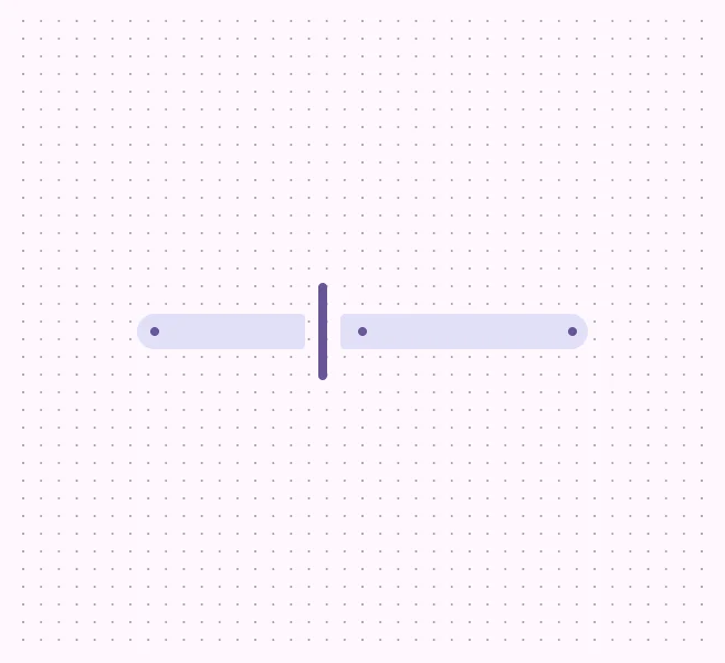
There are 4 types of them: Continuous, Discrete, Centered, Range selection.
🧰 Usage
- Continuous or discrete
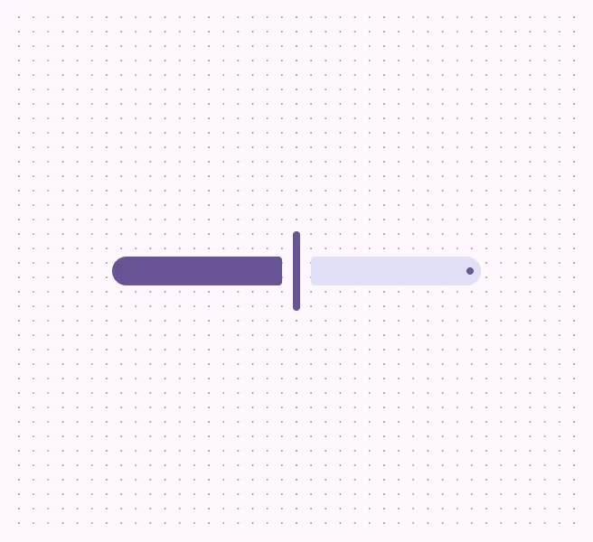
- Continuous: Selects a value from a range with no added restrictions.
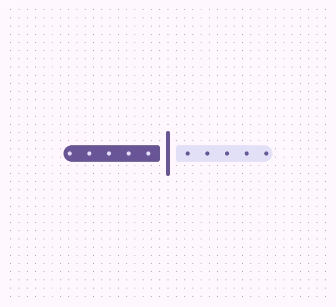
- Discrete: Selects a value from a range of predetermined values, marked by stop indicators.
- Centered: Selects a value from a positive and negative value range. The starting value is in the center.
- Range selection: Selects two values on one slider to create a range.