
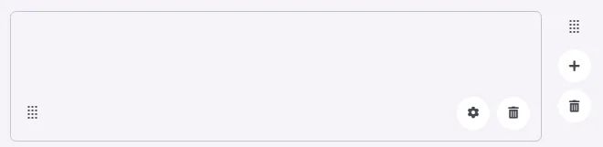
A filler is an element used to fill in spaces in your menu.
🧱 Gridding Rules
The Filler element follows a flexible grid system where it can be placed alone or alongside one other element in the same row.
Min | Max |
20 grids | 60 grids |
⚙️ Applicable Settings
The following table outlines the available configuration options for this element. Each setting defines how the element behaves or appears within your app’s UI.
Field | Description |
Cell ID | This is the unique name for the cell. It's used to find or manage the cell later. If both cell_id and callback are provided, the system will use cell_id. |
Callback | This is the action name linked to the cell when a user interacts with it. You must add this when creating the cell. Once the cell is saved, this value can’t be changed. |
Cell Order | This controls where the cell appears inside the row (from left to right). Like callback, it must be set when creating the cell and can’t be changed later. |
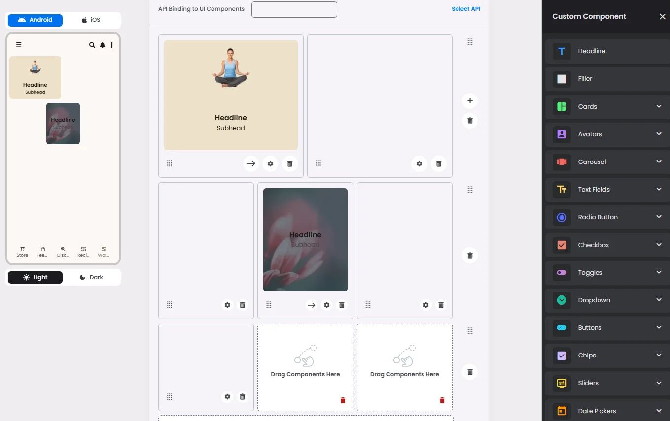
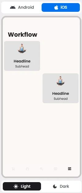
📱 UI for Android & iOS
The Filler element adapts its appearance and layout behavior based on the platform to align with native UI guidelines:

👇🏻 Action (onClick)
Element | Purpose | Supports Actions | Notes |
Filler | Occupy or pad empty spaces within workflow menus for layout consistency. | ❌ | Purely visual; helps with spacing but has no functional behavior. |