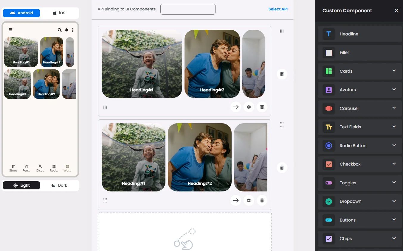
Carousels show a collection of images that can be scrolled right and left on the screen.

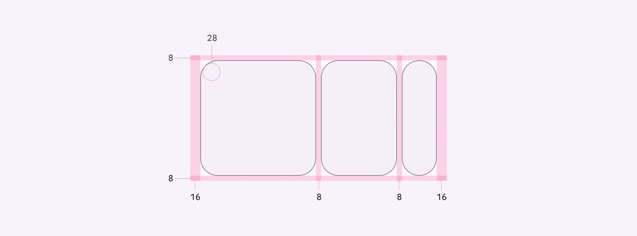
🧱 Gridding Rules
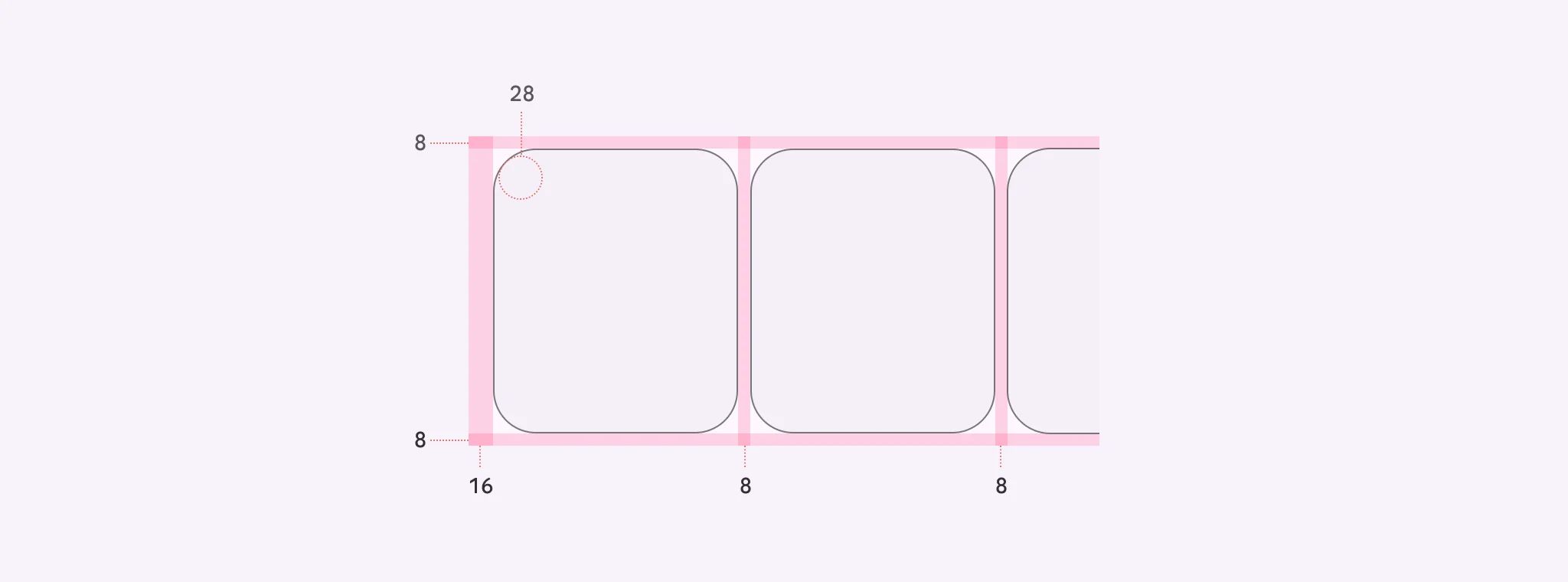
You can place the Carousel element alone in the row using a flexible grid system.
Max |
60 grids |
⚙️ Applicable Settings
The following table outlines the available configuration options for this element. Each setting defines how the element behaves or appears within your app’s UI.
Field | Description |
Label | The main label for form fields like inputs or dropdowns. |
Sublabel | Extra information shown below the label, usually for clarification. |
Text Alignment | Alignment of the text in the cell: left, center, or right. |
Font Size | Font size of the headline and subhead text. |
Cell ID | This is the unique name for the cell. It's used to find or manage the cell later. If both cell_id and callback are provided, the system will use cell_id. |
Callback | This is the action name linked to the cell when a user interacts with it. You must add this when creating the cell. Once the cell is saved, this value can’t be changed. |
Cell Order | This controls where the cell appears inside the row (from left to right). Like callback, it must be set when creating the cell and can’t be changed later. |
Style | The visual style of the element (e.g., filled, outlined). You need to set this when creating the cell, and it can't be changed after saving. |
Image | An image shown inside the cell when light mode is active. |
Image Dark | An image shown inside the cell when dark mode is active. |
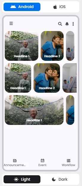
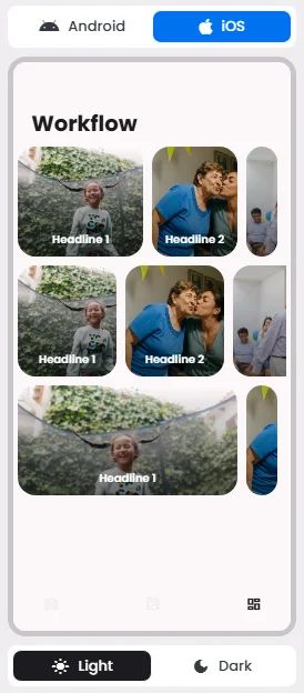
📱 Android & iOS Interface
The Carousel element adapts its appearance and layout behavior based on the platform to align with native UI guidelines:
👇🏻 Action (onClick)
Element | Purpose | Supports Actions | Available Actions |
Carousel | Present static content like images and text. | ✅1 action | 1. Create a New Component
2. Open URL
3. Chat with User
4. Open Channel
5. Chat with Group
6. Open Product Details
7. Open Booking Details
8. Open Event Details
9. Show Collection
10. Show Category
11. Map Navigation
12. Open Phone Dialer
13. Image Preview |
🃏 Carousel Style Overview
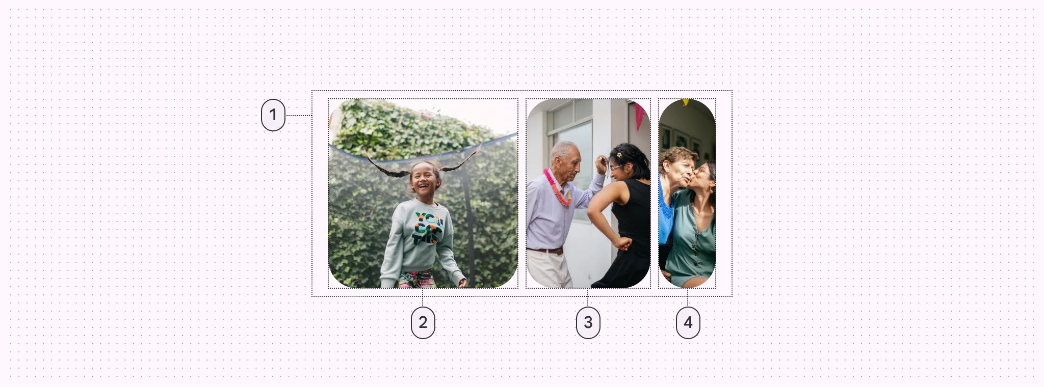
Carousels include optional label text in addition to visual elements like images and text alignment; items change size while moving through the carousel.
There are 4 layouts of them: Multi-browse, uncontained, hero, and full-screen
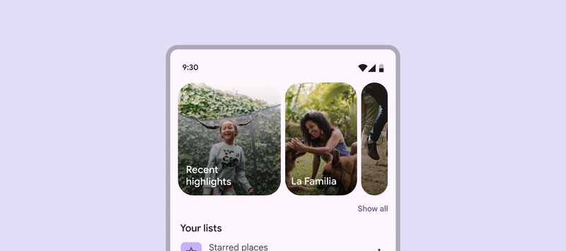
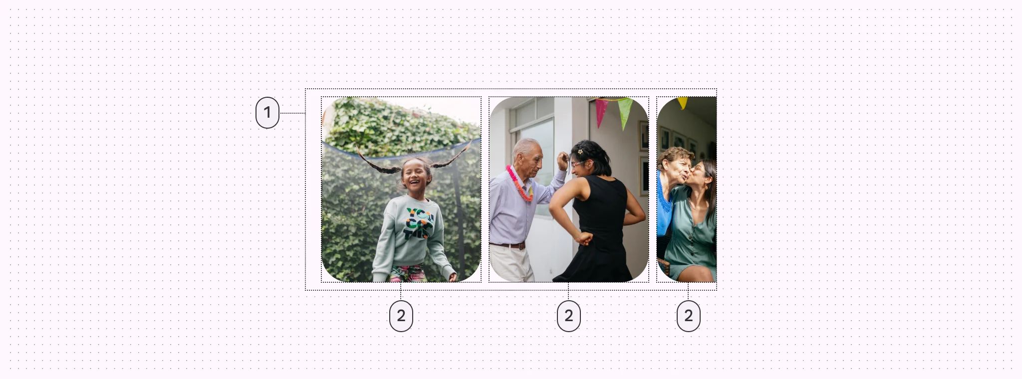
Multi-browse
It shows at least one large, medium, and small carousel image at a time.
Multi-browse carousels have padding on both sides of the container
🧰 Usage
This layout is best for browsing many images. Snap-scrolling is recommended to ensure images are recognizable and consistently sized.
Avoid using this layout if the carousel items need lots of text or have complicated imagery.
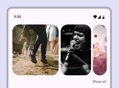
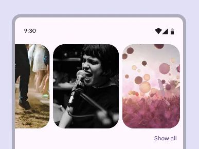
Uncontained
It shows images that scroll to the edge of the container.
Uncontained carousel items bleed over the padding on each side when scrolling.
🧰 Usage
This layout is most similar to a traditional carousel, where images are a single size and flow past the edge of the screen.
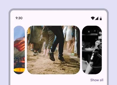
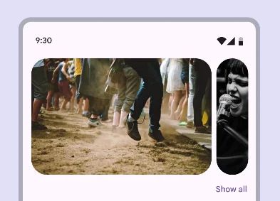
Hero
This layout shows at least one large item and one small image.
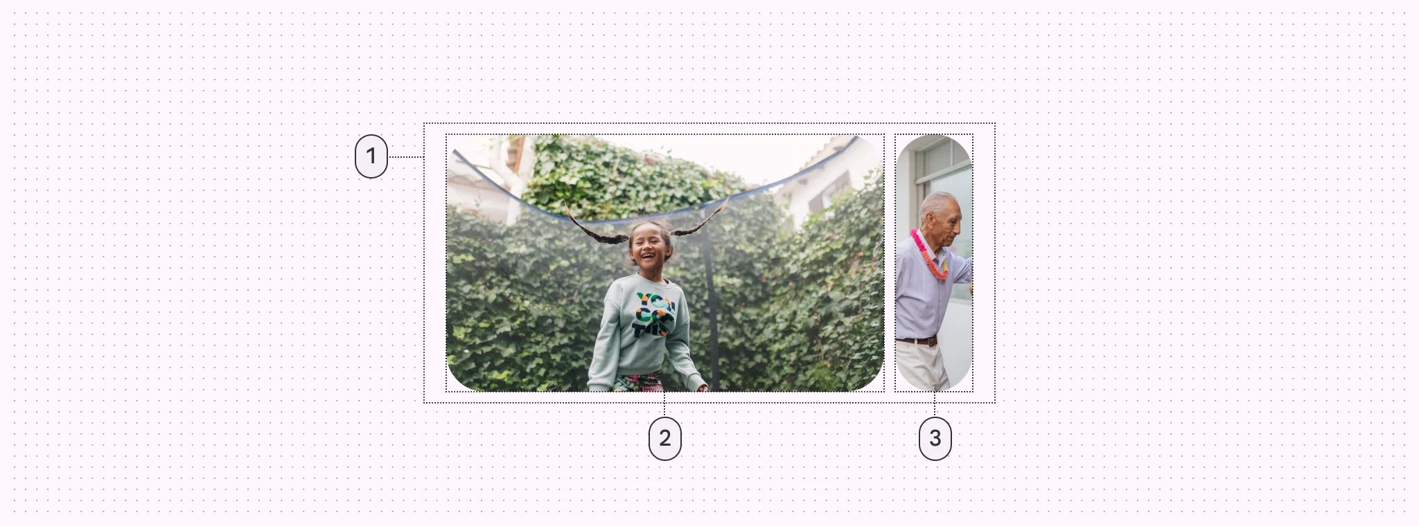
Hero carousels have padding on both sides of the container.
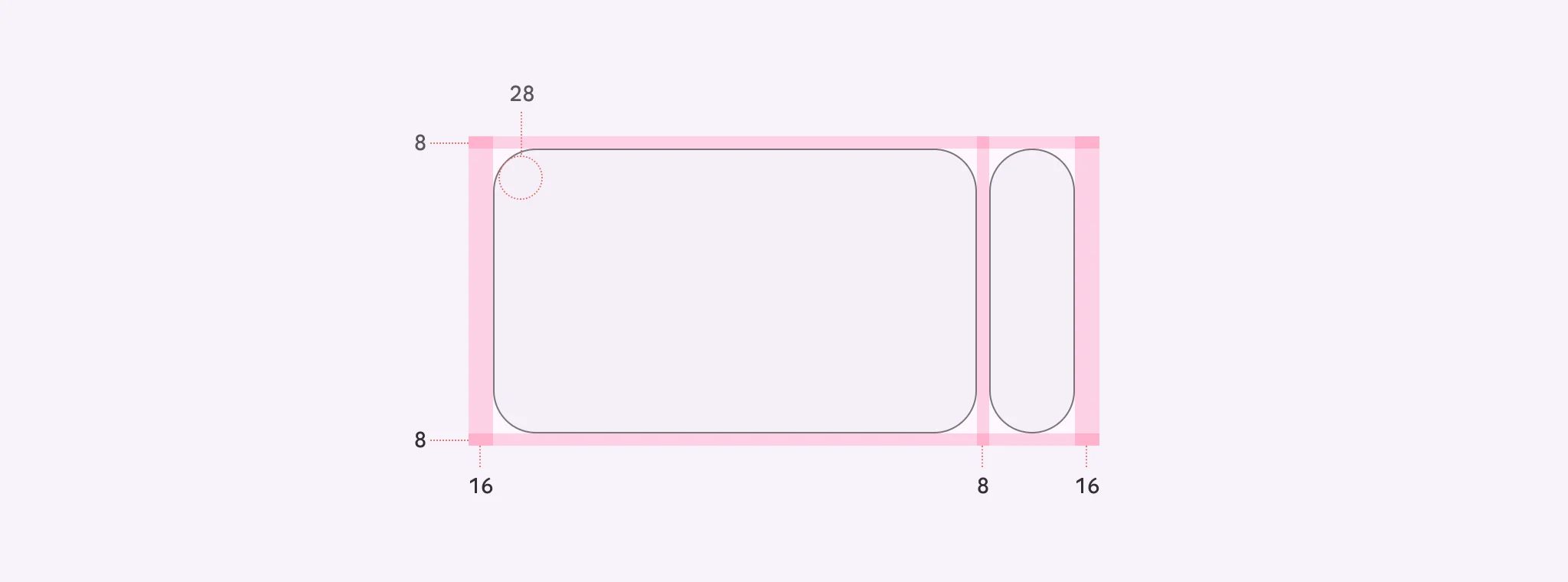
🧰 Usage
This layout is best for spotlighting content that needs more attention; it highlights one large image to focus on while providing a sneak peek of what’s next.
Center-aligned hero
It shows at least one large item and two small images.
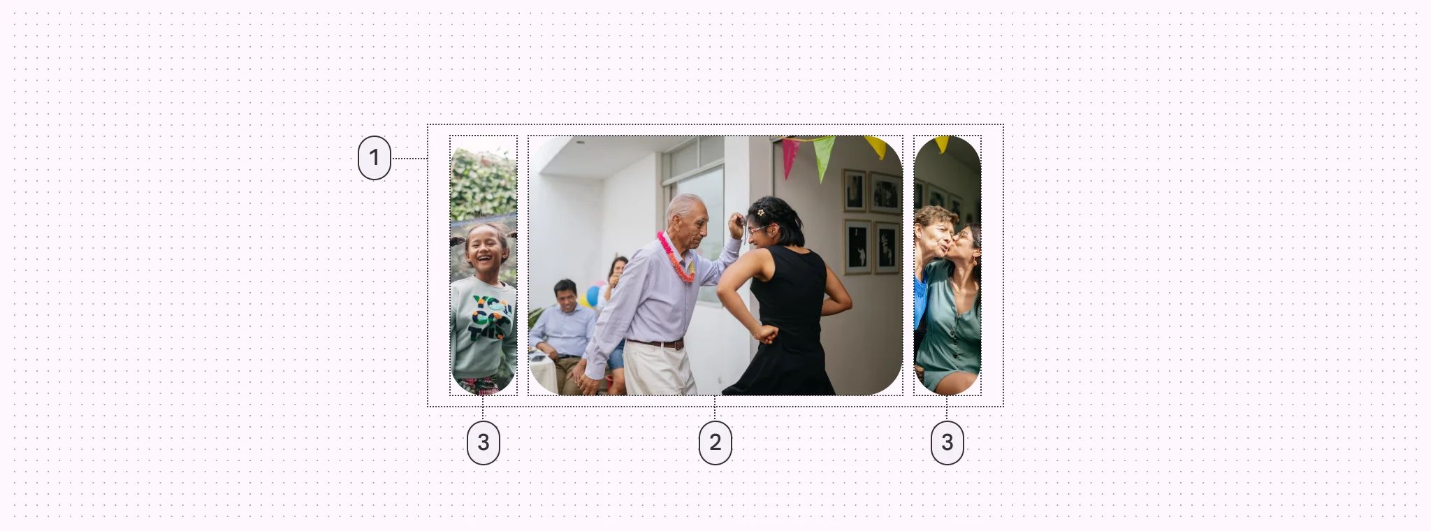
Center-aligned hero carousels have padding on both sides of the container
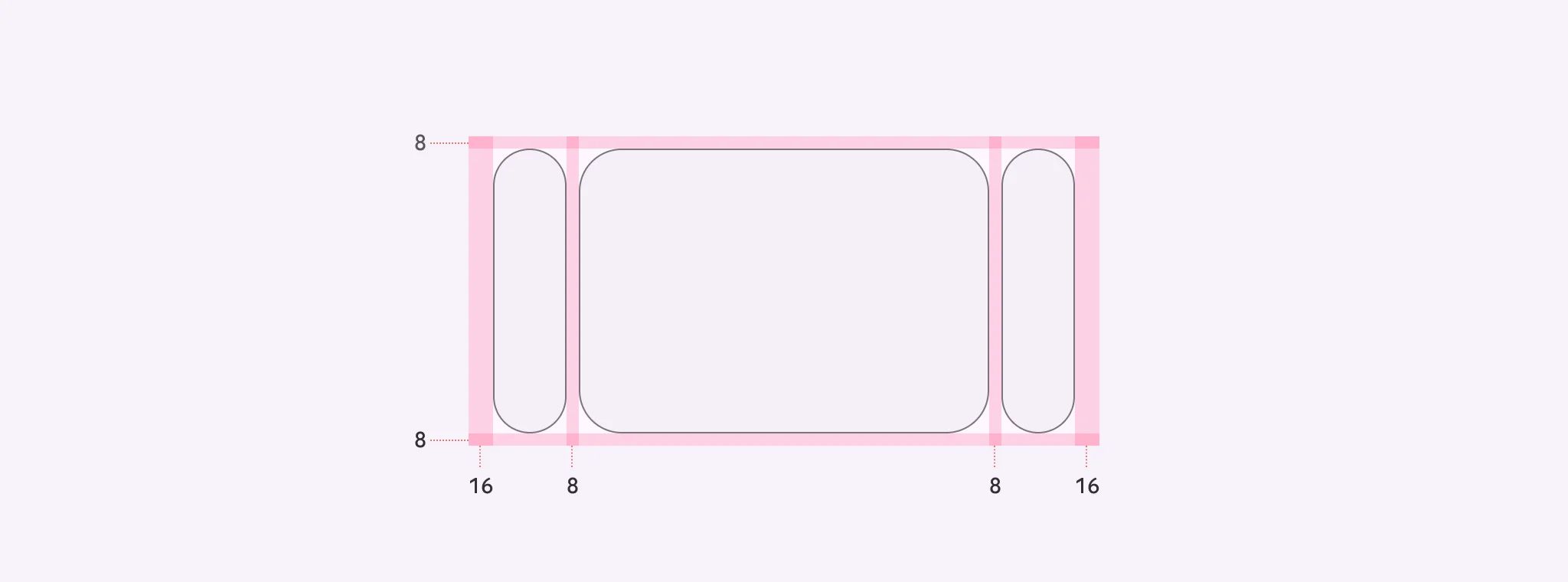
🧰 Usage
When the hero layout is center-aligned, it adds an additional previewed image on the leading edge, making the large carousel item centered.