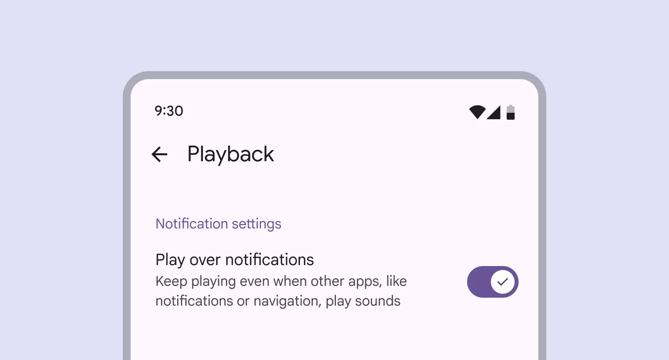
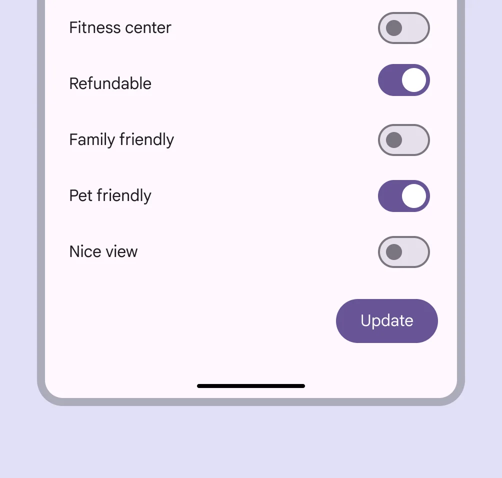
Toggles are used to quickly switch between two states—on or off—for a single setting.
🧱 Gridding Rules
You can place the Toggles element alone in the row using a flexible grid system.
Max |
60 grids |
⚙️ Applicable Settings
The following table outlines the available configuration options for this element. Each setting defines how the element behaves or appears within your app’s UI.
Field | Description |
Headline | A main title is shown in the cell if supported by the element type. |
Subhead | A smaller, secondary title is shown below the headline. |
Image | An image shown inside the cell when light mode is active. |
Icon | An icon shown at the start (left side) of the cell. |
Divider | Shows a line under the cell to separate it from others, if supported. Default is off. |
Font Size | Controls how large or small the text appears in the cell. |
Text Alignment | Adjusts how the content inside the cell is aligned — left, center, or right. |
Options | A list of choices is shown to the user in dropdowns, radio buttons, or multi-select elements. Only needed for cells that require selection. |
Custom Color | controls the color styling of text or divider. |
Cell ID | This is the unique name for the cell. It's used to find or manage the cell later. If both cell_id and callback are provided, the system will use cell_id. |
Callback | This is the action name linked to the cell when a user interacts with it. You must add this when creating the cell. Once the cell is saved, this value can’t be changed. |
Cell Order | This controls where the cell appears inside the row (from left to right). Like callback, it must be set when creating the cell and can’t be changed later. |
Form | The type of the element. You must choose this when creating the cell, and it can't be changed later. |
Value | The default or current value for the cell (like a pre-selected option). |
Style | The visual style of the element (e.g., filled, outlined). You need to set this when creating the cell, and it can't be changed after saving. |
Version | A system-generated version number that updates automatically whenever the cell is changed. |
Body | Main text content displayed inside the cell. |
Helper | Helpful text shown below the cell to guide the user. Usually used for tips or extra context. |
Error | Error message shown when the user enters something wrong. It usually replaces the helper text. |
Prefix | Text that appears at the beginning of an input field (before the user's input). |
Suffix | Text that appears at the end of an input field (after the user's input). |
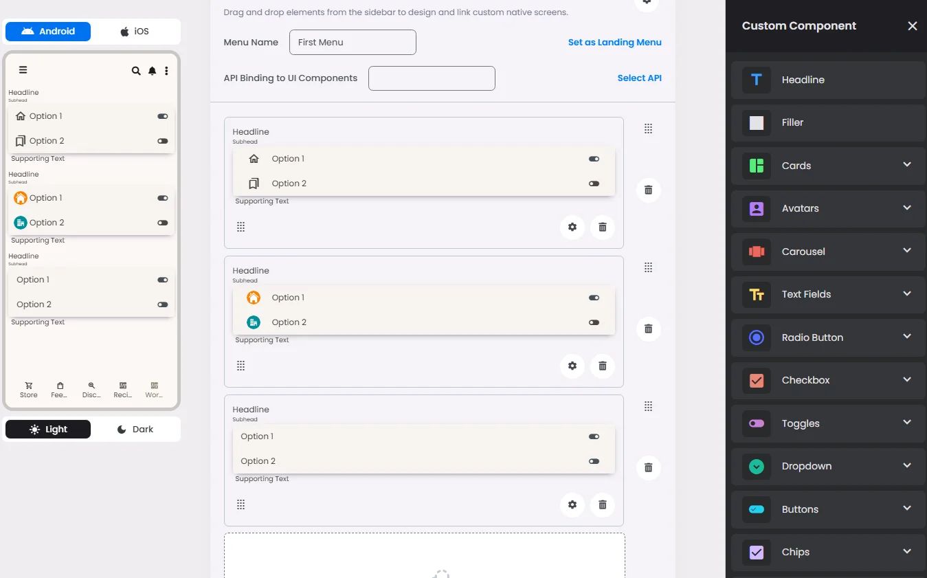
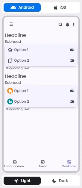
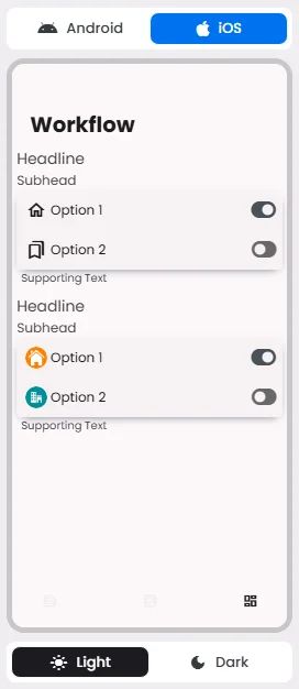
📱 Android & iOS Interface
The Toggle element adapts its appearance and layout behavior based on the platform to align with native UI guidelines:
👇🏻 Action (onClick)
Element | Purpose | Supports Actions | Notes |
Toggle | To provide a binary choice (on/off) for a single setting or preference. | ❌ | Informational/structural use only. Not designed to trigger interactive actions. |
🃏 Toggles Style Overview
Toggles are used when each item in a list can be changed separately. When you turn a switch, the results should start right away, without having to save.

🧰 Usage
Use toggle to:
- Toggle a single item on or off
- Immediately activate or deactivate something

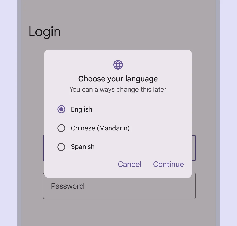
Checkboxes, radio buttons, and switches help people decide what to do, like picking options or turning settings on and off.
🟠Checkboxes let you choose more than one choice in a list that is related.
🟠Radio buttons let you pick one item from a list.
🟠Switches let you choose choices that stand alone or that give you more information from a list, like settings.
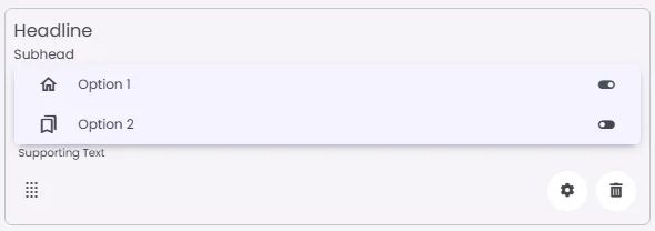
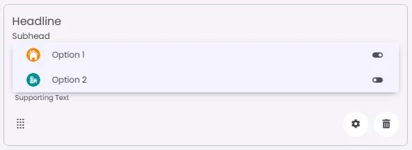
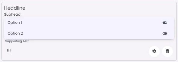
🎨 Our Styles
Standard
Image
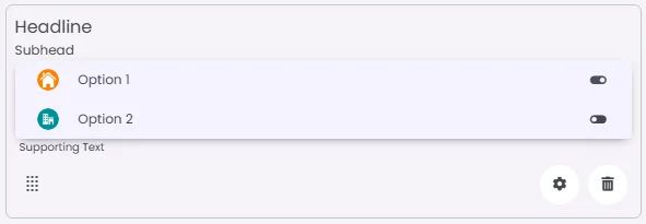
Iconic