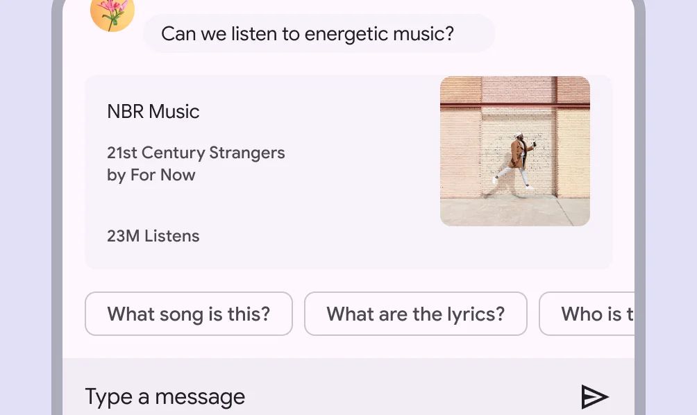
Chips are compact elements that represent inputs, attributes, or actions. They help users make selections, filter content, or trigger actions in a visually lightweight and space-efficient way.
🧱 Gridding Rules
You can place the Chips element alone in the row using a flexible grid system.
Max |
60 grids |
⚙️ Settings
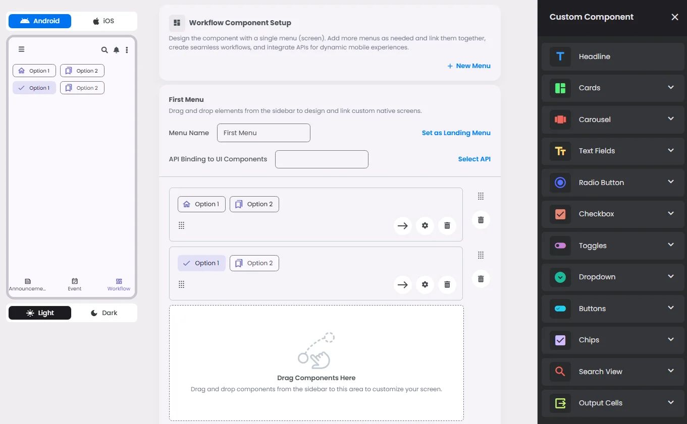
The following table outlines the available configuration options for this element. Each setting defines how the element behaves or appears within your app’s UI.
Field | Description |
Label | The main label for form fields like inputs or dropdowns. |
Icon | An icon shown at the start (left side) of the cell. |
Custom Color | controls the color styling of text or divider. |
Cell ID | This is the unique name for the cell. It's used to find or manage the cell later. If both cell_id and callback are provided, the system will use cell_id. |
Callback | This is the action name linked to the cell when a user interacts with it. You must add this when creating the cell. Once the cell is saved, this value can’t be changed. |
Cell Order | This controls where the cell appears inside the row (from left to right). Like callback, it must be set when creating the cell and can’t be changed later. |
Form | The type of the element. You must choose this when creating the cell, and it can't be changed later. |
Style | The visual style of the element (e.g., filled, outlined). You need to set this when creating the cell, and it can't be changed after saving. |
Version | A system-generated version number that updates automatically whenever the cell is changed. |
Prefix | Text that appears at the beginning of an input field (before the user's input). |
Options | A list of choices is shown to the user in dropdowns, radio buttons, or multi-select elements. Only needed for cells that require selection. |
Value | The default or current value for the cell (like a pre-selected option). |
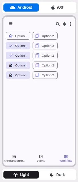
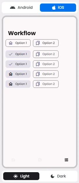
📱 Android & iOS Interface
The Chips element adapts its appearance and layout behavior based on the platform to align with native UI guidelines:
👇🏻 Action (onClick)
Element | Purpose | Supports Actions | Available Actions |
Chips | To represent inputs, filters, or trigger actions in a compact form. | ✅ | 1. Create a New Component
2. Select an Existing Component
3. Select an Existing Screen
4. Open URL
5. Execute Function:
⇒ Search
⇒ Search View |
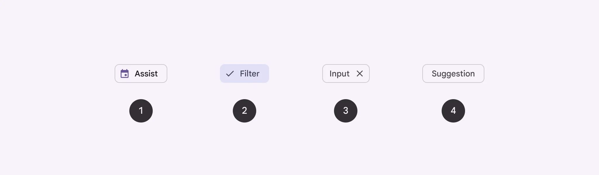
🃏 Chips Style Overview
Chips are used to show options for a specific context.

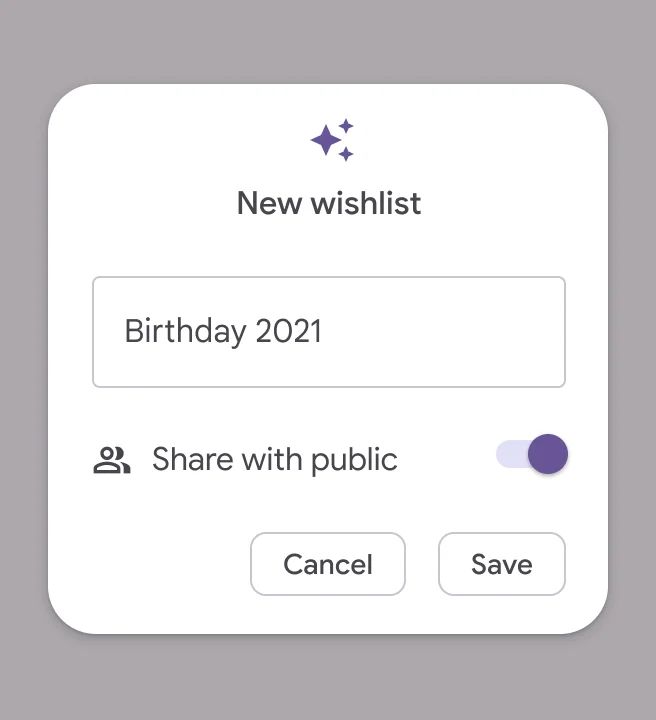
There are four types of them: Assist, Filter, Input & Suggestion.
🧰 Usage
Chips help people enter information, make selections, filter content, or trigger actions. They're best used to help users accomplish their current task faster and easier.
Use chips to enhance the user's current journey and encourage action, and buttons to progress through the product and take significant actions.
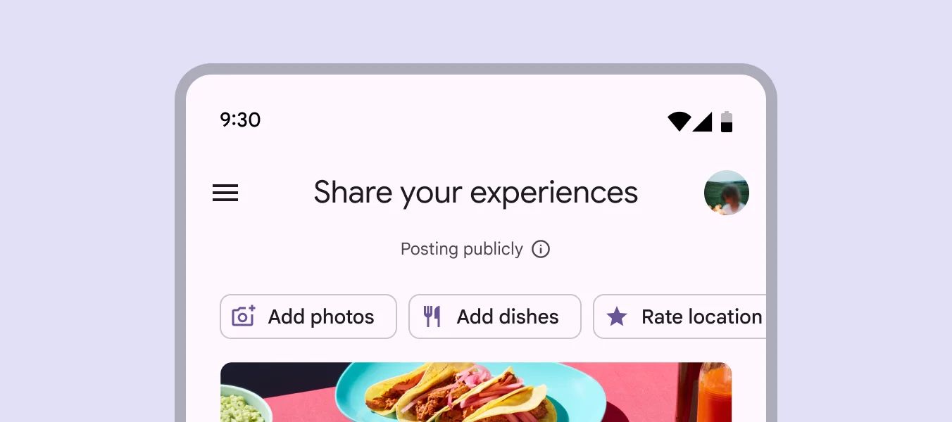
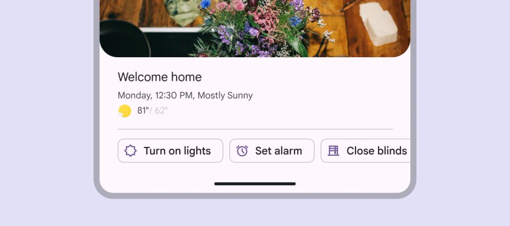
Assist Chips

🧰 Usage
Assist chips let you do smart or automatic things across multiple apps, like starting an event on your calendar from the home screen.

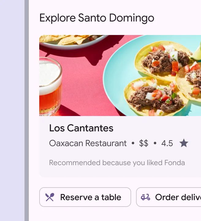
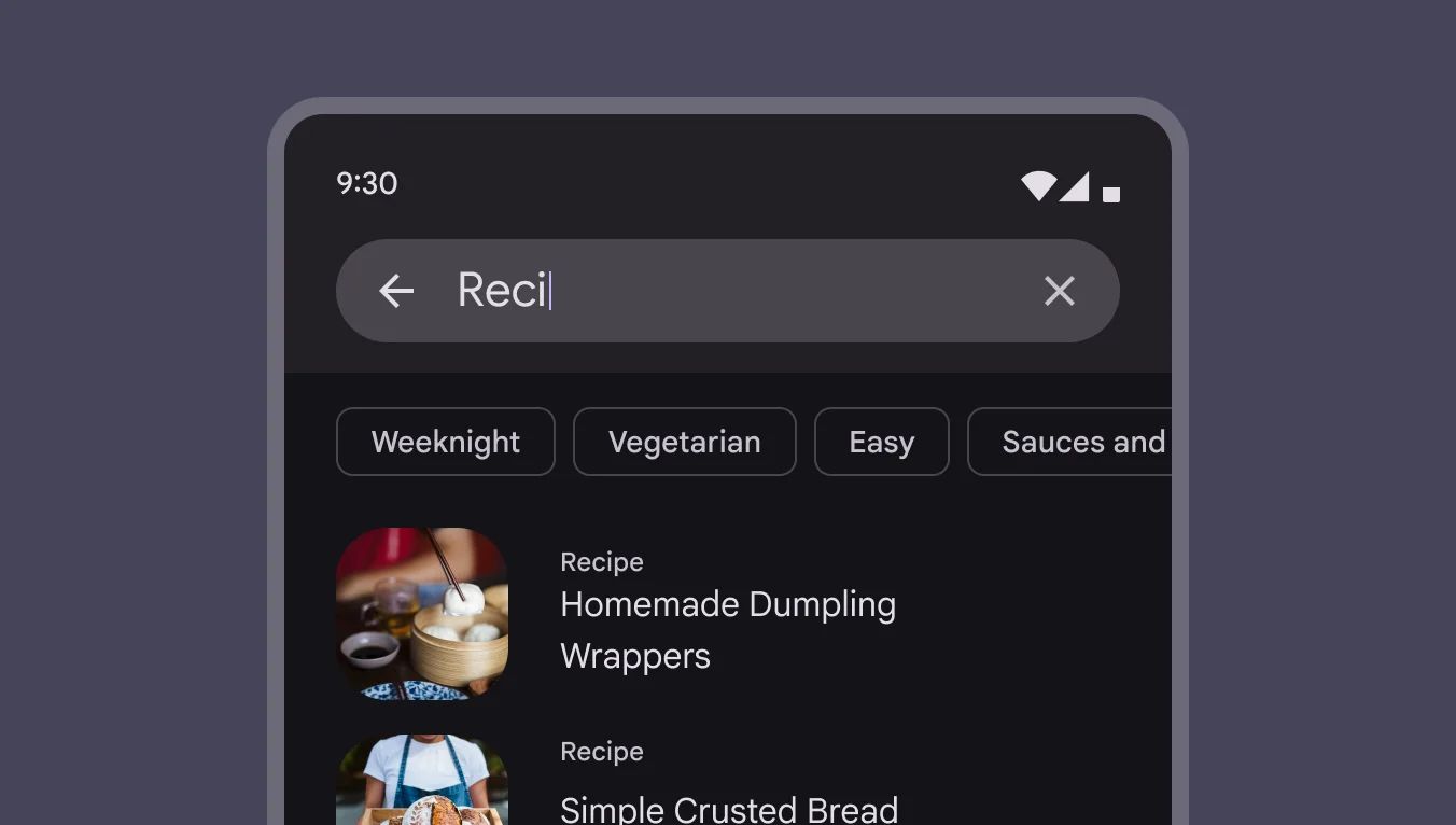
Filter Chips

🧰 Usage
Filter chips use tags or descriptive words to filter content. They can be a beneficial alternative to segmented buttons or checkboxes when viewing a list or search results.
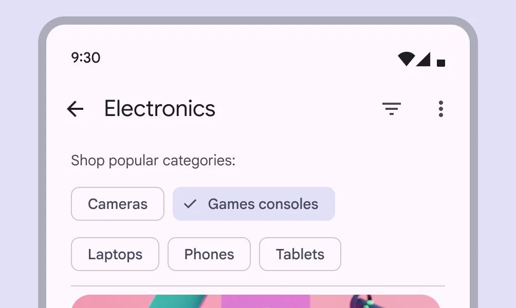
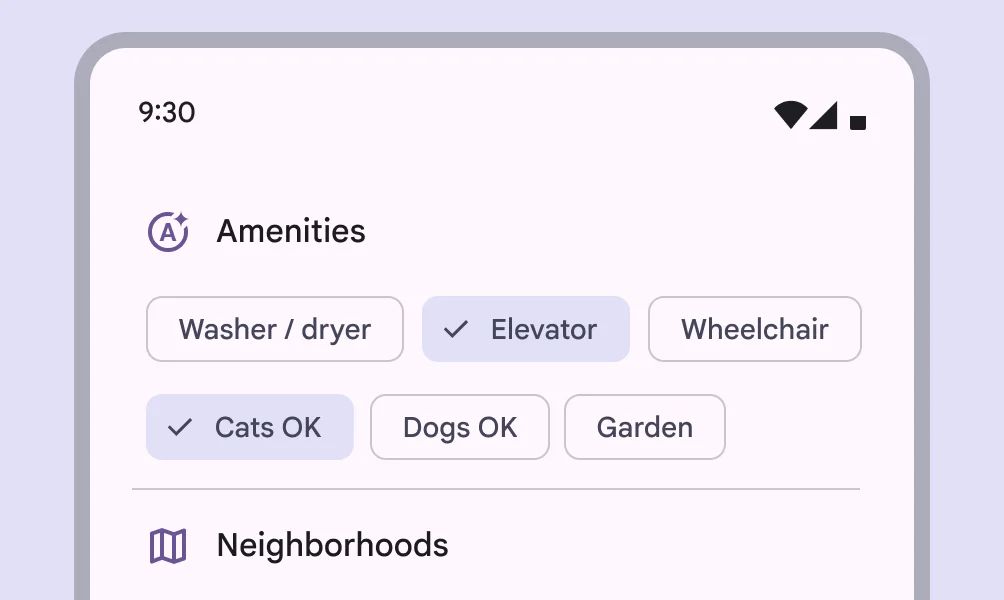
Filter chips can be used with other components, such as search fields and sheets.
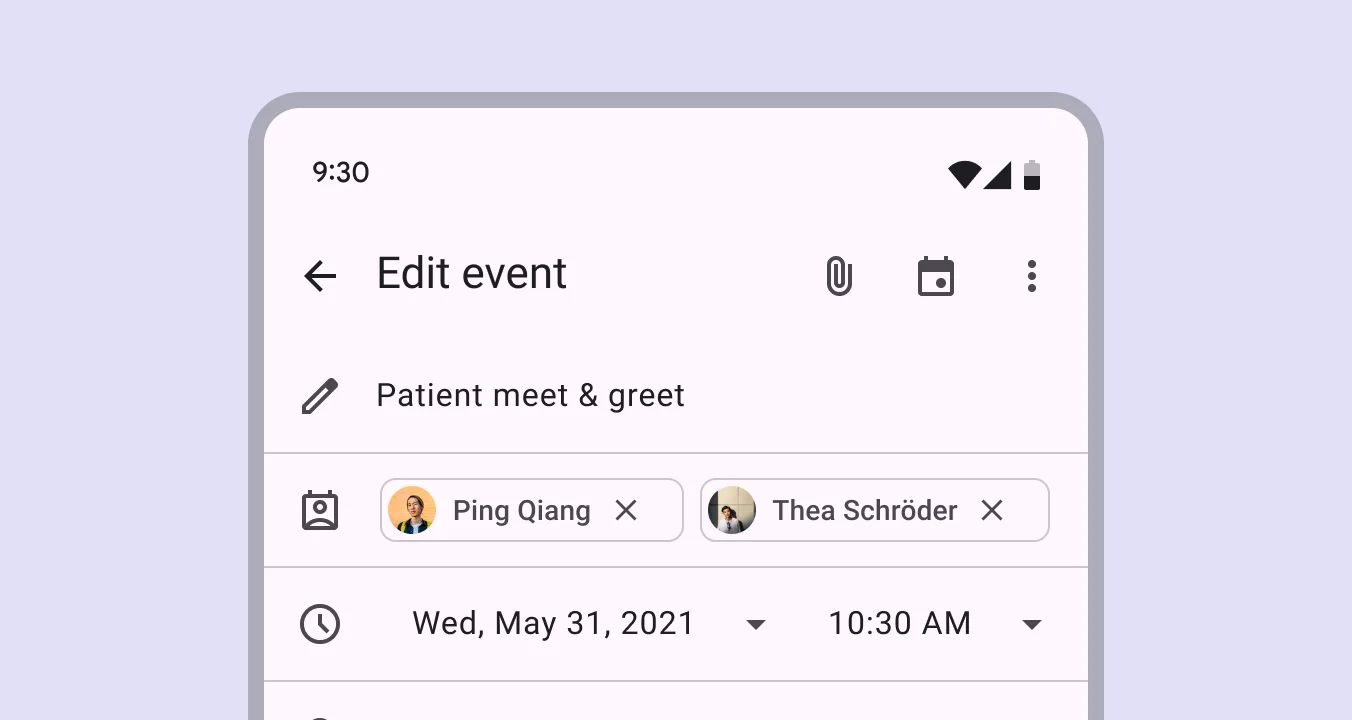
Input Chips

🧰 Usage
Input chips represent discrete pieces of information entered by a user, such as Gmail contacts or filter options within a search field.
Suggestion Chips

🧰 Usage
Suggestion chips help narrow a user’s intent by presenting dynamically generated suggestions, such as possible responses or search filters.