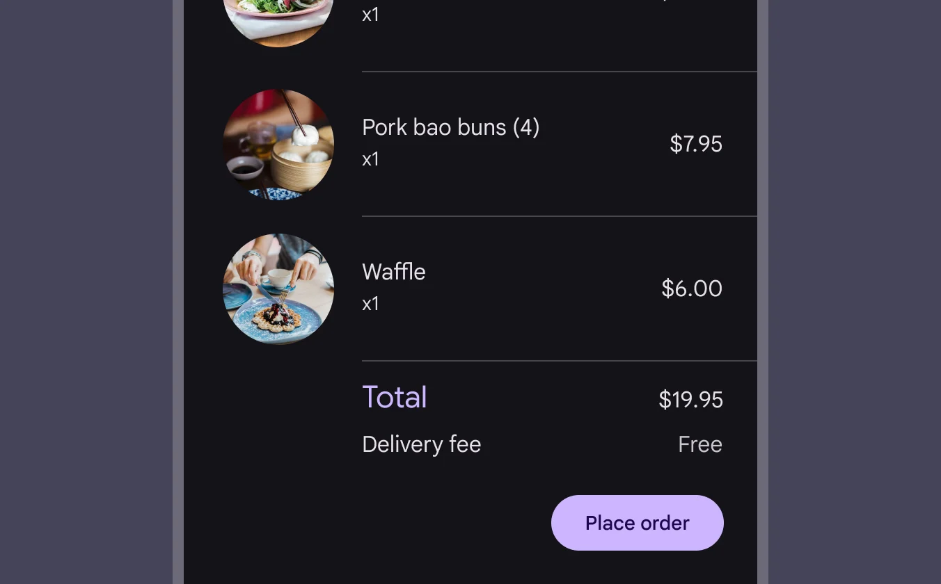
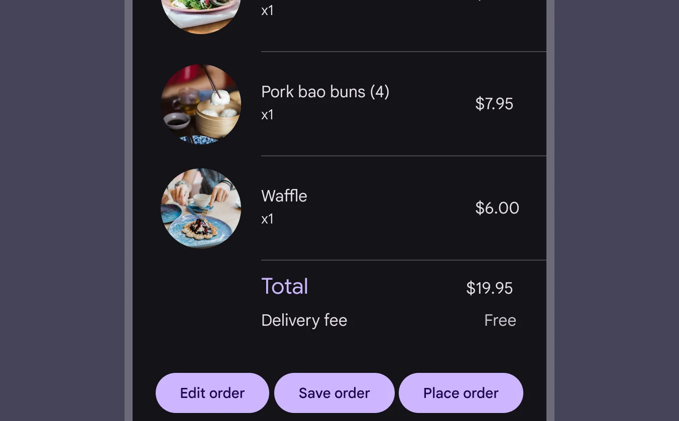
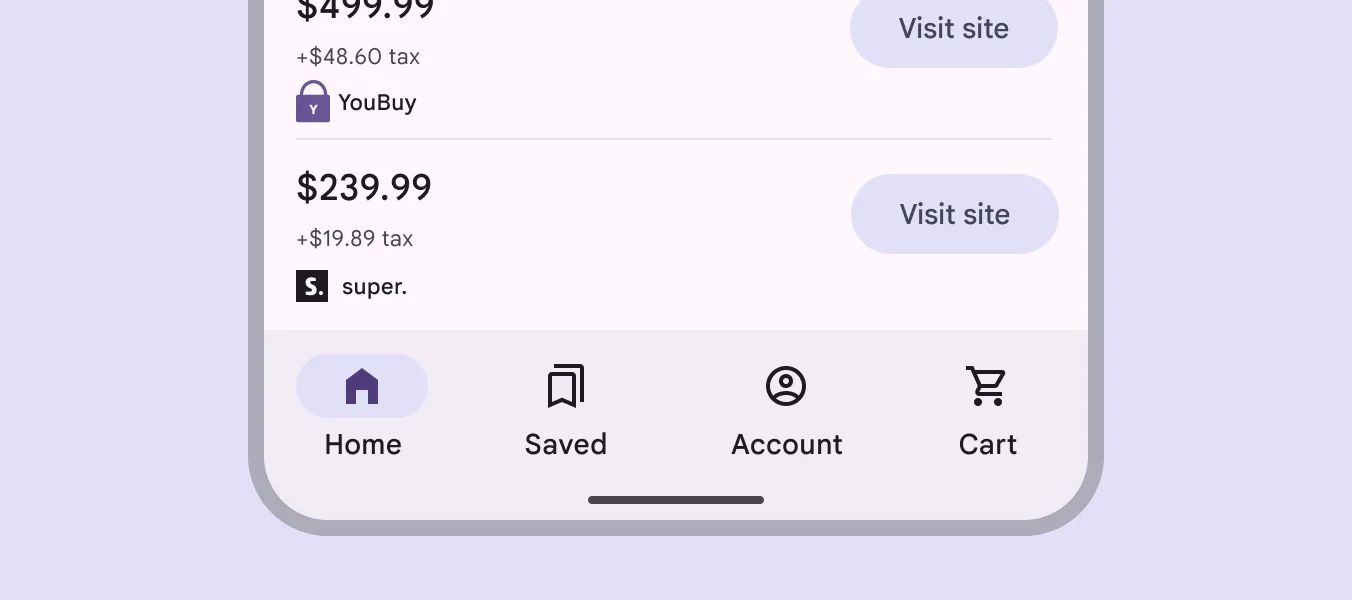
Buttons are for initiating actions and making choices with a single tap.
🧱 Gridding Rules
The Button element follows a flexible grid system where it can be placed alone or alongside one other element in the same row.
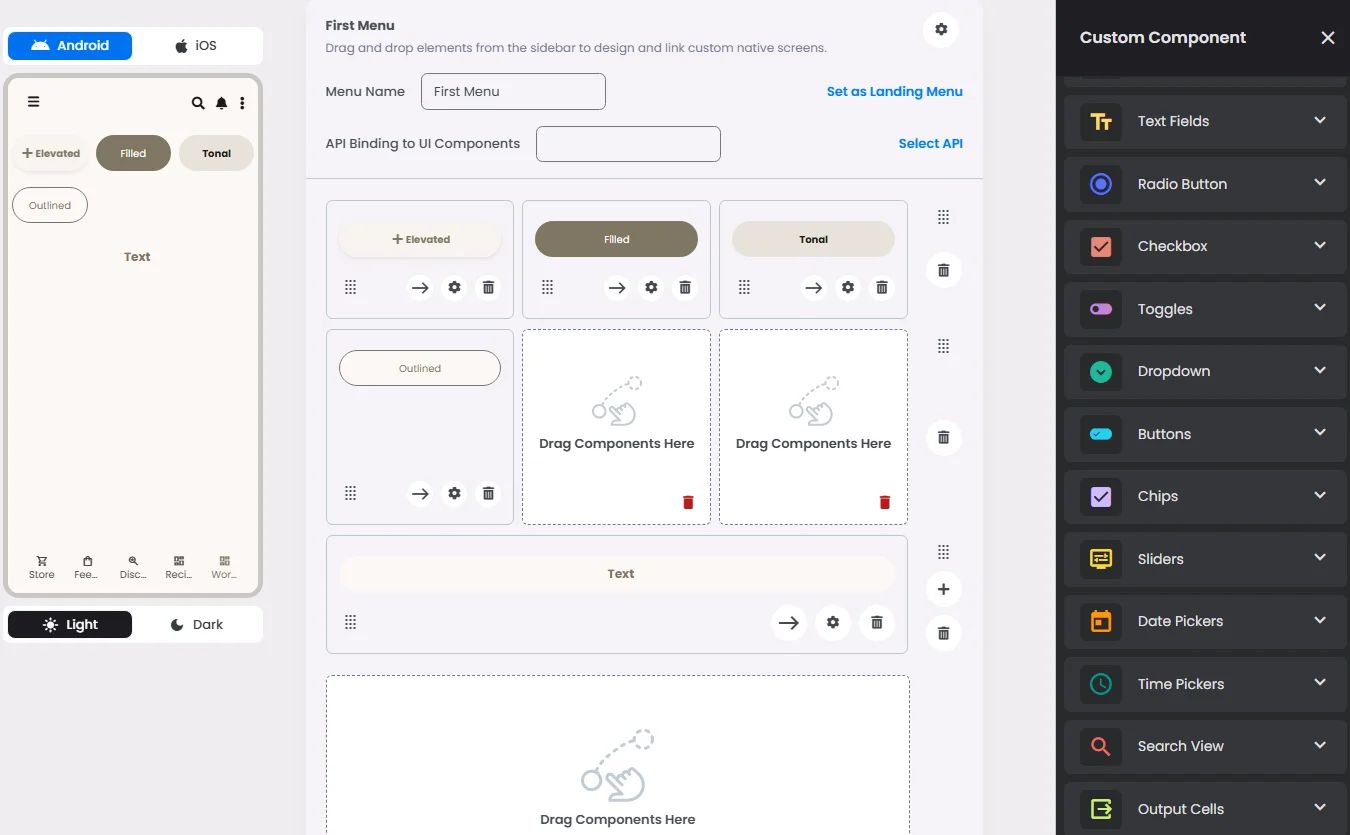
- For button types: Elevated, Filled, Filled tonal, Outline & Text buttons.
Min | Max |
20 grids | 60 grids |
- For button type: Segmented button.
Max |
60 grids |
⚙️ Applicable Settings
The following table outlines the available configuration options for this element. Each setting defines how the element behaves or appears within your app’s UI.
Field | Description |
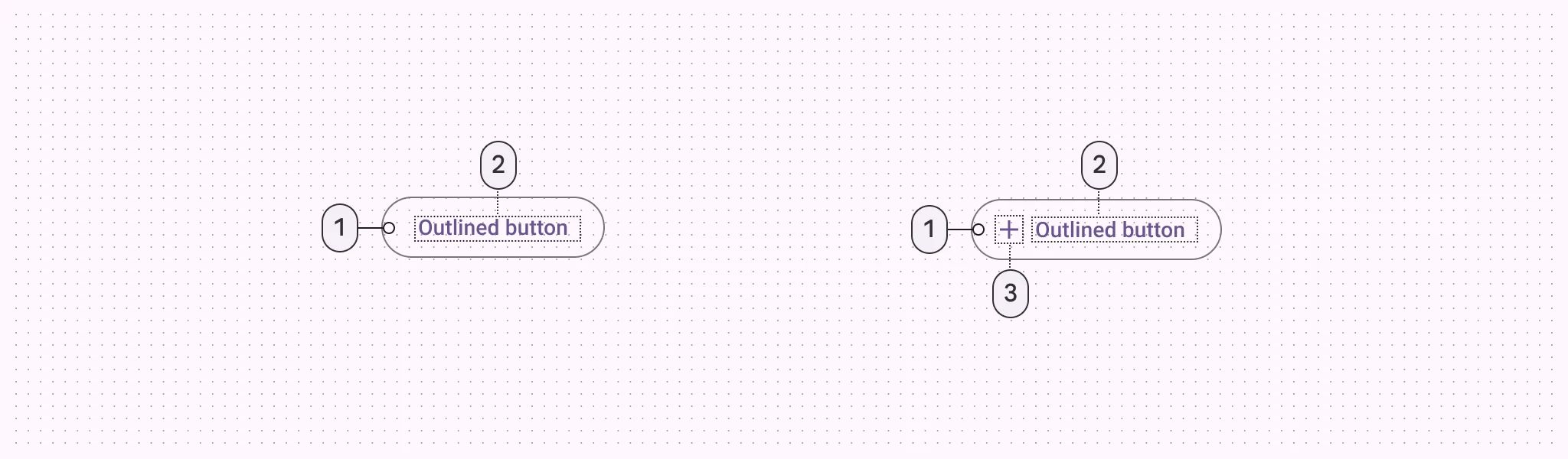
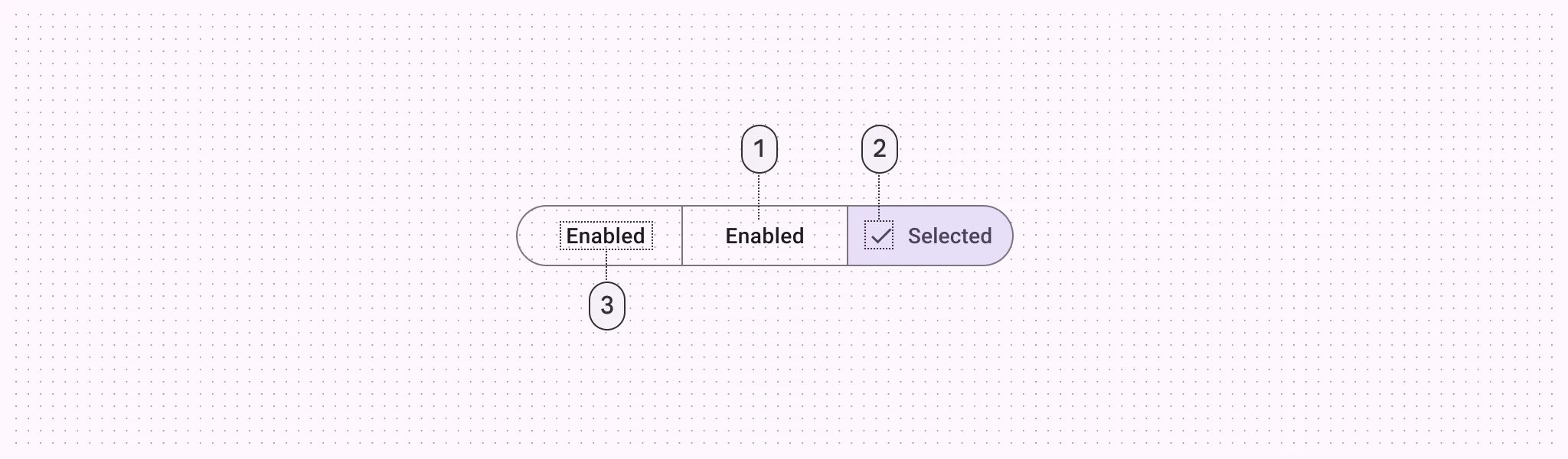
Label | The main label for form fields like inputs or dropdowns. |
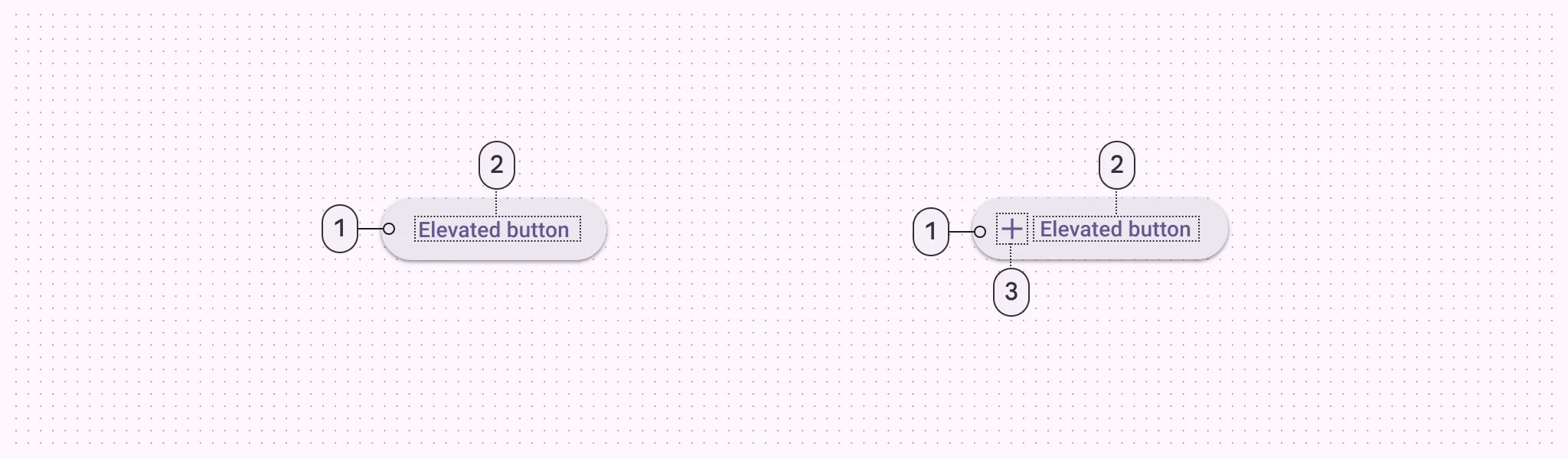
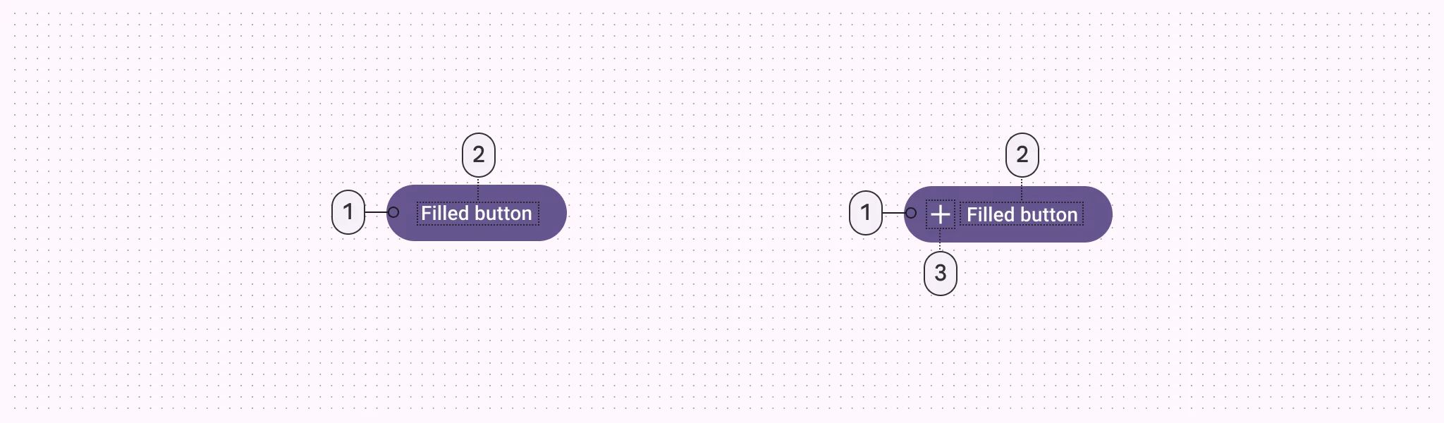
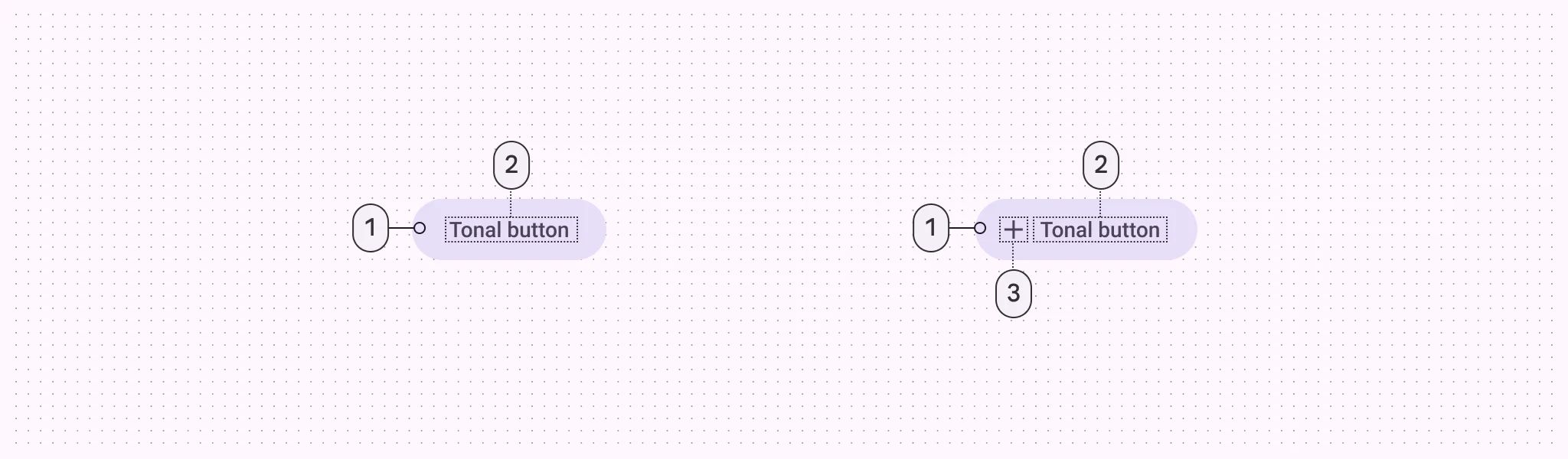
Cell ID | This is the unique name for the cell. It's used to find or manage the cell later. If both cell_id and callback are provided, the system will use cell_id. |
Callback | This is the action name linked to the cell when a user interacts with it. You must add this when creating the cell. Once the cell is saved, this value can’t be changed. |
Cell Order | This controls where the cell appears inside the row (from left to right). Like callback, it must be set when creating the cell and can’t be changed later. |
Custom Color | controls the color styling of text or divider. |
Style | The visual style of the element (e.g., filled, outlined). You need to set this when creating the cell, and it can't be changed after saving. |
Prefix | Text that appears at the beginning of an input field (before the user's input). |
Icon | An icon shown at the start (left side) of the cell. |
Submit | Defines which values get submitted when this cell is triggered: |
Next | What happens after the cell is triggered — open another screen or menu, or run a function. You must set this during creation, and it can’t be changed afterward. |
Options | A list of choices is shown to the user in dropdowns, radio buttons, or multi-select elements. Only needed for cells that require selection. |
Value | The default or current value for the cell (like a pre-selected option). |
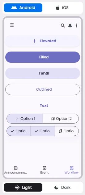
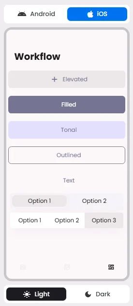
📱 Android & iOS Interface
The Button element adapts its appearance and layout behavior based on the platform to align with native UI guidelines:
🔘 Actions
Element | Supports Actions | Available Actions |
Elevated button
Filled button
Filled tonal button
Outline button
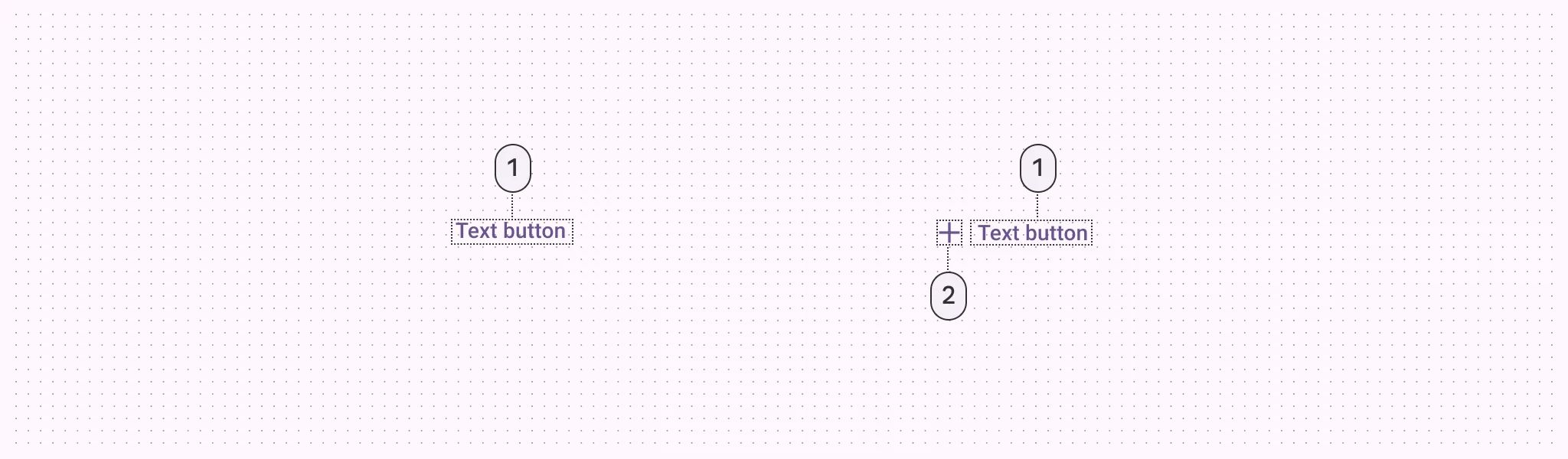
Text button | ✅1 action | 1. Create a New Component
2. Open URL
3. Chat with User
4. Open Channel
5. Chat with Group
6. Open Product Details
7. Open Booking Details
8. Open Event Details
9. Show Collection
10. Show Category
11. Map Navigation
12. Open Phone Dialer
13. Image Preview |
Segmented button | ❌ | ❌ |
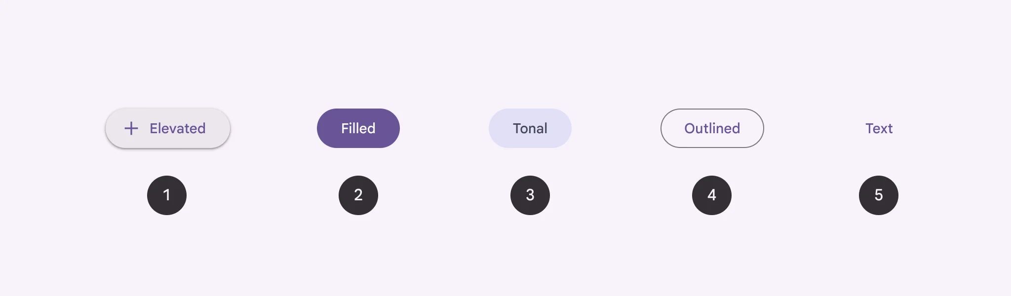
🃏 Button Style Overview
Buttons are elements that allow users to perform actions, make choices, or navigate within an app.
There are 5 types of them: Elevated, Filled, filled tonal, Outlined, Text, and Segmented—each designed to express different levels of emphasis and hierarchy within the user interface.
Buttons communicate actions that users can take; they are just one option for representing actions in a product and shouldn’t be overused. Too many buttons on a screen disrupt the visual hierarchy.
Segmented buttons help people select options, switch views, or sort elements.
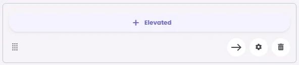
Elevated Button
🧰 Usage
Only use elevated buttons when absolutely necessary, such as when the button requires visual separation from a patterned background or when it needs to stand out from a colored background.
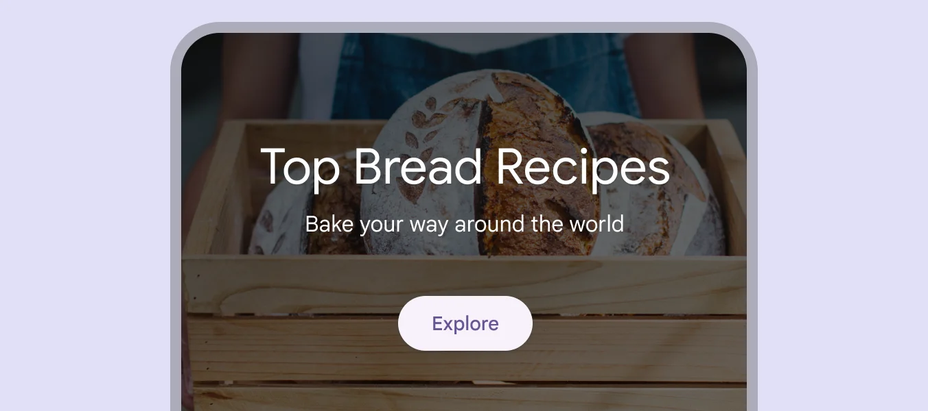
Filled Button
🧰 Usage
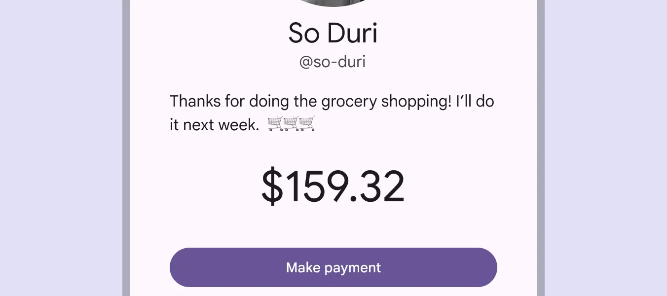
Use filled buttons for crucial final actions that finish a flow, such as "Save," "Join now," or "Confirm.” Use it for the final steps in a flow or to remove any blocks.
Filled Tonal Button
🧰 Usage
They're useful when a lower-priority button, like "Next" in an onboarding flow, needs a little more focus than an outline would give it.
Outlined Button
🧰 Usage
They have acts that are important but not the primary action in an app, like ‘‘See all’’ or ‘’Add to cart.’’. Outlined buttons are visually appealing when placed next to filled buttons, as they indicate an alternative or supplementary action.
Text Button
🧰 Usage
Text buttons are used for the lowest priority actions, especially when presenting multiple options.
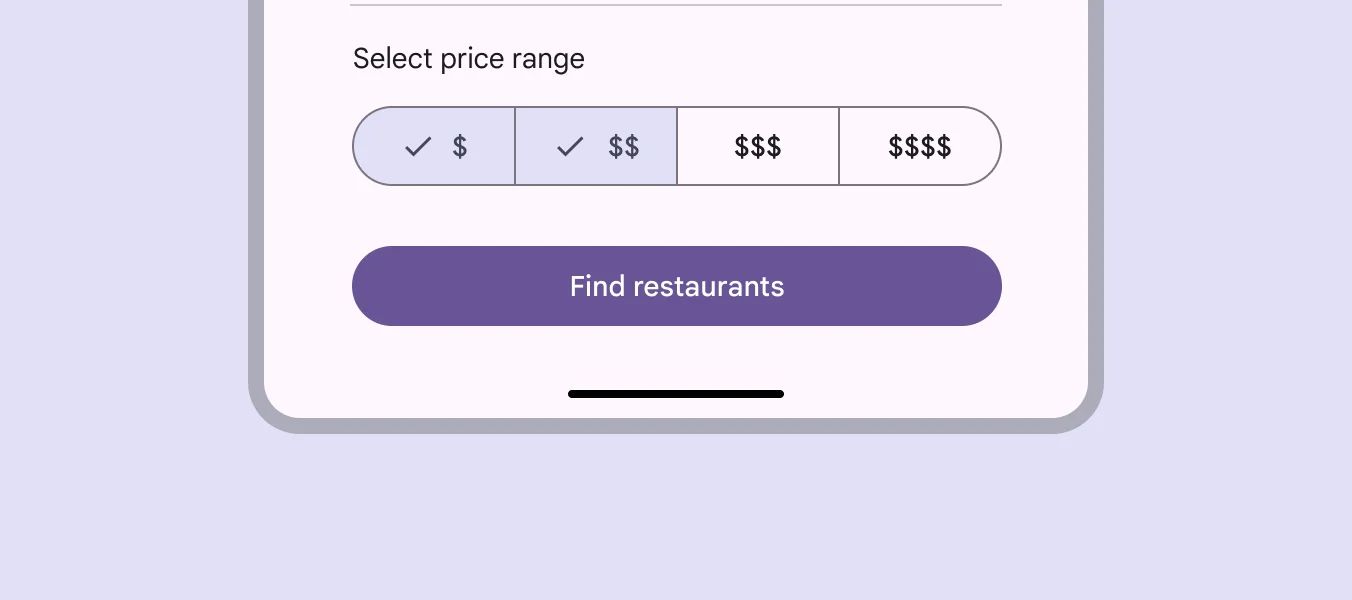
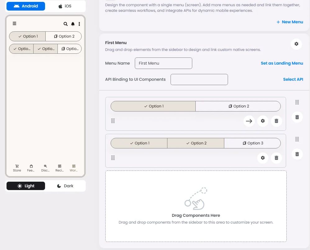
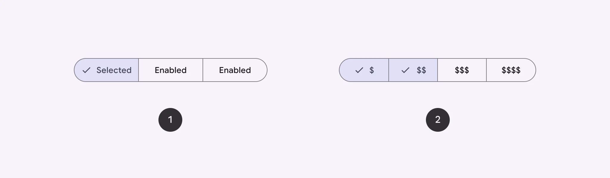
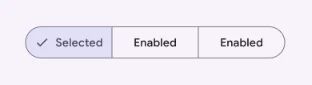
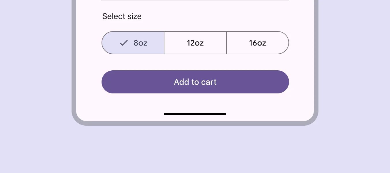
Segmented Buttons
There are two types of them: Single-select & Multi-select.
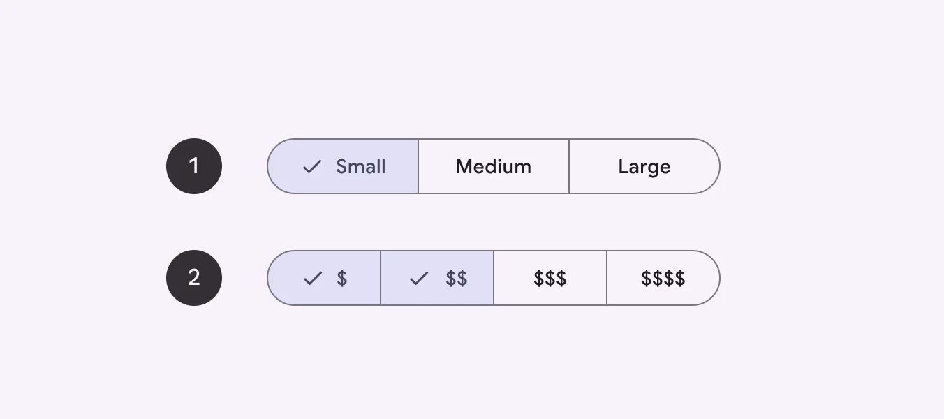
🧰 Usage: Single-select
Use a single-select segmented button to select one option from a set, switch between views, or sort elements from up to five options.
🧰 Usage: Multiple-select
Use a multi-select segmented button to select or sort from two to five options. Unlike single-select, selection is not required and a user may concurrently select anywhere from all to none of the options.