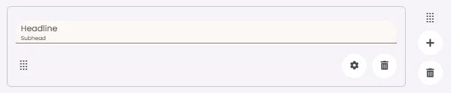
A headline is an element that organizes and briefly describes the content that follows to guide readers. It contains space for optional text: a headline, subhead and a divider.
🧱 Gridding Rules
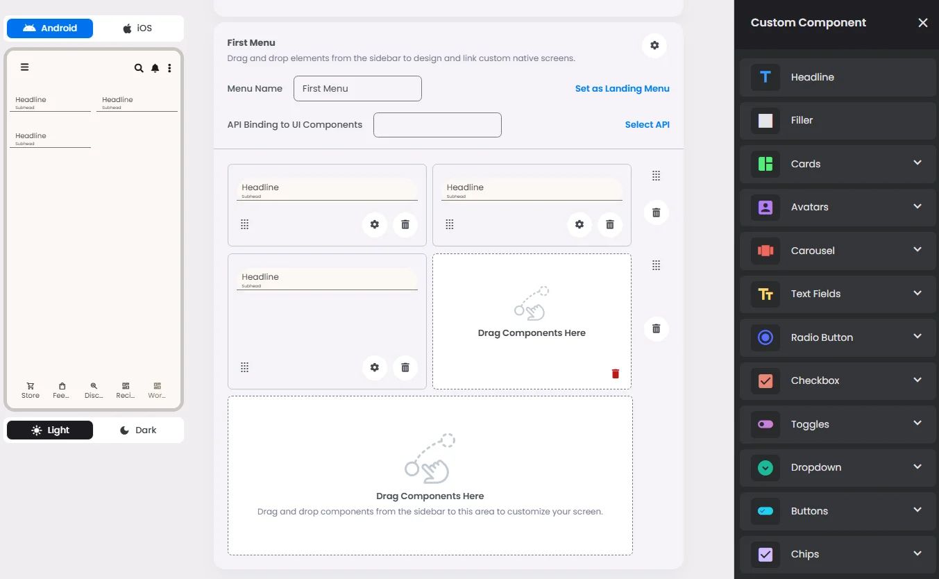
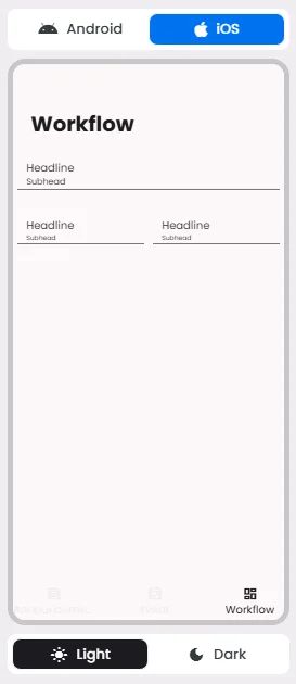
The Headline element follows a flexible grid system where it can be placed alone or alongside one other element in the same row.
Min | Max |
30 grids | 60 grids |
⚙️ Applicable Settings
The following table outlines the available configuration options for this element. Each setting defines how the element behaves or appears within your app’s UI.
Field | Description |
Headline | The main title of the cell (e.g., "Workflow Component Setup"). |
Subhead | Secondary text placed under the headline (if supported). |
Text Alignment | Alignment of the text in the cell: left, center, or right. |
Font Size | Font size of the headline and subhead text. |
Divider (Seperator) | Optional line under the headline for separation (often defaulted to true). |
Custom Color | controls the color styling of text or divider. |
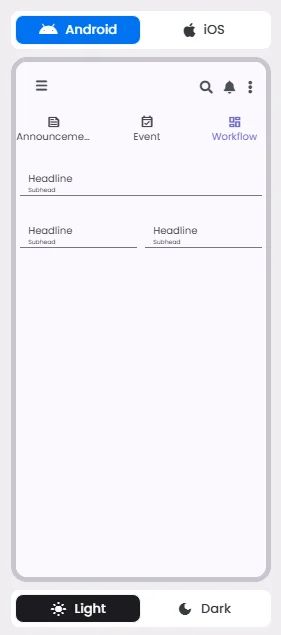
📱 UI for Android & iOS
The Headline element adapts its appearance and layout behavior based on the platform to align with native UI guidelines:
👇🏻 Action (onClick)
Element | Purpose | Supports Actions | Notes |
Headline | To present static content such as a headline, subhead, or divider. | ❌ | Informational/structural only. |
🃏 Headline Style Overview
In addition to being a headline element as it describes certain content, it can be used as a divider (separator) to separate between elements.