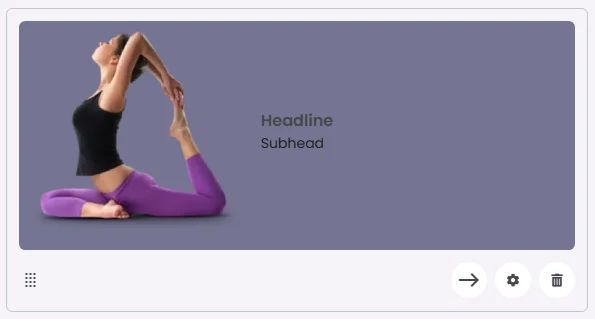
The Inline Card uses a horizontal layout where the image is positioned on one side, typically to the left or right of the headline and subhead. This side-by-side arrangement creates a compact and efficient design, ideal for showcasing items, profiles, or quick highlights where space optimization and visual balance are important.
🧱 Gridding Rules
The Inline Card element follows a flexible grid system where it can be placed alone or alongside one other element in the same row.
Max |
60 grids |
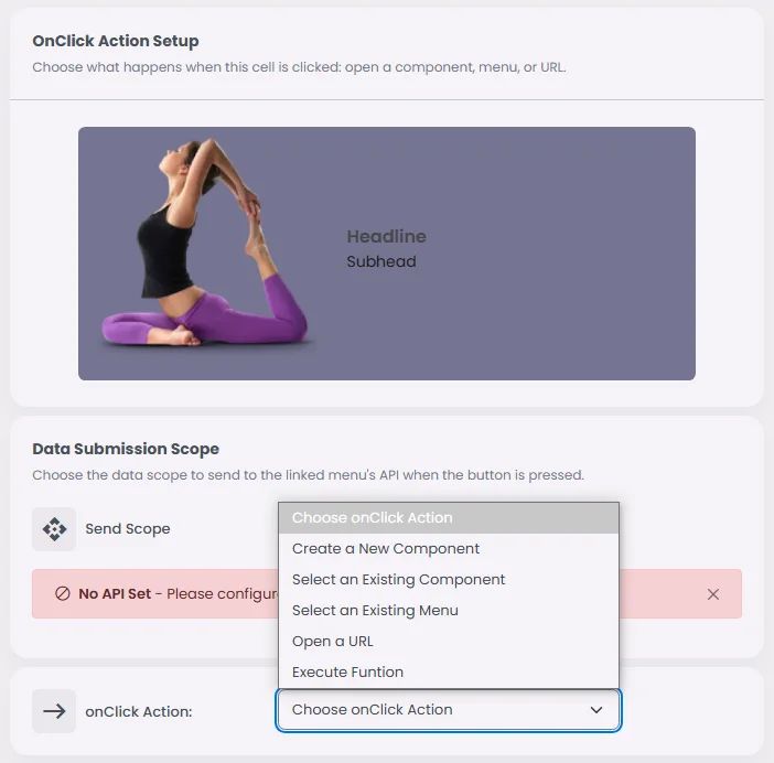
🔘 Actions
Element | Supports Actions | Available Actions |
Inline Card | ✅1 action | 1. Create a New Component
2. Select an Existing Component
3. Select an Existing Screen
4. Open URL
5. Execute Function:
⇒ Search
⇒ Search View |