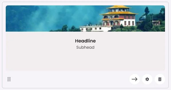
The Balanced Card features a vertical layout with a top-aligned image, followed by a headline and subhead. This design creates a well-proportioned structure that balances visual content with supporting text, making it ideal for showcasing destinations, services, or featured items while maintaining readability and visual flow.
🧱 Gridding Rules
The Balanced Card element follows a flexible grid system where it can be placed alone or alongside one other element in the same row.
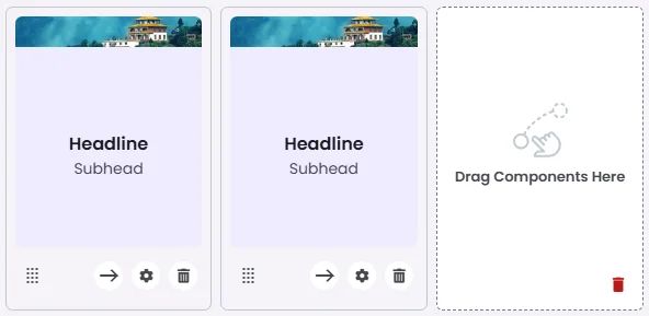
Min | Max |
20 grids | 60 grids |
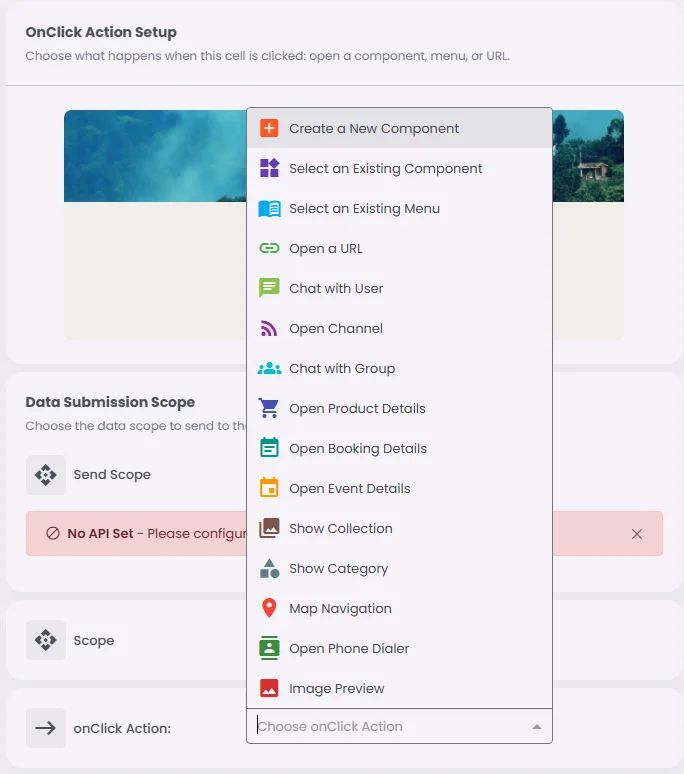
🔘 Actions
Element | Supports Actions | Available Actions |
Balanced Card | ✅1 action | 1. Create a New Component
2. Open URL
3. Chat with User
4. Open Channel
5. Chat with Group
6. Open Product Details
7. Open Booking Details
8. Open Event Details
9. Show Collection
10. Show Category
11. Map Navigation
12. Open Phone Dialer
13. Image Preview |