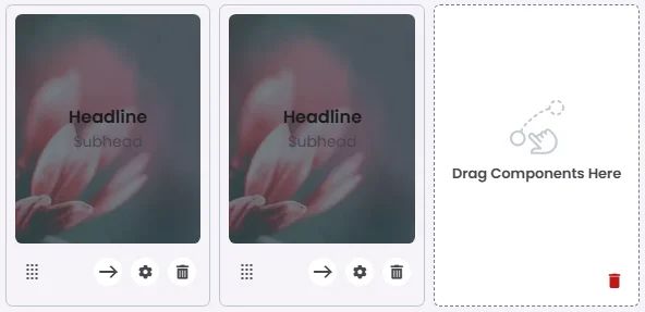
The Overlayed Card uses a full-width background image with the headline and subhead overlaid directly on top. This style is perfect for creating immersive, visually rich content blocks—ideal for promotional banners, event highlights, or storytelling elements where the imagery plays a central role in capturing attention.

🧱 Gridding Rules
The Overlaid Card element follows a flexible grid system where it can be placed alone or alongside one other element in the same row.
Min | Max |
20 grids | 60 grids |
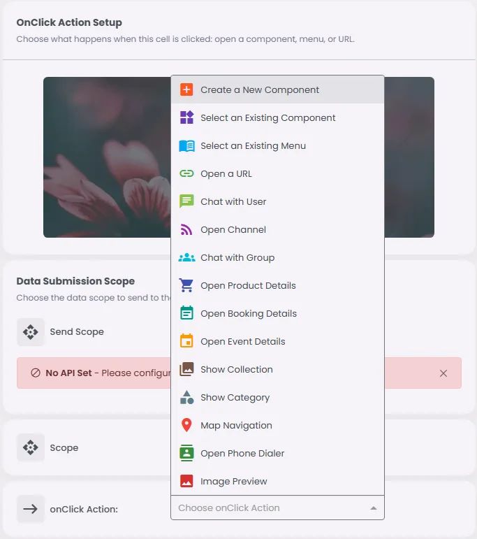
🔘 Actions
Element | Supports Actions | Available Actions |
Overlay Card | ✅1 action | 1. Create a New Component
2. Open URL
3. Chat with User
4. Open Channel
5. Chat with Group
6. Open Product Details
7. Open Booking Details
8. Open Event Details
9. Show Collection
10. Show Category
11. Map Navigation
12. Open Phone Dialer
13. Image Preview |