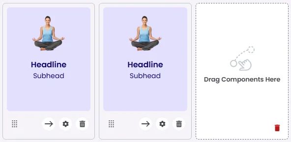
The Centered Card presents a clean, vertically structured layout where the image, headline, and subhead are all center-aligned. This design emphasizes balance and clarity, making it ideal for featured sections, lifestyle content, or welcome screens. Its minimal yet focused layout ensures the content remains visually engaging without distractions.

🧱 Gridding Rules
The Centered Card element follows a flexible grid system where it can be placed alone or alongside one other element in the same row.
Min | Max |
20 grids | 60 grids |
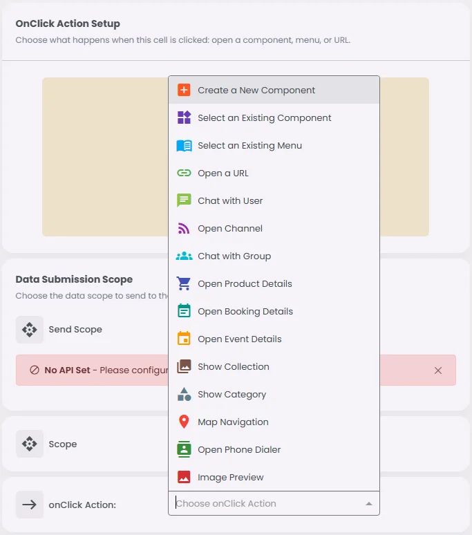
🔘 Actions
Element | Supports Actions | Available Actions |
Centered Card | ✅1 action | 1. Create a New Component
2. Open URL
3. Chat with User
4. Open Channel
5. Chat with Group
6. Open Product Details
7. Open Booking Details
8. Open Event Details
9. Show Collection
10. Show Category
11. Map Navigation
12. Open Phone Dialer
13. Image Preview |